Leaked Android 12 screenshots looks a bit like iOS
1 min. read
Published on
Read our disclosure page to find out how can you help MSPoweruser sustain the editorial team Read more
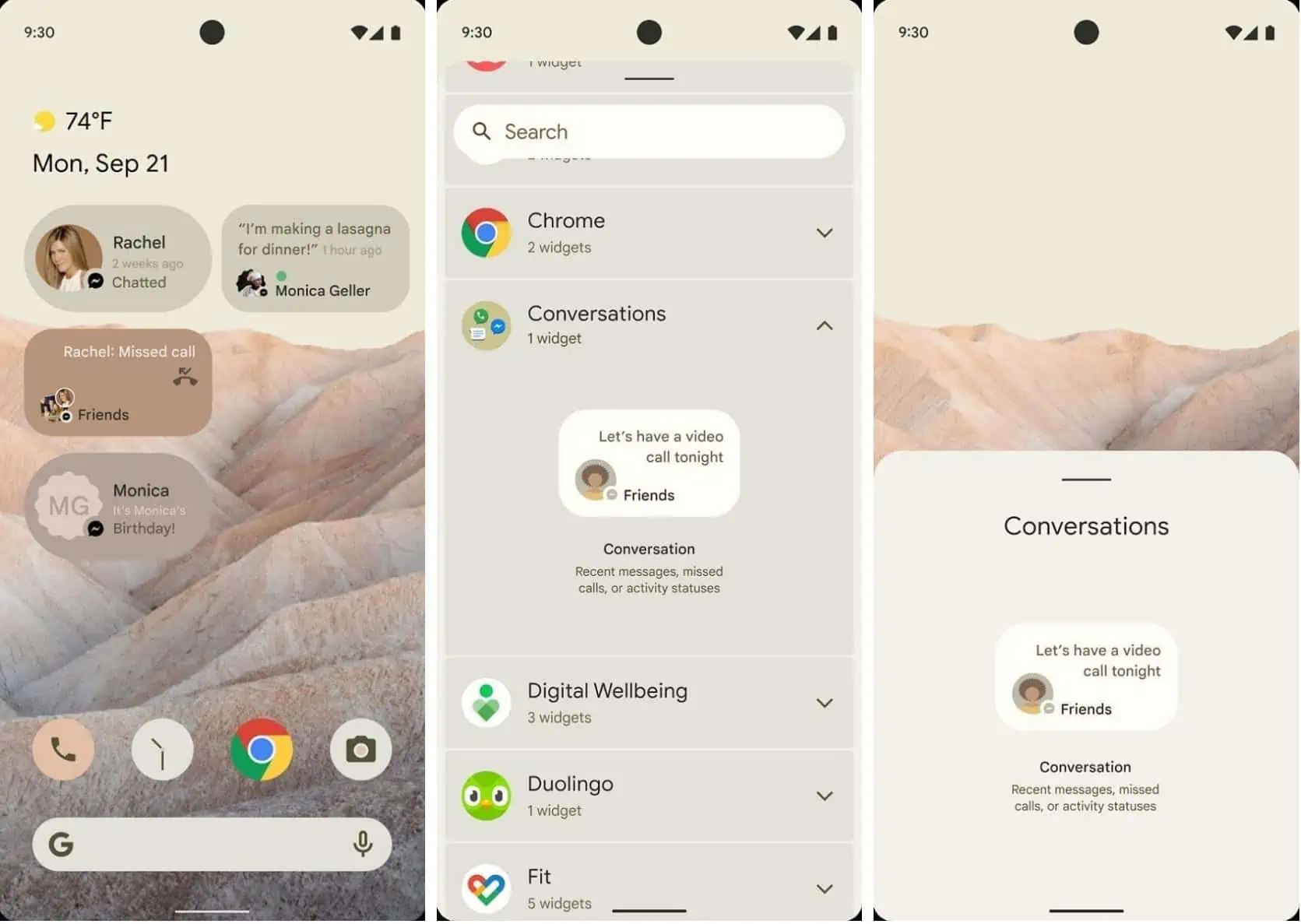
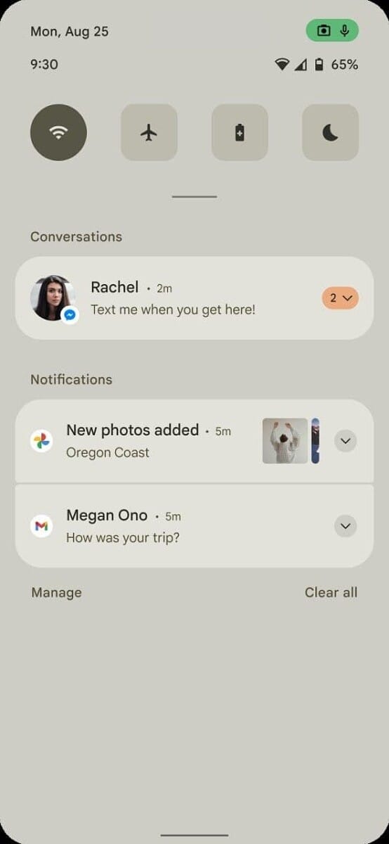
XDA-Developers and AndroidPolice have posted screenshots of what they are confident are a preview of what Android 12 will look like.
The new flat but layers design is very reminiscent of iOS.
There appears to use less transparency, more white space and more rounded corners.
Android 12 also appears to feature new privacy indicators, similar to iOS 14, which would allow users to know when an app uses your microphone, camera or location for example, via on-screen indicators. Android 12 appears to make it easier to access the information in detail, however, using specific icons for camera and microphone for example. AndroidPOlice suggests privacy options have been streamlined to make them more accessible and less confusing.
The screenshots also show a new “conversations” widget which shows “recent messages, missed calls, or activity statuses,” and may feature integration with other messaging apps such as Facebook.
What do our readers think of the new iOS-inspired look and features? Let us know below.






User forum
0 messages