Is Windows 10 Mobile really more usable than Windows Phone 8.1?
![]() 2 min. read
2 min. read
![]() Published on
Published on
Share this article
Improve this guide
Read our disclosure page to find out how can you help MSPoweruser sustain the editorial team Read more
One of the designers who worked on the next version of Windows Phone has today revealed that Microsoft believes Windows Phone 7/8 has significant usability issues, and that the current system of app bar and panoramas did not meet the needs of users, and that the Windows 10 Mobile solution should do this better, especially for the non-technical average user used to the iPhone or Android.
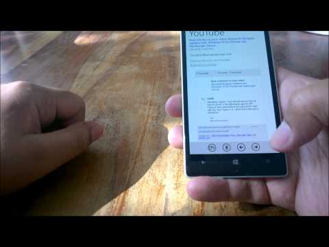
To put the last part of that question to the test, I have recorded a quick video looking at a pretty basic task – checking your email.
On Windows Phone 8.1 the default is holding the phone in the palm of your hand, with the corner resting at the base of your thumb, and in that position it is easy to scroll up and down your list of emails, read and email, use the next and previous button to read email after email without returning to the list, and reach the other controls, such as deleting an email or responding to it. Overall I would give that pretty high marks for a smooth and uncomplicated interaction for a basic task.
On iOS buttons used for task completion are scattered around the screen, but for a smaller phone like the iPhone 5S this is not an issue, as the whole screen is still reachable if you hold in in the middle of the device resting on your fingers. It is clearly however more poorly organized than Windows Phone, and your grip on the phone less secure.
On Windows 10 Mobile, in the new Outlook Mail app, things are pretty disastrous. All controls are on the top of the page, and pretty tiny, meaning on a large phone you will be forced to use two hands, and it is in fact impossible to move from one email to the next. In terms of usability for this basic task, it is a definite fail.
This suggests to me that, despite claims that Microsoft has done a huge amount of research on a better way to build a smartphone user interface and in the end concluded it was the way Apple and Google has done it, the software giant is once again throwing out the baby with the bathwater and abandoning what is good from Windows Phone for uncertain gain.


User forum
0 messages