Google replaces icon grid with carousel on Chrome New Tab Page in new Android test
2 min. read
Published on
Read our disclosure page to find out how can you help MSPoweruser sustain the editorial team Read more
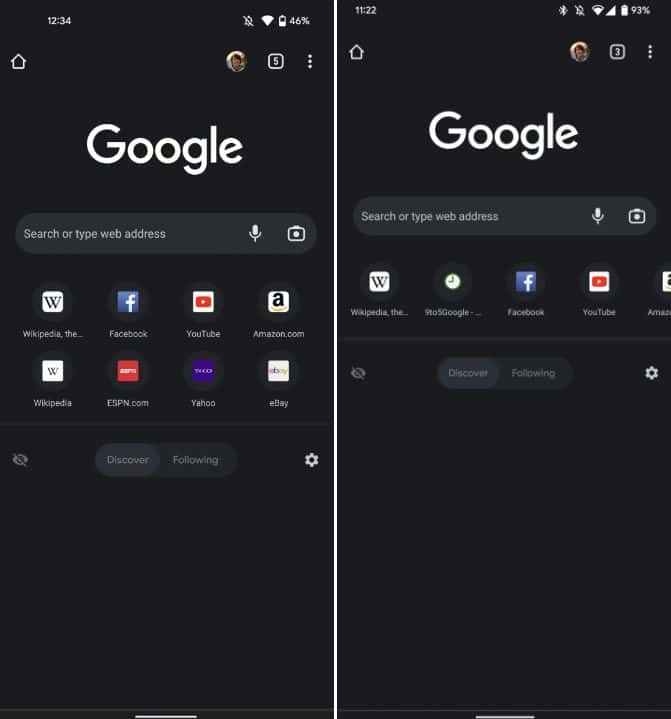
Google continues to be productive in recent days by making some changes in the designs of its products. Recently, it made a lot of changes in Google Play, including the addition of the Compatibility section, removal of the Movies and TV tab, and a lot more. Now, it is testing a new design for the New Tab Page of Chrome Android by turning the 4×2 Favicon grid into a scrollable carousel.
The new design change is reportedly being tested on some users over the weekend, as spotted by 9to5Google. Under this new design, the Chrome New Page on Android will be seen in a much neater layout since the presently space-consuming grid of eight shortcut icons would be just one long line of carousel. If your Discover and Following feed is turned off, it gives you a clean bottom New Tab Page. If you choose to activate it, on the other hand, you get a more spacious feed to scroll on.
It is the only feature reportedly seen in this test, which is still located in the same spot where the current 4×2 grid resides. That said, Chrome Android users will still see the Omnibox address bar with the voice and image search icons, the Discover/Following feed section, and the rest of the details of the present Chrome.
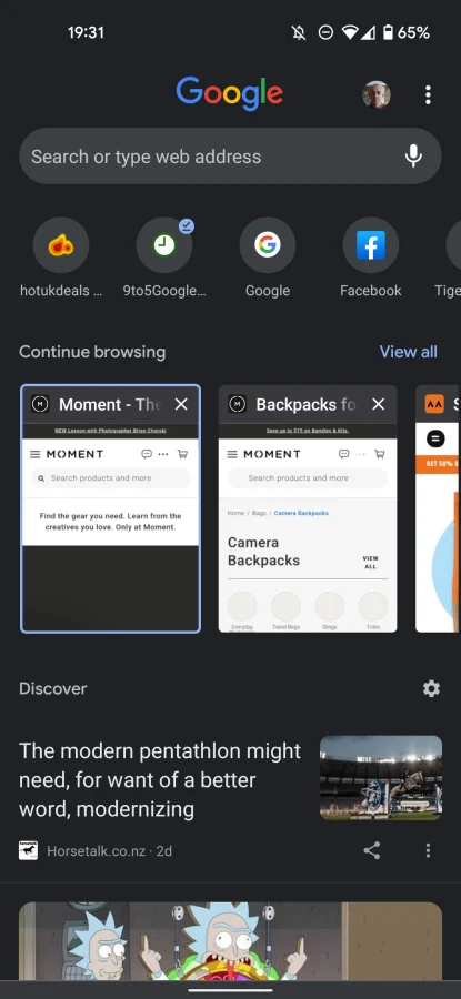
It can be recalled that Google previously tried this same Favicon carousel setup in Chrome Android in April this year, together with the addition of a new “Continue browsing” section. It is placed just above the Discover feed section of the tab and uses the carousel effect with a “View all” option. That test was not tested widely and obviously didn’t get implemented on users globally, but the resurrection of the icon carousel on Chrome Android must mean it will be rolled out formally this time.






User forum
0 messages