Chrome for Android to get a bottom toolbar—just like on Opera & Vivaldi browsers
Months ago, Google let iOS users move the address bar to the bottom
2 min. read
Published on
Read our disclosure page to find out how can you help MSPoweruser sustain the editorial team Read more
Key notes
- Google is testing a bottom toolbar for Chrome on Android.
- UI changes may be needed, including adjusting elements like the address bar.
- Similar features exist in other browsers and Chrome on iOS.

Google is apparently trying to make bottom toolbars a thing on its popular mobile browser, Chrome for Android. The feature itself has somewhat become common in many modern mobile apps—including YouTube, Instagram, WhatsApp, and even Netflix.
We spotted a commit message that hints at how Google is adding a flag for this feature to Chrome on Android. The “Bottom toolbar” flag reads that, “if enabled, displays the toolbar at the bottom.”
Here’s the commit message, and the string of codes that we spotted:


For Chrome on Android to support a bottom toolbar, some changes need to be done at the UI level. The overall layout of the app would need to be adjusted to accommodate the bottom toolbar, and that could move some elements like the address bar or tabs and even navigation buttons.
While Chrome for Android has never had bottom toolbars, even as an option, Google is now considering implementing it due to popular demand. The browser developers did experiment with a bottom toolbar interface in the past though, but they never released it to the public.
And it’s pretty much a big deal. Not only—as we previously mentioned—modern mobile apps have bottom toolbars, but they also give users some sort of flexibility as to how they want their browsers to look.
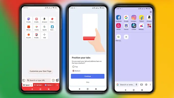
Browser apps on Android like Vivaldi and Opera have also allowed configuring the address bar and tab bar at the bottom via Settings. And, in case you missed it, Chrome already supports moving the address bar to the bottom on iOS but not on Android, so this feature is likely.


User forum
0 messages