As usual Microsoft did the "Touch Bar" first, but actually thought better of it (video)
2 min. read
Published on
Read our disclosure page to find out how can you help MSPoweruser sustain the editorial team Read more

Apple revealed their latest innovation today, the Touch Bar, which is a touch sensitive strip above the keyboard on some of their laptops which replace their function keys.
While there it little doubt Apple’s unveiling was less impressive than Microsoft’s Surface Studio yesterday, it becomes even less so when we remember that Microsoft first showed off the same idea in 2010, with much of the same “innovations”.
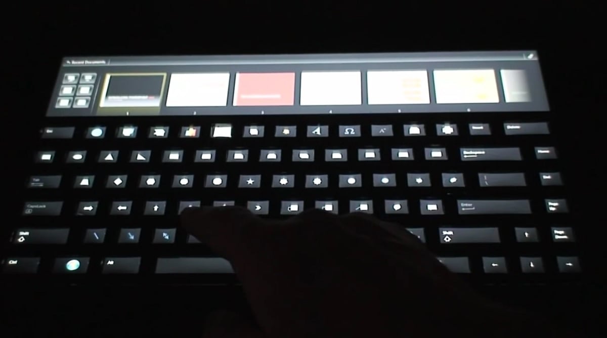
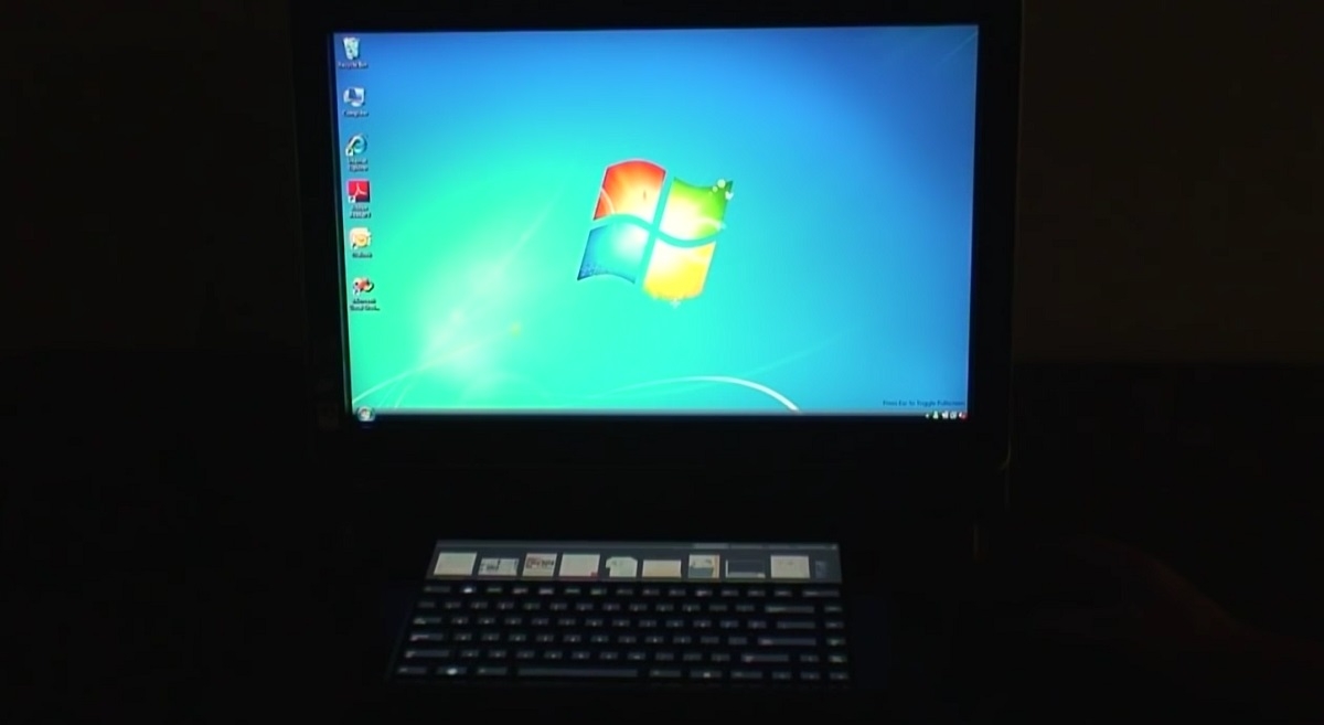
In the above video we have Microsoft Hardware showing off their Adaptive keyboard.
What’s an Adaptive Keyboard? It is a research prototype developed by Microsoft Hardware to explore how combining display and input capabilities in a keyboard can allow users to be more productive. The keyboard incorporates a large, touch-sensitive display strip at the top. In addition, the display continues underneath the keys, allowing the legends to be modified in real time. This lets you do things like change the character set to a different language or display command icons.
It’s almost as if Apple engineers watched this video (which has 150,000 views) at some point…
In fact Microsoft has been looking at the idea more recently, when they showed off their Surface-attached “Display Cover” concept in August 2015.
The DisplayCover is a peripheral cover and also a tactile keyboard affords users with the comfort and ease of use provided by physical keys. A thinfilm e-ink display with a resolution of 1280 x 305 pixels extends the available screen real estate of the slate device by up to 8%. It supports dynamic UI manipulation, concurrent access to multiple applications, stylus annotation, gestures and trackpad interactions on the horizontal plane.
See the video demo below:
Sometimes we lament when Microsoft develops an idea first but we see it implemented first in a competitor product. On this occasion however, particularly looking at Apple’s implementation, the idea does seem rather clumsy, requiring the user to constantly take their eyes from the screen and split their attention between the screen and the keyboard, and that rather narrow strip seems incredibly overloaded with functions.
Maybe one day Apple will consider using the large, expansive screen for touch rather than the tiny 1/2 inch strip above the keyboard instead…


User forum
0 messages