Are we going to get better looking Windows 8 apps?
3 min. read
Published on
Read our disclosure page to find out how can you help MSPoweruser sustain the editorial team Read more
Note: I wrote this article before this story that partly covers the future of Metro UI at Microsoft. It answers some questions but I think this post is still relevant .
Ever since Microsoft brought Metro UI to the forefront with Windows Phone 7, the design principles now seem to pop up everywhere from apps to websites. This is a good development. Unfortunately, a lot of people seem to be jumping on the bandwagon without any thought of aesthetics. Simply designing websites or apps with large flat colored tiles overlaid with text betrays the spirit of the Metro guidelines.
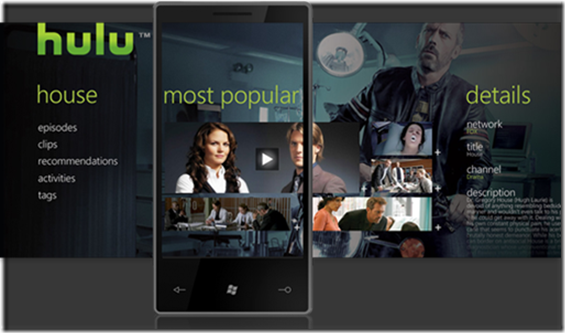
I’ve seen way too many apps on WP7 that are no more than the default template with developer content plugged in. Where are apps that look like the image below from Clarity Consulting which were showcased when wp7 was introduced?
Most apps also don’t seem to take advantage of the Panorama controls offered by the platform to create a magazine effect. It seems like there are a lot of programmers but not enough designers.
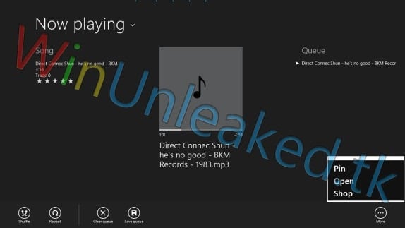
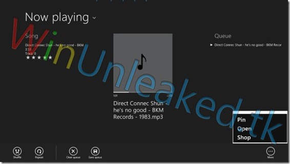
What drove me off the cliff was the recently leaked Windows 8 music app. I know its only a leak, but it is plain ugly in my opinion. I hope that the apps will look drastically better when they release the Windows 8 beta. windowsUnleaked.tk has more screenshots. Was it that difficult to somehow modify the Zune desktop app and use it here instead?
I was never impressed by most of the Metro apps that a were part of the Windows 8 unveiling because they were as simplistic as it gets. An argument could be made that Microsoft is just holding back their cards and will reveal the polished products at the last moment. I certainly hope so. If it were up to me, I would make a case for the opposite approach. Microsoft needs to design and showcase the best looking native apps, like Office, Photo gallery, Music and Video, Email, Calendar and more so that aspiring developers can take cue from that to produce even greater looking apps.
Take for example the Bing iPad app. It brings Metro UI to life!
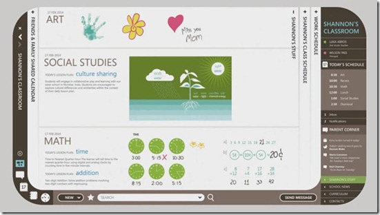
This can also be said of the Microsoft Office labs 2019 concept video.
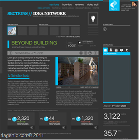
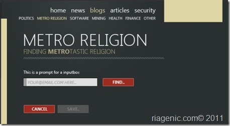
Scott Barnes, former Microsoft .NET Program Manager, had a great post a few months back about going beyond the monochromatic color scheme found in most of the designs we see today. Some of his ideas are on the two images below.
Check out more Metro inspired designs from this site.
Clearly, the Metro designing principles done right can achieve great results. Even Microsoft’s bitter rival, Google, decided to use some of the elements in their Android ICS update via Roboto font and their obvious copy of WP7’s people hub with their People app.
My sincere hope is that Microsoft leaves all the legacy behind and ventures beyond the basic framework guiding principals i.e “Metro Styleâ€, to create an OS that is truly and authentically digital with Windows 8.
Thanks to @danweitran for Pintrest link.
Office 2019 image via istartedsomething.com
User forum
0 messages