Microsoft is putting ads in Windows 11 sign-out flyout menu
3 min. read
Published on
Read our disclosure page to find out how can you help MSPoweruser sustain the editorial team Read more
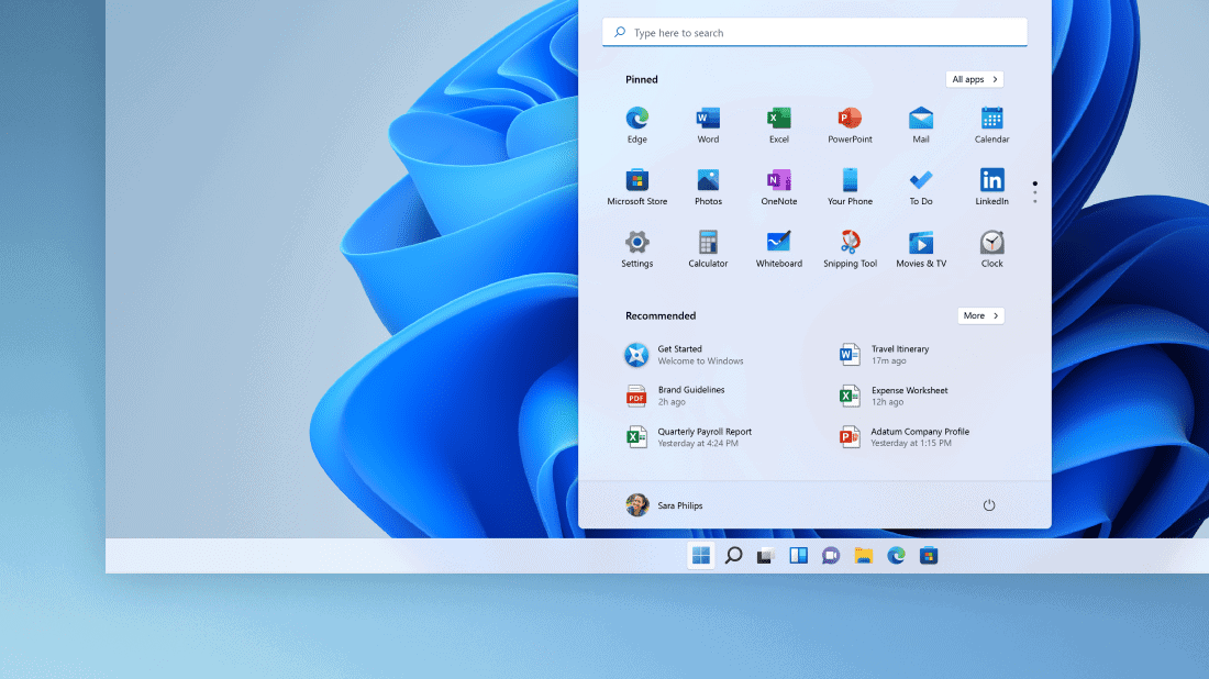
The public despises advertisements, but companies see them as an incredible way to push their products to their customers. With this, it is not surprising we see ads every now and then. Businesses make sure to put them in all possible places, like Microsoft trying to push its product even if you just want to sign out of your computer.
Turns out OneDrive isn't the only thing that can be advertised here, prompts for creating a Microsoft Account can appear as well ? pic.twitter.com/ZXjdv44Byn
— Albacore ?? (@thebookisclosed) November 7, 2022
Twitter user Albacore spotted Microsoft had put two of its product offerings — OneDrive and Microsoft account — on the sign-out flyout menu in the Windows 11 Start menu. The ads are not as direct or obvious as other common ads we know, but Microsoft is suggesting them in an area that is just supposed to give you easy access to sign out of your account.
“Do we really need to stuff OneDrive promos in the user session flyout?” The tweet reads.
The ads join the current three options in the flyout menu, including locking the PC, signing out, and changing your account settings. According to the tweet, the ads did not show up simultaneously, keeping the flyout space as small as possible. Also, the change seems to be only a part of Microsoft’s test among Insiders, as it is still unavailable in regular Windows 11 systems. Nonetheless, the news caught flak from various users.
“I’m honestly not surprised at all the hate towards Windows 11 in forums and social media,” commented another Twitter user on Albacore’s revelation. “Not surprised at how little people have upgraded from Windows 10 too.”
“Soon they’ll shove every ad they can so your only option is to use physical power button,” another user commented.
Microsoft is not new to pushing ads in different sections of its systems and platforms. In August, former Microsoft director of user experience, Jensen Harris, criticized the company for the “friction” in the Start menu when a user is searching for information about a specific subject. In his tweets, Harris showed how a large section of the Start menu is used for advertisement instead of directly showing the best results for the topic being searched.
“The bigger issue here though: why are there banner ads in the Start menu?” The tweet reads. “Is the amount of $ made by this wallpaper app worth cheapening the experience people have in this very high-touch piece of UI? …Great UI should help people achieve a task with minimum friction. But the next section down is expressly designed to introduce friction into my experience. It’s the largest UI in the Start menu, and it’s designed specifically to distract me away from achieving my intended task.”
Many Xbox fans expressed the same sentiment over the recent Xbox dashboard design update, which came with rows of ad tiles. Users complained about how years of their suggestions and comments about ads were ignored, with the dynamic background theme turning into a useless feature due to blocks of ads concealing the images.
Despite these regular streams of criticism, Microsoft seems unbothered, resulting in a continuous presentation of ads on its different platforms. However, how much is too much? And if the Redmond company continues this approach, would it benefit the latest Windows 11 OS it is trying to promote? Or would it just make the place repulsive, causing more people to be stuck in the old Windows 10?

User forum
0 messages