Concept creator shows his vision of Windows 10
1 min. read
Published on
Read our disclosure page to find out how can you help MSPoweruser sustain the editorial team Read more
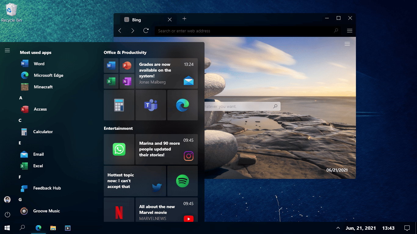
Windows 10 is more than five years old and while the software giant did change a lot of things in the operating system in the past five years, in terms of design, we didn’t see serious improvements other than the Fluent Design System and new icons. There is still a lot to be done in order to make Windows 10 look more polished, and concept creator u/jacomartins_reddit has some design ideas that Microsoft can take inspiration from.
As you can see in the above images, the concept creator has reimagined what the File Explorer, Calendar in Windows 10 should look like. The new Fluent Design-based File Explorer app, however, is not entirely new. Microsoft teased something similar last year, but it looks like no progress has been made since then. The calendar app has also received a major redesign treatment. The concept creator also envisioned a new Start Menu with blur effects.
Let us know whether or not you like the new Windows 10 design in the comments section below.
via Betanews





User forum
0 messages