What to know about Nothing Phone 1
Nothing Phone 1 is already revealed, and different units have already been tested everywhere. These tests give us ideas of what to expect once it goes on official sale on July 21. So, really, what should you know about Nothing’s first handheld phone?
This Thursday, Nothing Phone 1 is set to arrive in the markets of the UK, Europe, India, Japan, Hong Kong, and Australia. As for the US market, the launch date is still unclear due to the modifications needed for the phones in order to complement the 5G infrastructure in the region. If you are curious about the unit’s price, though, you could check pricetags of the phone from the markets mentioned earlier. Nothing Phone 1 has three variants available: 8GB/128GB, 8GB/256GB, and 12GB/256GB, and their international prices respectively convert to $475, $530, and $590 in the US.
With such prices, you know you are not getting a luxury phone. Phone 1 is a mid-price handheld meant for general consumers, not just for a few users. And perhaps, this is a good step from Nothing CEO and co-founder Carl Pei who wants to create a remarkable entrance for the Phone 1 in the market. However, the question is, does it make the cut to be the phone that the market would love?
Transparent back and Glyph Interface
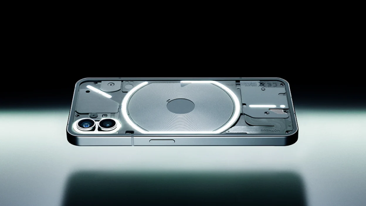
Producing phones these days can be a huge challenge for manufacturers. The phone industry is constantly changing, so companies need new ideas to tickle the market’s interest at all times. We saw it from the flipping galaxy phones of Samsung and the unreleased LG Rollable. Pei clearly knows this requirement, resulting in the birth of Nothing Phone 1 with a strangely transparent back. Of course, it is not the first phone to use the same design concept (there’s Xiaomi’s Mi 8 Explorer Edition and HTC U12+), but it is the first phone model to justify why it has such a look.
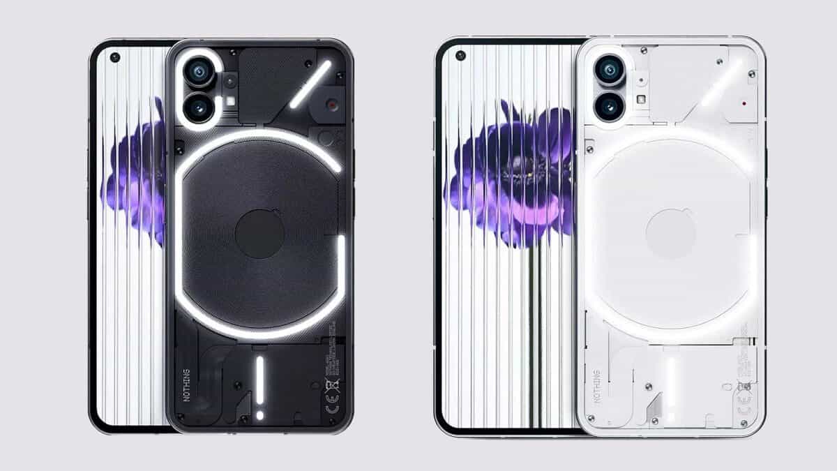
Nothing Phone 1’s back has functional and aesthetically satisfying strips of lights. The Glyph Interface, as Nothing calls it, is a series of 900 white LEDs that responds to the phone’s activities, specifically to the notifications arriving. It also showcases the phone’s different components, giving it that modern vibe.
What makes the Glyph Interface even more unique is that the phone has its own dedicated settings for it, which lets you customize the glyphs and assign them to particular purposes (e.g., notifications, charging indicators, Google Assistant indicator, video soft light, etc.). The lights blend with the brand’s 10 original ringtones and notification tones, and they will blink and light up according to the rhythm of the tones playing.
Body
Another huge advantage of the Phone 1 is its incredible resistance to smudges. The clear Gorilla Glass 5 back can do a good job of preventing slight fingerprint marks on the phone’s surface, making its cleanup a cinch at all times. Additionally, it has an IP53 certification for effective protection against dust and a slight amount of liquids.
It has two colors available: a black and white model. Both are visually appealing, but the black one will let you better appreciate its LEDs and transparent back layout. It also looks neat, with its sides featuring slightly rounded edges for comfort. Plus, it only weighs 193.5g, making its weight familiar for modern owners of smartphones today.
On the other hand, like in other phone models, there is a power key on the right side of the phone, while the two volume controls settle on the left side. The good thing about them is how properly big they are, allowing your fingers to locate them easily. They are also responsive and will give you that clicky response.
The phone doesn’t have a wired headphone jack, so you better have a pair of wireless earphones ready when you purchase the unit. Nonetheless, note that it only supports select wireless buds via Bluetooth 5.2, so if you want to ensure this section, Nothing Ear 1 is a sure option.
Display and Camera
Nothing Phone 1 has a 6.55in Full HD+ flexible OLED display with HDR10+ compatibility and 10-bit color support, so you can be sure of vibrant images at all times. Meanwhile, the power-efficient adaptive 120Hz refresh rate combined with a 240Hz touch response rate gives the phone a satisfying performance from regular swiping to gaming.
The phone has a low optical in-display fingerprint sensor with a faint ring that guides your finger even when the screen is off. Meanwhile, around the screen is a bezel with even thickness from tight to bottom and left to right, giving the phone a uniform look. The screen’s top-left corner shows a hole for the front camera, making the layout neat.
The phone’s camera system has dual 50MP rear cameras plus a 16MP front camera, in addition to the main Sony IMX766 sensor with optical image stabilization. Meanwhile, Phone 1’s video recording can provide 1080p/60fps or 4K/30fps footage via the rear sensors with OIS and EIS. This is nothing special, given the current standards of smartphones today, but what makes its camera experience different from the other phones is the ability of the Glyph Interface to serve as a fill light. This gives you another option to use during low-light conditions, aside from its dedicated LED flash.
Hardware and Battery
As said, the Phone 1 is a mid-range phone, so it is not surprising that it comes with a tuned older seventh-generation Qualcomm Snapdragon 778G+ chipset. It comes with 8GB RAM, but you have the choice to bump it up to 12GB.
Despite this rather unexciting chipset choice, Snapdragon 778G+ can work great for handling different games and multiple apps at once. However, time will tell the longevity of its satisfactory performance, especially after years of device use and updates.
On the other hand, while the “+” sign of the chipset means the phone will be getting up to 15W wireless and up to 5W reverse wireless charging capabilities, it doesn’t mean an excellent battery life. The 4,500mAh battery with 33W fast charging support is claimed by Nothing to offer up to 18 hours of use per charge. However, just like in other phones advertised before, the performance of the Phone 1 in the real world could differ. Reports say the phone can only last about five hours of screen-on time, which is still pretty decent for an affordable phone.
Software
Nothing OS is a light skin atop Android 12, offering some tweaks and new features to try, including the brand-new Nothing Launcher and Nothing’s original Camera and Recorder apps.
The OS boasts the Dot Matrix font, which can be seen across the phone’s UI (and even hardware), like Analogue Clock, Digital Clock, and Weather widgets. It is the most notable thing about the appearance of the OS, but there are other small additional details worth mentioning. One is the tweaked Quick Settings of the phone with a six-tile layout. It features a Wi-Fi section with quick access for network and data sharing. When you expand the Wi-Fi or Mobile data toggle, an internet pop-up panel will show you the mobile hotspot setting. In relation to that, the Bluetooth toggle lets you choose the device or accessories you want to connect to.
Of course, the settings include additional controls for the Glyph Interface, although they are located in the main Settings section of the OS. Other new experiences in Nothing OS extend to the phone’s personalization, particularly in wallpaper, grids, themes, folder sizes (as large as 2 x 2 home screen space), and more. Finally, Nothing says that the phone will have three years of OS updates and four years of security updates.
Read our disclosure page to find out how can you help MSPoweruser sustain the editorial team Read more
User forum
0 messages