Twitter updates its PWA with improved Explore functionality
2 min. read
Updated on
Read our disclosure page to find out how can you help MSPoweruser sustain the editorial team Read more
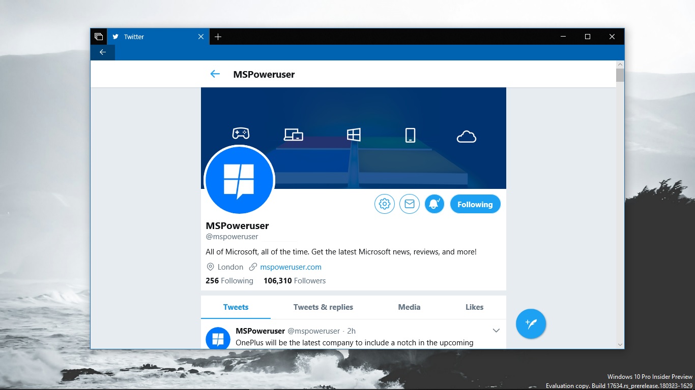
Twitter is rolling out a series of changes to its explore functionality, making it easier to use to follow up on different topics.
As the Twitter for Windows app is a PWA< these changes will roll out to your Windows app on Windows 10 or supported builds on Windows 10 Mobile.
The first change is allowing Explore to be more organized by topic tabs, this one is an experimental US-only feature for iOS and Android, so it’s not really relevant to most users here. Nevertheless, here’s what Twitter says:
We heard from you that Explore would be easier to navigate if it was organized by topic instead of content type (video, articles, etc). We’re now experimenting with topic tabs in Explore so it’s easier to see what’s happening in news and entertainment, and what’s most relevant to you. Available in the coming months to everyone in the US on iOS and Android.
Twitter is also adapting the Moments feature to make it easier to navigate as a result of tests it had run earlier, as seen below:
Right now, you swipe horizontally to read Moments, but our research showed us that Moments are easier to use vertically, just like your timeline. In our tests of this new look, we saw significantly more people using and returning to Moments. So, we’re starting to introduce this new vertical timeline experience for Moments.
Some Moments — including Moments outside of the US, Sponsored Moments and Moments created by you — will temporarily continue to be horizontal as we roll out this change.
Twitter is rolling out these changes now, and they can be accessed via Twitter’s Windows app, no updates required.
Source: Twitter, via AllAboutWindowsPhone



User forum
0 messages