The Windows 10 Start Menu wins ISDA 2015 Digital Design Award
2 min. read
Published on
Read our disclosure page to find out how can you help MSPoweruser sustain the editorial team Read more
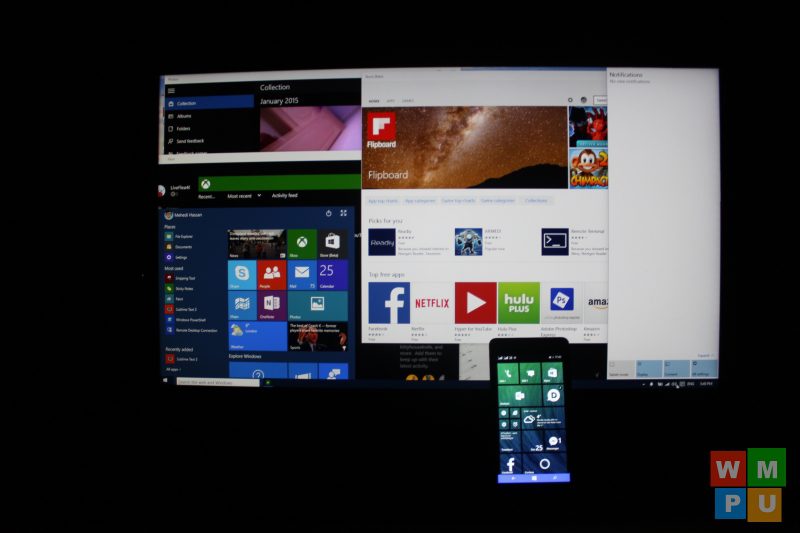
Widely seen as a capitulation to the demands of Windows 7 users who refused to move to the full screen Start screen, the new Windows 10 Start Menu has been widely welcomed, but has otherwise not been seen as the height of originality or new design.
In fact Danny Oran, the designer of the start menu in Windows 95, has expressed disappointment that the menu was still being used, saying:
“In some ways, it’s a little disappointing the same stuff is in there,”
“Windows 8 had its ups and downs, but at least it tried something new besides a Start menu I invented decades prior.”
It seems however that the appeal of the pop-up menu has been under-estimated, as the feature has just won an ISDA 2015 Digital Design award.
They write:
Since its inception more than 20 years ago, the Windows Start menu has been the anchor point for launching apps and getting users to the content they care about. With Windows 8 and Windows Phone 7, Microsoft continued the evolution of the Start screen by adding live tiles which surface relevant and personal information to the user from apps and services. With the Windows 10 Start design, the experience of launching and switching apps is unified across the familiar and learned legacy of the Start menu on desktop PCs—and the modern capabilities of the Start screen on phones and tablets. The design allows users to leverage what they know from one device and apply that knowledge to using a different device in a contextually appropriate manner.
Do our readers think the Start Menu in Windows 10’s design is under appreciated? Let us know below.


User forum
0 messages