New app lets you finally customise the awful Windows 10 Volume Flyout
2 min. read
Published on
Read our disclosure page to find out how can you help MSPoweruser sustain the editorial team Read more
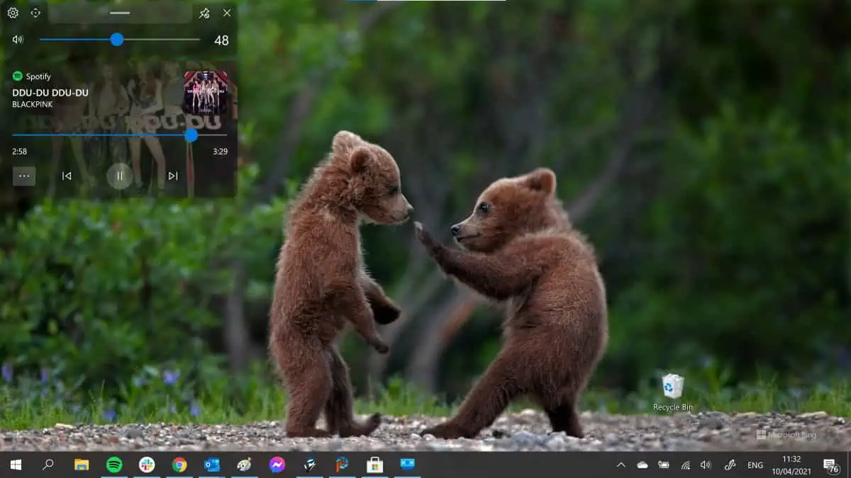
The Windows 10 Volume Flyout is one of the worst UI problems with the operating system. It has not been updated since Windows 8, is much too large, obscuring the video you are watching, for example, persists much too long, and is completely uncustomizable.
Thankfully an app has finally come along to save my sanity. ModernFlyouts by developer ShankarBUS and Sam G aims to replace the native volume flyout with its own version, which is extremely customizable.
The gallery shows the old version, a new larger version and a new compact version.
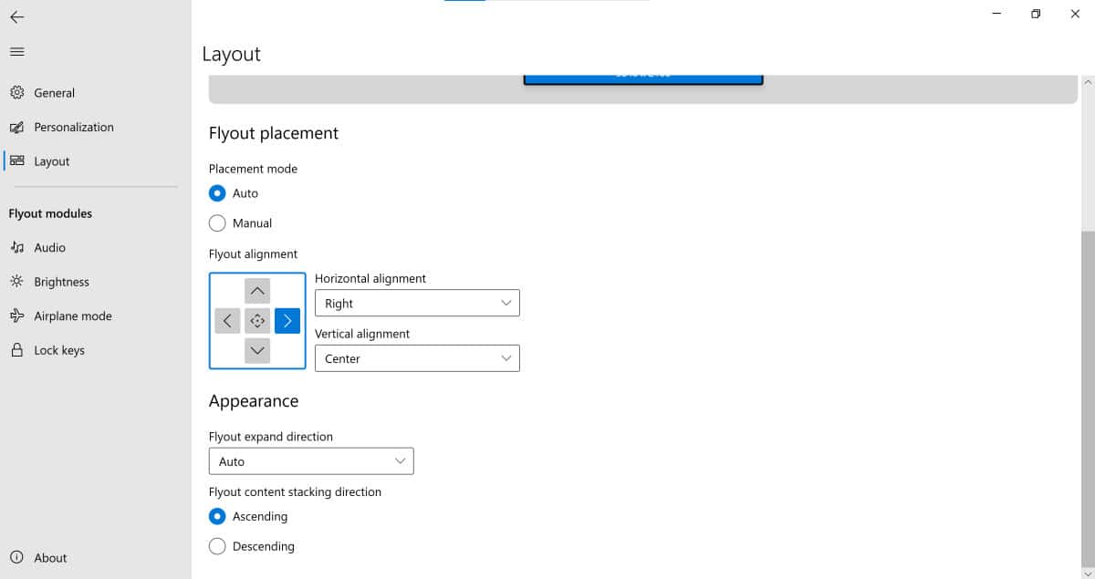
The new volume fly-out can be positioned on the screen wherever you want it, you can set how long you wish it to persist on your screen, how opaque you want it to be, and many more options. It even supports dark and light mode.
Replacement flyouts for brightness, aeroplane mode and lock keys are also available.
The work builds on a foundation by well-known windows hacker ADelta-X and the app is being developed in the open on GitHub.
The app is currently in preview, so do not expect 100% reliability, especially since it has to replace the native volume flyout just before it loads, so it may not always be successful, but it is still a massive improvement on what we have currently.
Find it in the Microsoft Store here.
[appbox microsoftstore 9mt60qv066rp]
via WBI




User forum
0 messages