Samsung briefly demoes One UI (video)
2 min. read
Published on
Read our disclosure page to find out how can you help MSPoweruser sustain the editorial team Read more
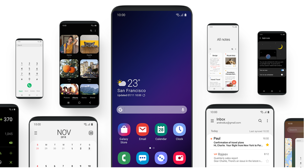

At their Unpacked event, Samsung revealed its new user interface for its Android phones going forward. Dubbed One UI, this new interface is aimed at making phones — many of which have now ballooned in sizes — easier to use.
“Find and focus on the content you want easily, “Samsung’s official website reads, “The decluttered screen shows relevant information with each tap, so you only get the essentials, one at a time.”
With One UI, Samsung will redesign its apps to have two areas, a viewing area where it will place large header text (akin to a one now-defunct smartphone OS which used to grace the firm’s phones), and an interaction area which will be placed at the bottom of the screen. This means that users will be able to easily get access to the most relevant actions without needing to stretch their thumbs to the top of the screen.
https://youtu.be/X3LVk0i6bY4
“Its clean and minimal design keeps the most relevant content on the bottom half of the screen – making it more natural and comfortable for one-handed use,” Samsung explained, “The experience was reengineered to reduce clutter and distractions, allowing the user to better focus and quickly navigate their phone.”
Samsung’s One UI will roll out with the Android Pie update, but the firm will let users try a beta version of it for the Galaxy S9, S9 Plus, and the Note 9 before it rolls out in January to the Samsung Galaxy S8, S9 and of course S10 range.
Via BGR

User forum
0 messages