Check out this reimagined Windows 10 experience (video)
2 min. read
Updated on
Read our disclosure page to find out how can you help MSPoweruser sustain the editorial team Read more
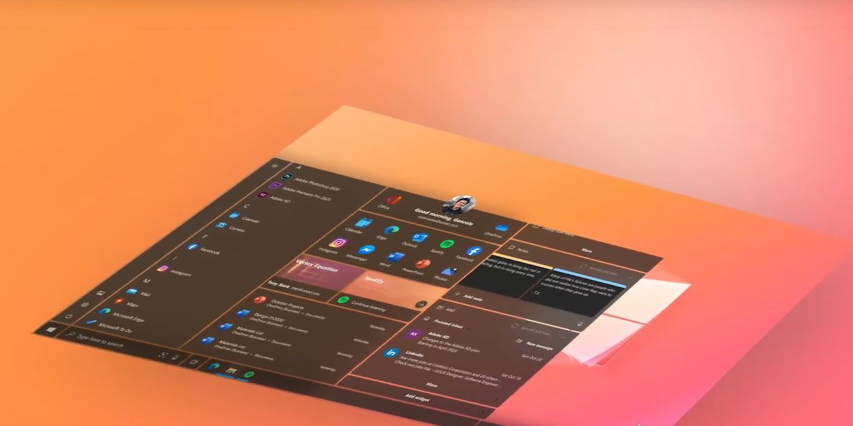
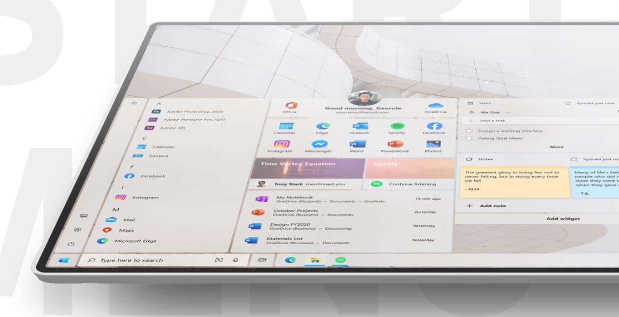
Genrole Caspe, a Philippines-based designer has reimagined Windows with a beautiful concept, check it out from the video above. As you can see from the video, this concept does not introduce a radically new UX, instead, it tries to deliver a better UX by making changes to the current design of Windows 10/Windows 10X OS. Since the concept is designed based on Microsoft’s Fluent Design language, the reimagined experience looks very familiar as well.
You can find the following in the video:
- Brand new look and feel: Curved edges, modular design, allowing for a more personal and frictionless experience.
- New Start menu: Open your favorite and most important apps and documents by pinning them to the launcher.
- Timeline cards: Cards show a suggestion of apps based on its relevance and recent use.
- Recent files: A new place to quickly open your recently edited Office documents.
- App Widgets: Interact with your apps directly from the Launcher without opening them.
- A new look for Cortana and Cortana Notebook for a more engaging conversations.
- Redesigned File Explorer experience.
- Redesigned Action Center/Notification experience.
You can learn more about his project here. Recently, Microsoft revealed the key features that will be part of the upcoming Windows 10X OS. The Windows 10X is a modern OS that is built for dual-screen devices like Surface Neo. You can learn more about it here.


User forum
0 messages