Google announces redesigned Google Photos experience
2 min. read
Published on
Read our disclosure page to find out how can you help MSPoweruser sustain the editorial team Read more
Google today announced a redesigned Google Photos experience that brings more prominence to your photos and videos. Also, search is now front-and-center of the Google Photos experience. Google Photos app now comes with the following three-tab structure.

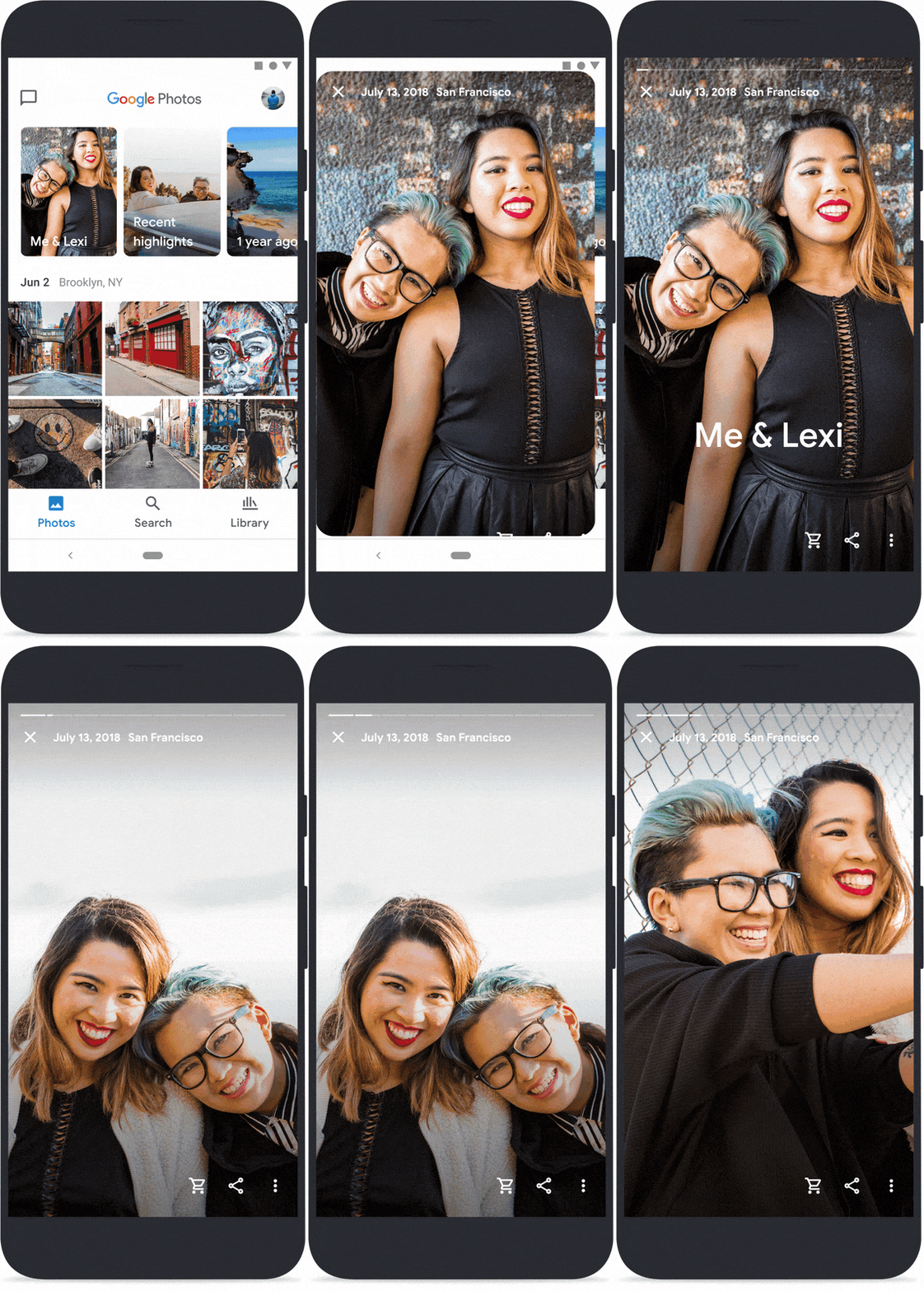
- Photos: As always, the main tab contains all your photos and videos, but now you’ll see larger thumbnails, auto-playing videos, and less white space between photos. At the very top, there is a larger Memories carousel. Google is also adding new types of Memories, like the best pics of you and your closest friends and family over the years, trips, and even just the highlights from last week. You can also control what types of Memories you receive. Google has also moved automatic creations–like movies, collages, animations, stylized photos and more to Memories.
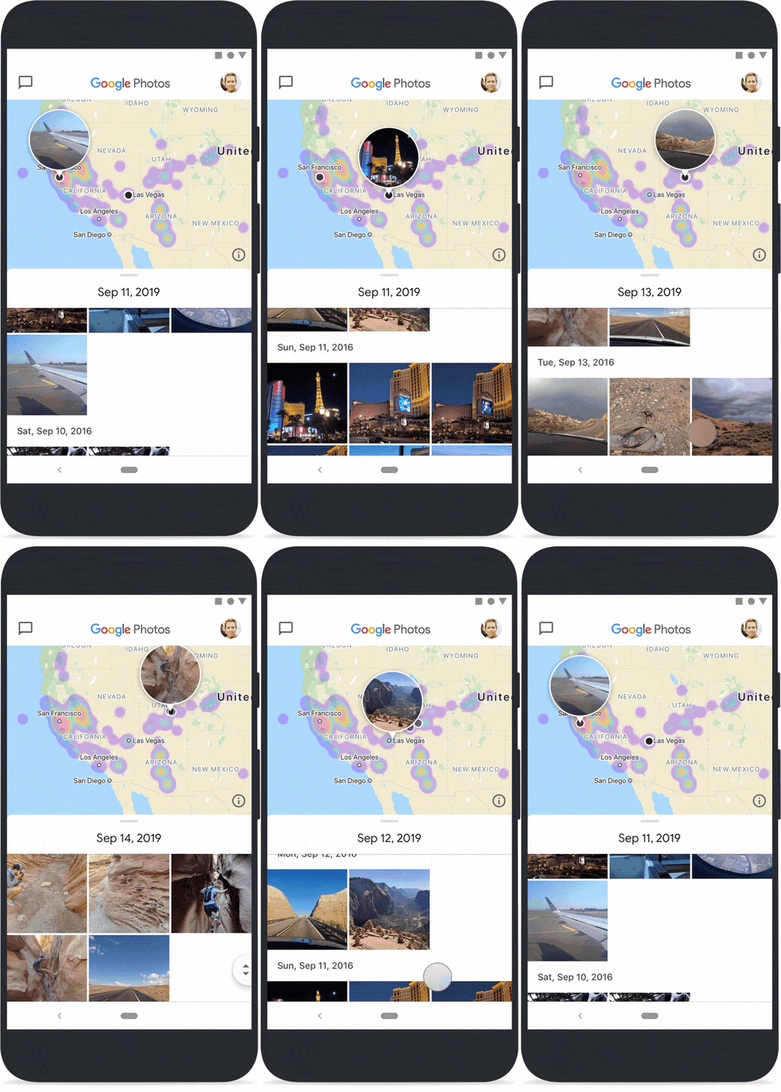
- Search: Search is now front and center to give you quick access to the people, places, and things most important to you. You’ll also find a new interactive map view. With the new map view, you can pinch and zoom around the globe to explore photos.
- Library: The library tab contains the most important destinations in your photo library, like Albums, Favorites, Trash, Archive and more. And if you’re in the U.S., EU or Canada, you’ll also see our Print Store, where you can purchase printed products featuring your own photos.
Google today also announced that it is refreshing and simplifying the Google Photos icon.

Source: Google

User forum
0 messages