Outlook Mail for Windows 10 Mobile updated for better one-handed use
1 min. read
Published on
Read our disclosure page to find out how can you help MSPoweruser sustain the editorial team Read more
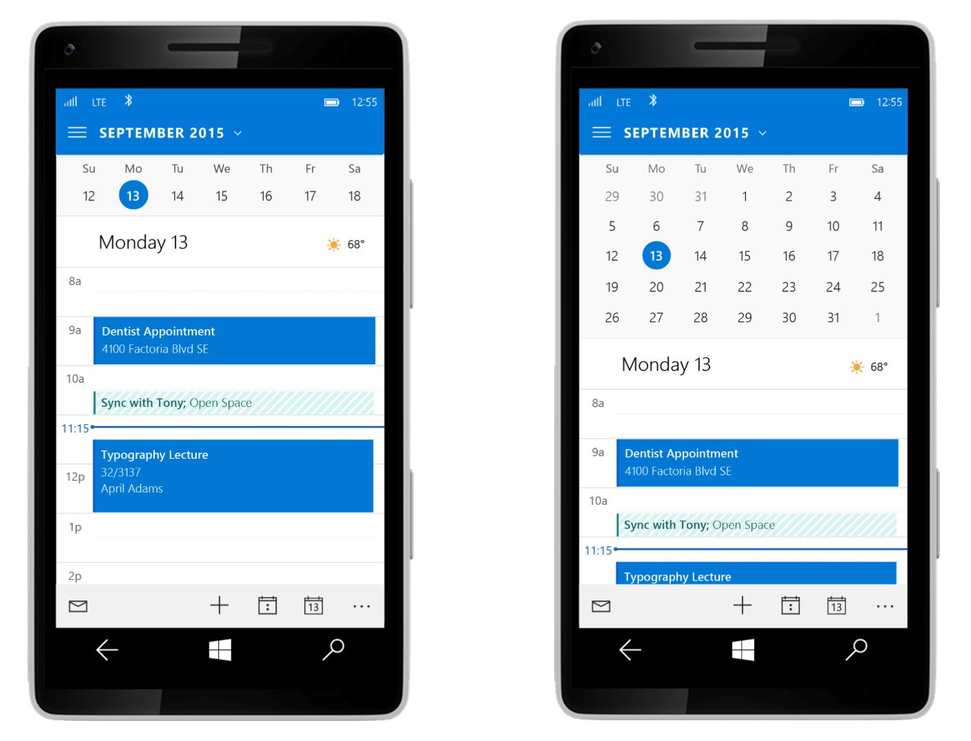

Microsoft has updated the Outlook Mobile app for Windows 10 Mobile with significant UI improvements.
The main feature appears to be bringing the action buttons to the bottom of the screen, with easy access to calendar, new mail, search, sync, and select and move, unread/read toggle. The icons now also features text-based tips, a major missing feature in the earlier betas.
The app now also features toggles for swipe actions, reading, signatures, notifications and when to mark an item as read.
The improvements are bringing the app a lot closer to the old Metro ideal, leaving us hoping that when the OS is finally released there will not be anything left to complain about.
Thanks Walt for the tip.
[via link=”http://www.windowscentral.com/outlook-app-windows-10-mobile-updated-design”]the WC[/via]





User forum
0 messages