Outlook 2016 Is Getting Darker On Windows
2 min. read
Published on
Read our disclosure page to find out how can you help MSPoweruser sustain the editorial team Read more
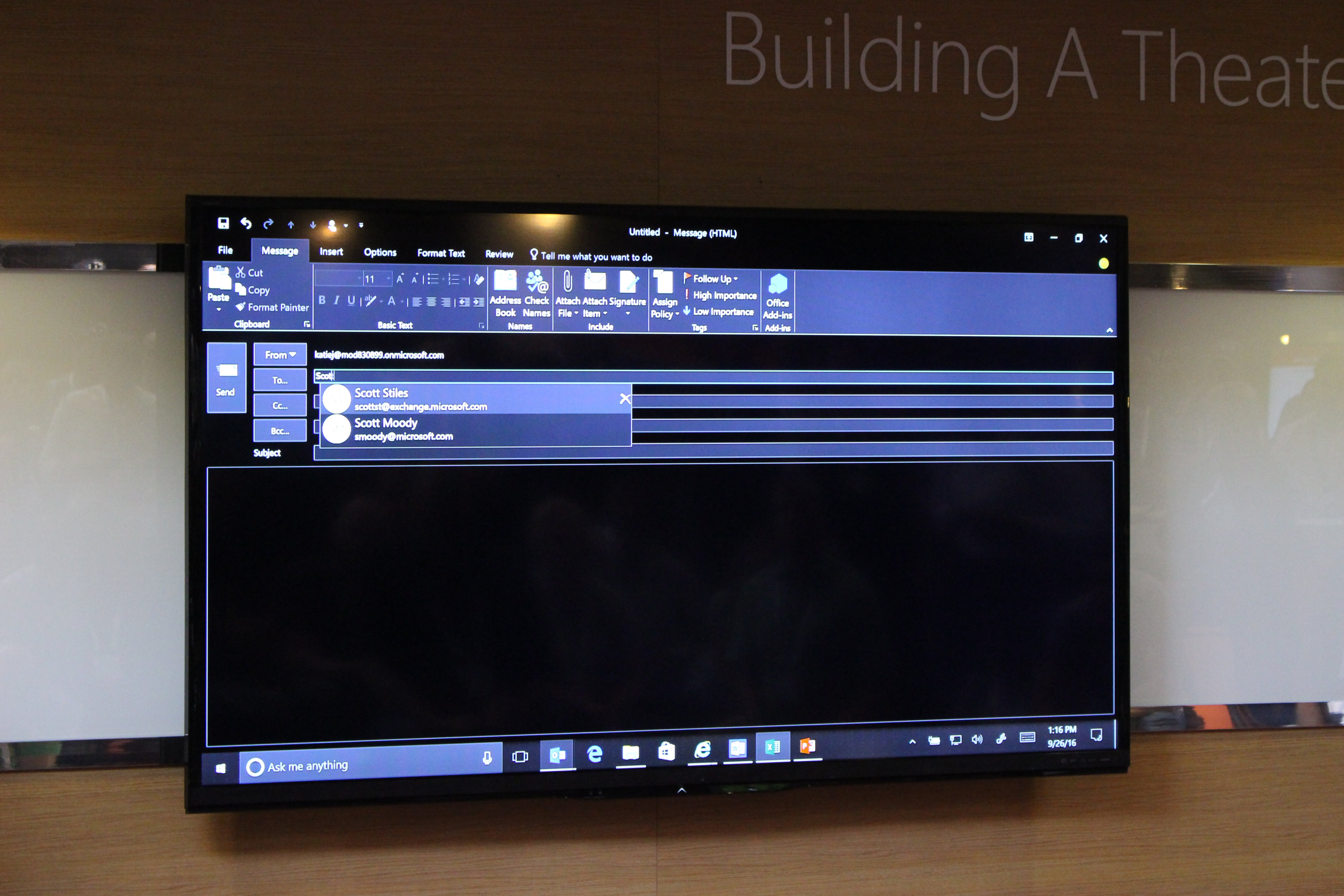
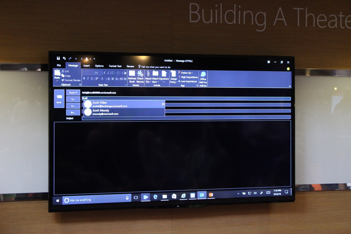
In addition to the announcements and revelations at the keynote and press-release events at Ignite this week, attendees had the chance to hear from project managers about some of the other things coming in their particular focus area. I was able to attend a session detailing the immediate and upcoming changes to the Outlook family of products.
At this current time, the Office 365 version of Outlook for the desktop includes the options for Colorful, Dark Grey, Black, and White. All but Black maintains the black text on a light background, and Black Theme obviously uses white text. (If you are unfamiliar with this option, here are a few screencaps to aid you in the change.)
As the number of UWP apps continue to grow, app developers are increasingly adding dark theme options in their products. Personally, I choose a dark theme whenever possible for three simple reasons. It is better for the eyes, it reduces power consumption, and it looks pretty cool (if you ask me).
Whether Microsoft is trying to follow the trend or just responding to feedback is difficult to determine.
In the current Black Theme, the email preview mode is still white, which can feel like a headlight blasting one in the eyes. This is now fixed. One obvious barrier to using a black background in an email, as that all the rich content may have problems inverting contrast. It has not been revealed how the Outlook team will work through this, but they did verbally confirm that the Black Theme will extend to the email preview pane in the coming months. The presenter stated that the feature will roll out to Office Insiders first (another source told me that Office Insiders could see it as early as next week), and move to general availability soon afterwards.
Do you use Outlook 2016, and if so, which theme do you prefer?






User forum
0 messages