Office Mobile 2010 - Review
3 min. read
Published on
Read our disclosure page to find out how can you help MSPoweruser sustain the editorial team Read more
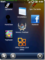
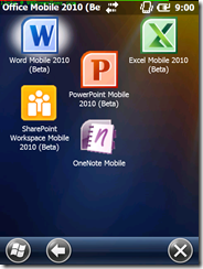
Office Mobile 2010 was fairly recently released as a beta on the Marketplace for Mobile. I’ve used it a bit, and as far as I can tell, it’s much the same. There are a few welcome changes, but the major new thing is SharePoint. Unfortunately, my school as SharePoint locked down so it’s not much use to me at the moment.
Word Mobile
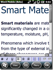
Word is probably the least changed of the lot, with very minor things like gesture support (flick scrolling etc present) and slightly better rendering of fonts and different font styles. The file above renders as just plain text without any change of colour for the “Smart Mate†title (it’s using the standard Office 2010 Desktop setup) under Office 2007 Mobile, and I’ve deliberately turned off the text reflowing that is set on by default.
Excel Mobile
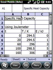
The main difference between 2010 and 2007 for Excel is the enlarged area at the top of the screen for entering a cell, and editing the data in that cell. It’s certainly a welcome change, but it’s hardly radical.
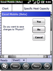
The warning dialogues on closing have also been updated, which makes it more finger friendly, though this could well be the OS build (23506) rather than anything else.
PowerPoint Mobile
PowerPoint has perhaps the most changes of the three, with much more fluid animations, faster load times, and gesture support for changing slide.
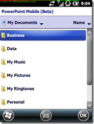
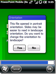
When you load PowerPoint, you’re greeted with a full file browser to find the presentation you want, rather than the crude and limited open file dialogue you get with Word and Excel. If you load a presentation in portrait, you also get told it’ll display better in landscape, and you get offered landscape mode instantly. After that, it simply shows the presentation you chose with no fuss.
Once the slideshow has loaded (which seemed much snappier) you can either swipe left->right to advance slides or animations (or right->left to go back) or tap on the slide to show the menu bars. This is a welcome change from the fiddly little arrows we used to have, and far more intuitive.
One of the softkeys is an option to zoom in on a slide, which gives you an interface similar to that of Pictures and Videos with a box you can drag round the screen.
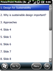
If sliding around the screen isn’t your thing, there’s always the ability to browse the slides in a list, and I guess this was in 2007, though I barely used it…
PowerPoint also supports a “presentation clicker†which I shall investigate further.
SharePoint
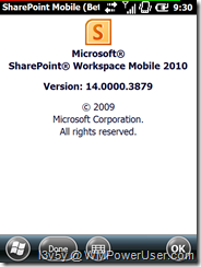
SharePoint is the only really “new†thing, but since I can’t access my schools SharePoint server, there’s not much I can do, until I pester the IT department.
And finally

The download is available from the US Marketplace, or use Microsoft tag (gettag.mobi).






User forum
0 messages