Gamers are extremely furious with the new Xbox Home screen
2 min. read
Published on
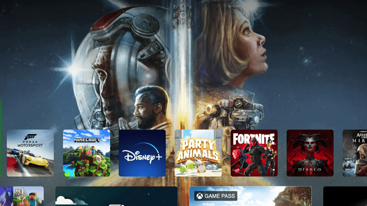
Microsoft, after infuriating gamers by killing Xbox Live Gold, just faced another controversy once again. The green console just launched a new Xbox Home Screen, and it’s safe to say that there has been quite a polarizing view on this one.
Now rolling out to all Xbox SeriesX/S and Xbox One consoles, the new Home screen actually does look fresh. The interface includes a convenient quick-access menu at the top of the screen, providing easy navigation to Library, Search, Settings, Xbox Game Pass, and other options. The background layout has also been simplified, with recently played games at the center.
Additionally, there is a feature allowing you to change your background to match the highlighted game, as well as curated game discovery and the ability to pin your favorite games, among other features. In the next week or two, the new Xbox Home screen is expected to be rolled out to all users eventually, as Microsoft is currently taking a gradual and slow approach to its release.
“This update is designed from player feedback and makes it easier to discover new games, rediscover games you already love, connect with communities, and create a more personalized experience,” says senior product manager Ivy Krislov.
Apparently, not everyone’s too happy about it. Insiders have also expressed their concerns about the new dashboard since its initial testing phase, but it appears that Microsoft is not paying much attention to their feedback.
In a post on Reddit, with almost 800 upvotes and 360 comments for now, one gamer complained that the “Most played games” tab is “unmovable” and contains games that they do not even own. Another gamer said that they would prefer for their custom groups to be at the top of the screen, rather than being buried further down.
“This wouldn’t be entirely horrible if it contained MY most played games but it doesn’t. It contains Xbox’s most played games, most of which I don’t even own. Generally I don’t mind the new Xbox Home Screen layout but I don’t feel like it’s much better either,” the post reads.
What are your thoughts on the new Xbox Home screen? Are you happy about it? Let us know in the comments!

User forum
2 messages