Using the new Microsoft Outlook? Microsoft is looking to make the app "easier to read and navigate"
2 min. read
Published on
Read our disclosure page to find out how can you help MSPoweruser sustain the editorial team Read more
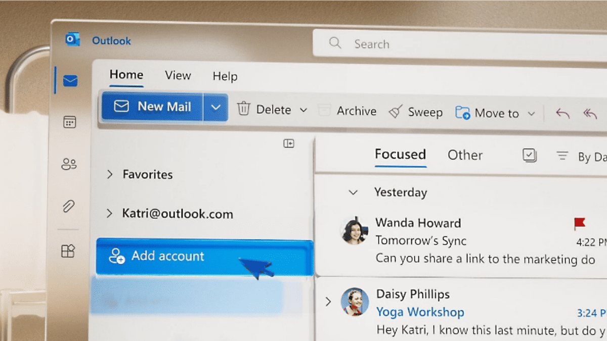
Microsoft is looking to revamp the user interface of its new Microsoft Outlook. The app, which already is 10x better than the good ol’ Outlook thanks to the new design & improved search, is apparently “undergoing some UI changes.”
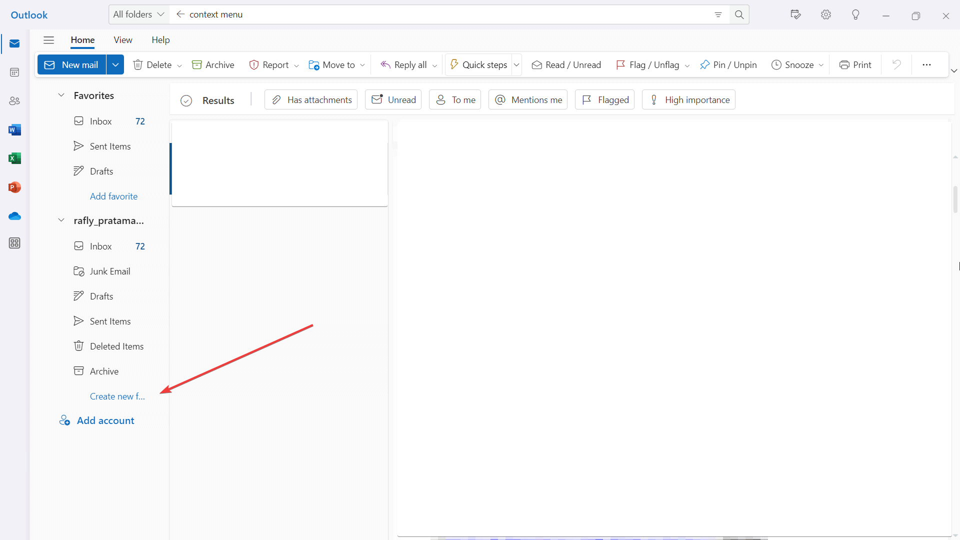
As we’ve first spotted in the Microsoft 365 Roadmap site, Microsoft says that they’re moving links to create new folders and search folder groups to the context menu. Besides that, you’ll also soon be able to right-click on the mailbox folder to craft a folder/subfolder and on search folders to make a new search folder.
 The context menu in the new Outlook is a pop-up menu that appears when you right-click on an item. It provides a list of actions that you can perform on the item. The items in the context menu will vary depending on the type of item you have right-clicked on. For now, here’s where the “Create new folder” link is located before the move becomes permanent.
The good news is you won’t need to wait for long for Microsoft to release this change. It’s been scheduled to be rolled out in September 2023 for the General Availability (GA) and Current Channel releases of Outlook.
In case you missed it, Microsoft also launched the latest version of its 365 productivity app to the Stable channel. The update, version 2308, brings security updates to Outlook as well as a new AutoFill feature on Excel and more.
Microsoft Outlook for desktops is available on Windows and macOS devices.




User forum
5 messages