Microsoft's Fluent Design System will evolve Windows 10 beautifully
5 min. read
Published on
Read our disclosure page to find out how can you help MSPoweruser sustain the editorial team Read more

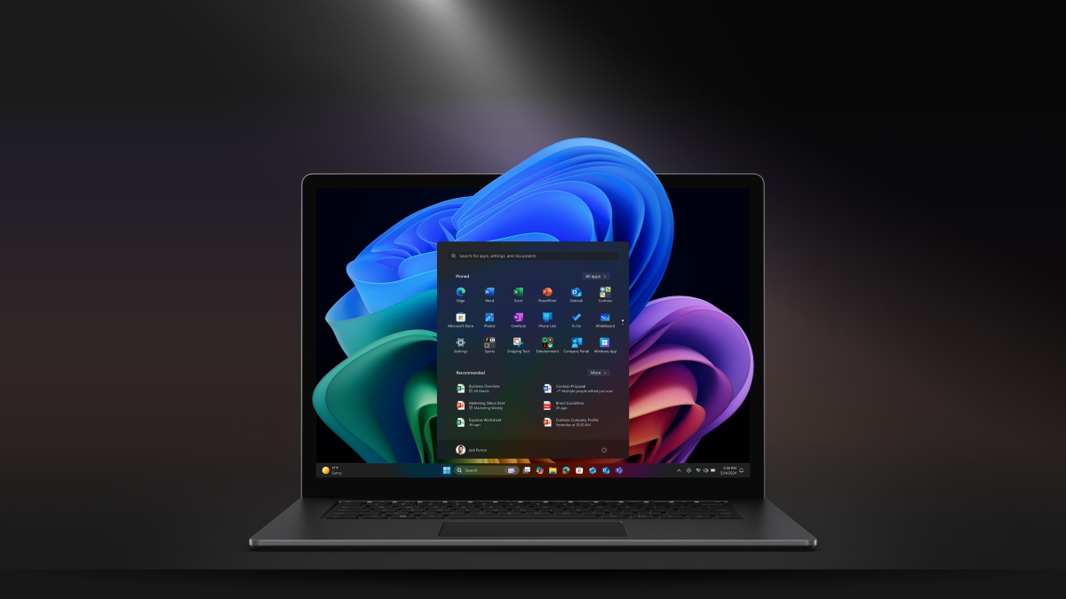
On Thursday, Microsoft introduced a brand new design language for its products. Redmond is calling it the new Fluent Design System, and it’ll be implemented across a lot of Microsoft products — starting with Windows 10 and all the hardware that runs the operating system, including the Xbox, HoloLens, PC, and phones. The Fluent Design System is built on 5 fundamental elements: Light, Depth, Motion, Material, and Scale.
In Windows 10, all of these elements work together to deliver an intuitive user-experience. Microsoft showed off a handful of concepts of the Fluent Design System in Windows 10, and they look absolutely gorgeous. Of course, concepts and the real deal are always drastically different from each other — but Microsoft is already delivering elements of the new Fluent Design System across some of the first-party apps in Windows 10 and these apps look really good now. If you are a Windows Insider, you can go try them out right now. Redmond has also released APIs for some of the key parts of the Fluent Design System, including the Acrylic material and the new Reveal experience. Windows 10 app developers can use these APIs to start revamping their existing apps with the new Fluent Design System, and designers can start designing Fluent Design System apps using the design kits. These new APIs will let developers build beautiful experiences powered by the Fluent Design System in Windows 10.
[shunno-quote align=”right”]The first wave of the Fluent Design System is already available to Windows Insiders[/shunno-quote]
In fact, most of the Windows 10 apps from Microsoft already utilize certain parts of the Fluent Design System, including apps like Groove Music, Microsoft Photos, Paint 3D, View 3D, Voice Recorder, and even the Calculator app. These apps are using all of the components of the first wave of the Fluent Design System — including things like the Acrylic Material, Reveal Highlight, Connected Animations, Conscious Controls, and Perspective Parallax. Microsoft dived deeper into the Fluent Design System in a session at Build 2017, where the company detailed what’s currently available and what’s next for the Fluent Design System. The company’s Paul Gusmorino and Bojana Ostojic showed off some of the apps that’ll be getting the new Fluent Design System sometime soon — including the Outlook Mail & Calendar apps, Microsoft Edge, Xbox, OneNote and the My People experience. The company even showed off how it’ll be implementing the Fluent Design System’s Reveal experience into the Start Menu in Windows 10. You can see some of those (potato quality) screenshots below.
At its core, the Fluent Design System isn’t all about the look and feel. Functionality is a substantial part of any design languages, and the Fluent Design System nails that with its building blocks. But I want to focus on the depth element that is a really huge part of the new design system. On PCs, the depth effect presents a layered user interface which you can see in the Windows Store concept above, and the Fluent Design System also offers a parallax effect that brings it all together.
[shunno-quote align=”left”]3D Depth Effect will look amazing in Windows Mixed Reality[/shunno-quote]
And when you move to a modern computer like the HoloLens, the depth effect really shines. Microsoft is currently experimenting with a 3D depth effect (z-depth-layering) that is immersive in Windows Mixed Reality. It isn’t clear when or whether this will actually ship in Windows 10, but it still looks fantastic. What this effectively means is that the Fluent Design System isn’t only built for the keyboard and mouse. Microsoft is designing the Fluent Design System so that it works across the diverse range of Windows 10 devices and inputs — including pen, gestures, gaze, and much more.
[shunno-quote align=”right”]Consistency will be key for the Fluent Design System[/shunno-quote]
Fluent Design is a journey for Microsoft and Windows 10. Don’t expect the design of Windows 10 to change radically with a single OS update at all — it’ll take its time to show up across the whole operating system, and that’s fine. But the Fluent Design System will only succeed if Microsoft manages to keep its design principles consistent across all apps in Windows 10. One of the biggest problems with the current Windows 10 design is the fact that it isn’t consistent at all — there are around 3-4 different designs for the context menu, first-party apps use different shades of background colors, and alignment of elements in apps is all over the place. Microsoft will need to do quite a lot of work to make sure its designers are implementing the Fluent Design System correctly across all of the first-party apps, but Redmond needs to figure out a way of making third-party devs to the same.
All of the Fluent Design concepts I’ve seen so far look infectiously beautiful. From the Windows Store concept to the new Xbox dashboard, all of the Fluent Design concepts are really gorgeous. Some of the functional elements also look and feel really nice as well. But as Microsoft advances the implementation of the Fluent Design System in Windows 10, it’ll need to make sure that the execution is perfect. The company has only added a touch of the new Fluent Design System to the apps in Windows 10, but the company still has a long way to go and implementing the new design system at the core of the Windows 10 (aka the shell) will take time. But that’s completely fine, and as long as the implementation is consistent across all apps and components of the Windows 10, the new Fluent Design System will be crucial for the future of Windows 10.
With the Windows 10 Fall Creators Update, Microsoft is shipping the first wave of the Fluent Design System. The company is currently experimenting with elements that’ll ship with the second wave — including the 3D depth effect you saw in the video above, along with things like 360 media playback, conscious headers, speech, and spatial sound.




User forum
0 messages