Microsoft video shows off new Fluent icons with fake Windows 10 Start Menu
![]() 1 min. read
1 min. read
![]() Updated on
Updated on
Share this article

Improve this guide
Read our disclosure page to find out how can you help MSPoweruser sustain the editorial team Read more
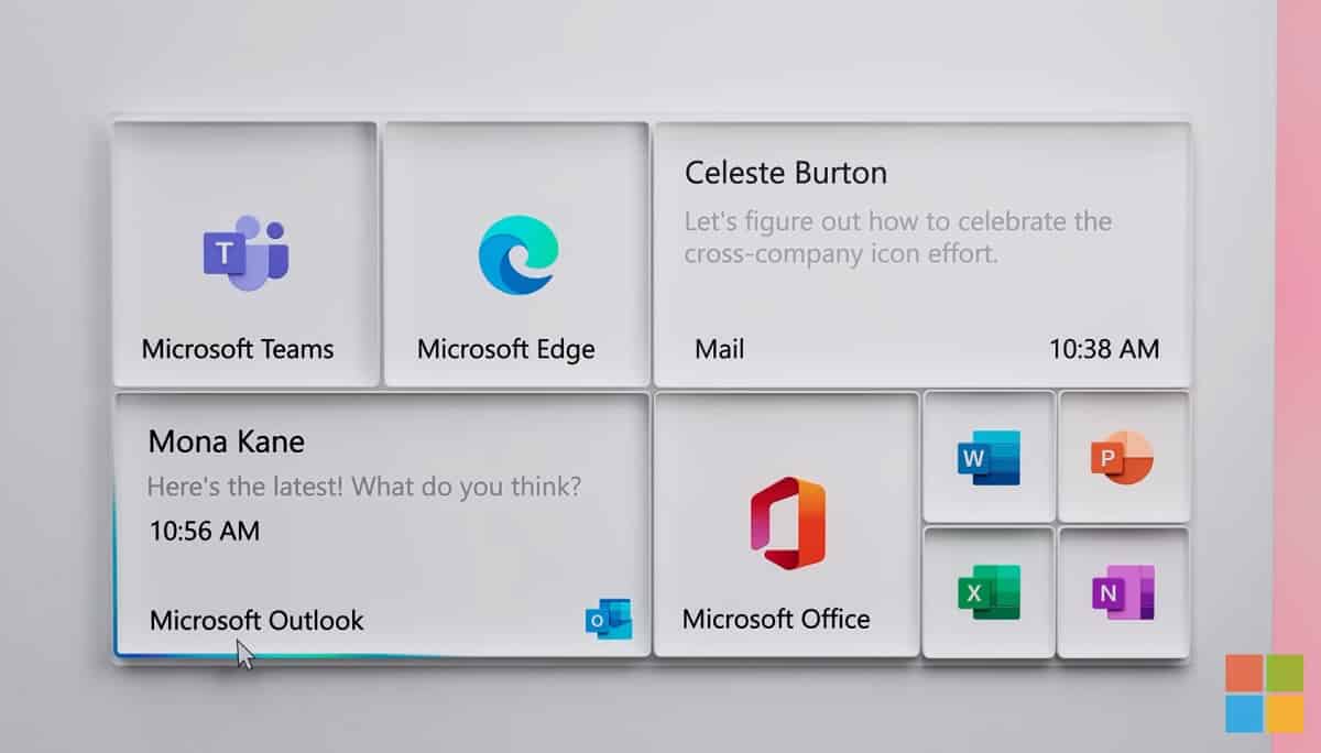
Microsoft’s design team has uploaded a new video of the redesigned icons in Windows 10, which replaces the old flat “modern” design.
Microsoft says their mission was to “create a beautiful, moving, coherent icon system” and that “the resulting One Microsoft icon design language is unique to Microsoft and reflects our brand personality.”
While the icons look OK, I wonder if your readers agree the Start Menu shown off in the animation looks 10 times better than even the new Windows 10 Start Menu,
Fake new Start Menu
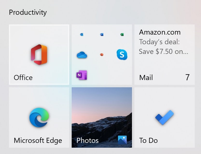
Actual new Start Menu
It seems the actual new Windows 10 Start Menu was not good enough to show off Microsoft’s amazing new icons.
I would suggest that instead of spending a year adding some gradients to the default icons the team should invest some time in bringing their glass tile vision for the chrome in Windows 10 to reality instead.
Do our readers agree? Let us know below.


User forum
0 messages