Microsoft Teams is getting a new and improved Dark Mode and icons
1 min. read
Updated on
Read our disclosure page to find out how can you help MSPoweruser sustain the editorial team Read more
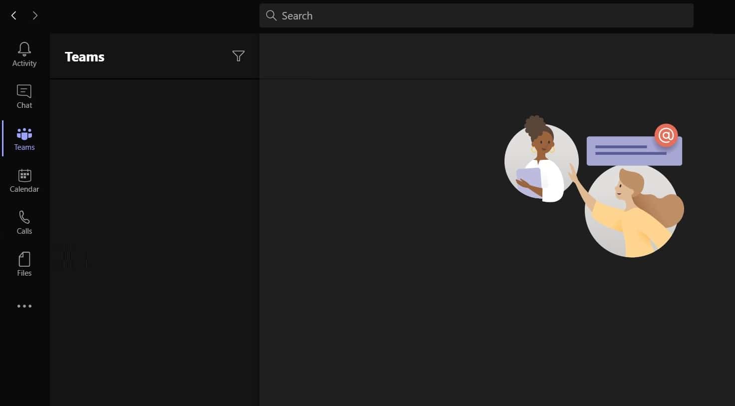
On the Microsoft 365 Admin Portal Microsoft has announced the roll-out of an upgraded Dark Mode for Microsoft Teams.
The new Dark Mode will cover more of the UI, an upgrade over the old version which still exposed some purple areas in the top menu and left side pane.
Microsoft is also launching a new range of icons for the client, designed to give it a more modern look.
The first phase of the rollout brings the following improvements:
- More rounded corners.
- Fluent Design.
- New drop shadows effect.
- New icons emphasizing rounded corners.
- New colours and styling.
The new design is already available to those in the Office 365 Public Preview and will roll out to regular users starting in mid-February. It will also start on Windows 10, and roll out to other platforms later.
via WindowsLatest





User forum
0 messages