Microsoft revamps the Outlook.com People experience
2 min. read
Updated on
Read our disclosure page to find out how can you help MSPoweruser sustain the editorial team Read more
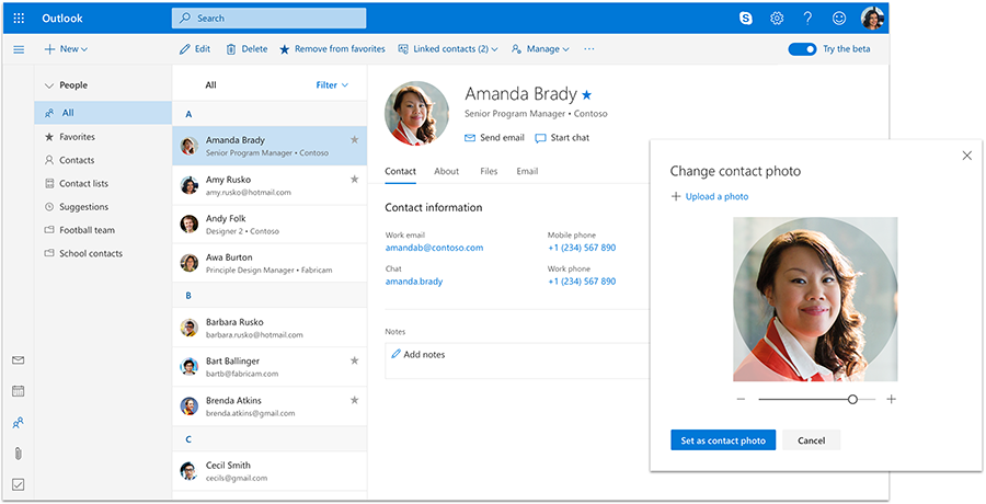

Microsoft is revamping Outlook.com’s People app to make it more modern.
First of all, the firm has completely changed the design of the People web-app, bringing it more in line with what it offers on the Mail and Calendar side of things.
Speaking of Mail and Calendar, Microsoft has improved the integration between People and Mail and Calendar. If you’re familiar with its Windows 10 apps, you should quickly get the hang of it.
Selecting a contact now shows a new profile card with the information you’ve filled in including a phone number, LinkedIn profile etc.
Should you have the contact on Skype as well, you’ll be able to launch right into a Skype chat from the people contact card, without leaving the Inbox itself. It’ll appear much like a Facebook Messenger chat does when on your newsfeed, and it is quite unintrusive.
Microsoft also now lets you manually add photos to contacts on the web-app, a feature that wasn’t offered before.
Like with the integration in the Mail and Calendar apps, users can also quickly send emails from the People view, as well as see all photos, conversations and attachments shared between you and another contact. Again, if you’re familiar right the Windows 10 app, this should be nothing new, but it’s nice to see Microsoft bringing it to the web.
You can learn more about Microsoft’s other updates to the Outlook web apps here.





User forum
0 messages