Microsoft adds new Pulse chart to the Power BI Visuals Gallery
![]() 1 min. read
1 min. read
![]() Published on
Published on
Share this article

Improve this guide
Read our disclosure page to find out how can you help MSPoweruser sustain the editorial team Read more
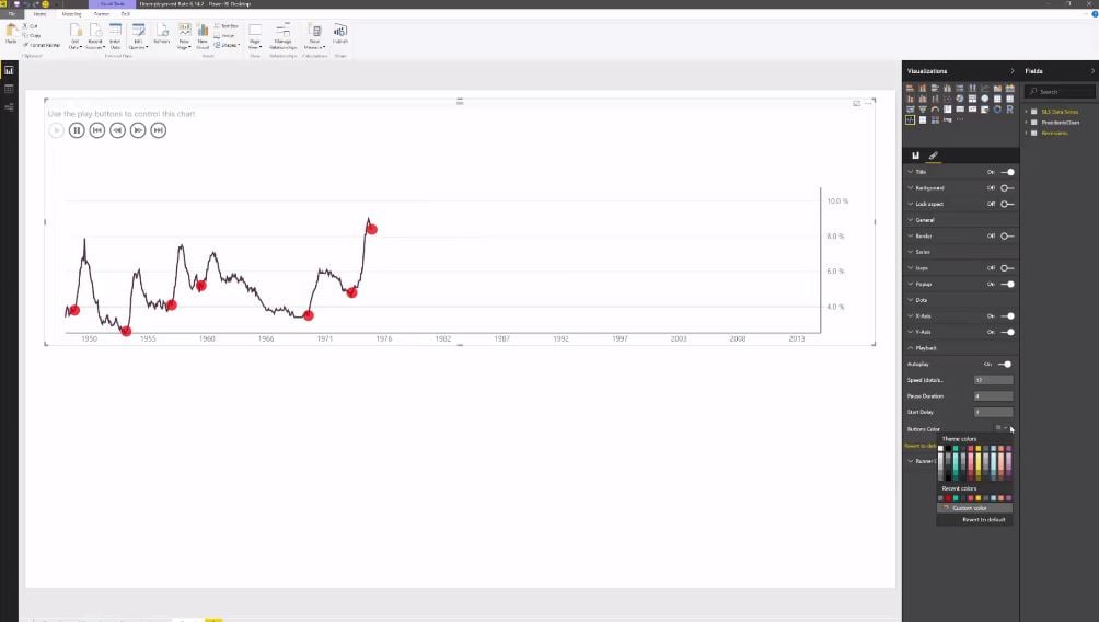
Microsoft recently added the new Pulse chart visualization to the Power BI Visuals Gallery. The Pulse chart shows key events on a timeline, and allows you play back the events to reveal insights. This new Pulse chart was inspired by Microsoft Pulse. The Pulse Chart also allows you to playback the data to see the trend unfold in front of your eyes. When an event appears, the playback pauses to filter the rest of the report, revealing hidden relationships.
Pulse chart shows a line chart annotated with key events. Each events can be selected to filter and cross highlight other visuals to reveal insights or help tell a story. Pulse chart supports animation so you can load your report and watch it play through key events, without user interaction. This visualization is perfect for story telling with data, especially the Power BI publish to web feature. Use it anywhere you need to draw attention to events that shaped a trend.


User forum
1 messages