Want to see Windows 11's mica effect on Chrome? We've got some good news
2 min. read
Published on
Read our disclosure page to find out how can you help MSPoweruser sustain the editorial team Read more
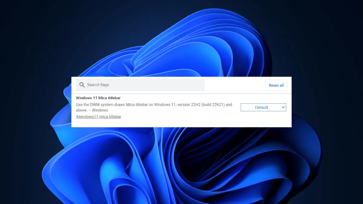
As Google gradually releases version 115 of Chrome to the stable channel for Windows, Mac, and Linux, one of the most highly anticipated features is the Mica effect on Chrome.
Despite the Mica effect being enabled by default since the May flight, it has been observed by Windows enthusiast @Leopeva64 that Chromium developers have chosen to conceal it behind a flag. The reason? Well, developers have reportedly expressed their dissatisfaction over the drastic power consumption while the mica effect is on.
https://twitter.com/Leopeva64/status/1660736764737204224?s=20
Mica material is a design technique that shines the desktop background colors through the body of the app with a semi-transparent blur effect (like a frosted window). In the case of Chrome, you can see the new material in the title bar.
At present, the visibility of the Mica effect in Chrome is limited to the default Chrome theme. However, there are plans to expand its visibility in the future.
You can open the Chrome flags page by typing “chrome://flags/” in the address bar and hitting Enter. Once you are on the flags page, scroll down until you find the “#windows11-mica-titlebar” flag. Click the dropdown menu next to the flag and select “Enable”. Then, relaunch Chrome. Please note that this flag is currently only available in the Beta version of Chrome. It is not yet available in the stable version of Chrome.
Have you ever tried the Mica effect on Chrome? How’s the experience? Let us know in the comments!



User forum
0 messages