Insiders rave about Windows 10's new "border-less" look
1 min. read
Published on
Read our disclosure page to find out how can you help MSPoweruser sustain the editorial team Read more
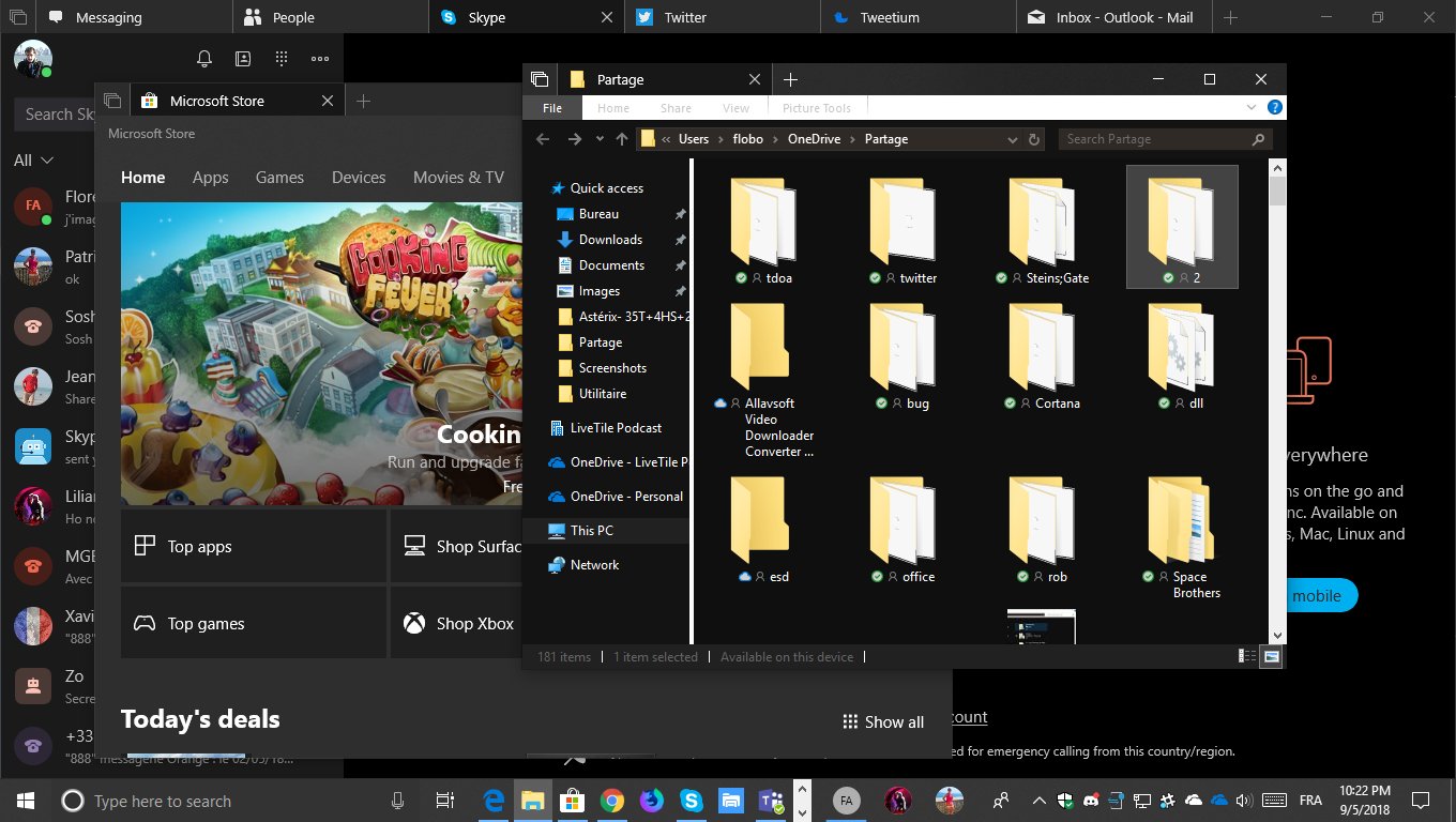
It’s only one pixel, but Windows 10 fans have been complaining for years now about the small border around windows in the OS, demanding it be eradicated completely.
In the latest Insider build of Windows 10 RS5 Microsoft appeared to do just that, resulting in many users rejoicing (and of course some complaining).
Windows are FULLY borderless on 17666. The last remaining 1 pixel border is gone !! Looks great. Il n'y a plus aucune bordure sur les fenetres windows sur 17666. C'est super joli ! pic.twitter.com/GeMnDM5u3X
— Florian (@flobo09) May 9, 2018
The truth is however somewhat more complicated. In Windows 10 Build 17666 Microsoft in fact merely made the border grey, which means it blends in better with the drop shadow, probably better illustrated in this screenshot below:

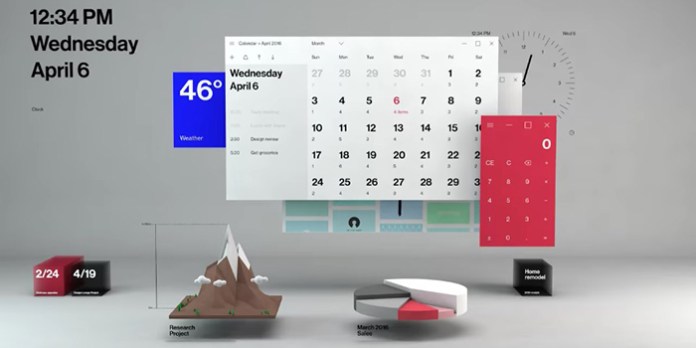
Microsoft is however not finished with innovating in this feature, and at Build 2018 discussed creating real depth-based 3D shadows which would give the OS some real rather than fake drop shadows.
Either way, it seems that if this minor UI feature has been bothering you, switching to the latest RS5 Insider build with a dark theme may make the itch finally go away.
Via Reddit.com









User forum
0 messages