Google tests ‘New Google.com’ page with new widget cards
2 min. read
Published on
Read our disclosure page to find out how can you help MSPoweruser sustain the editorial team Read more

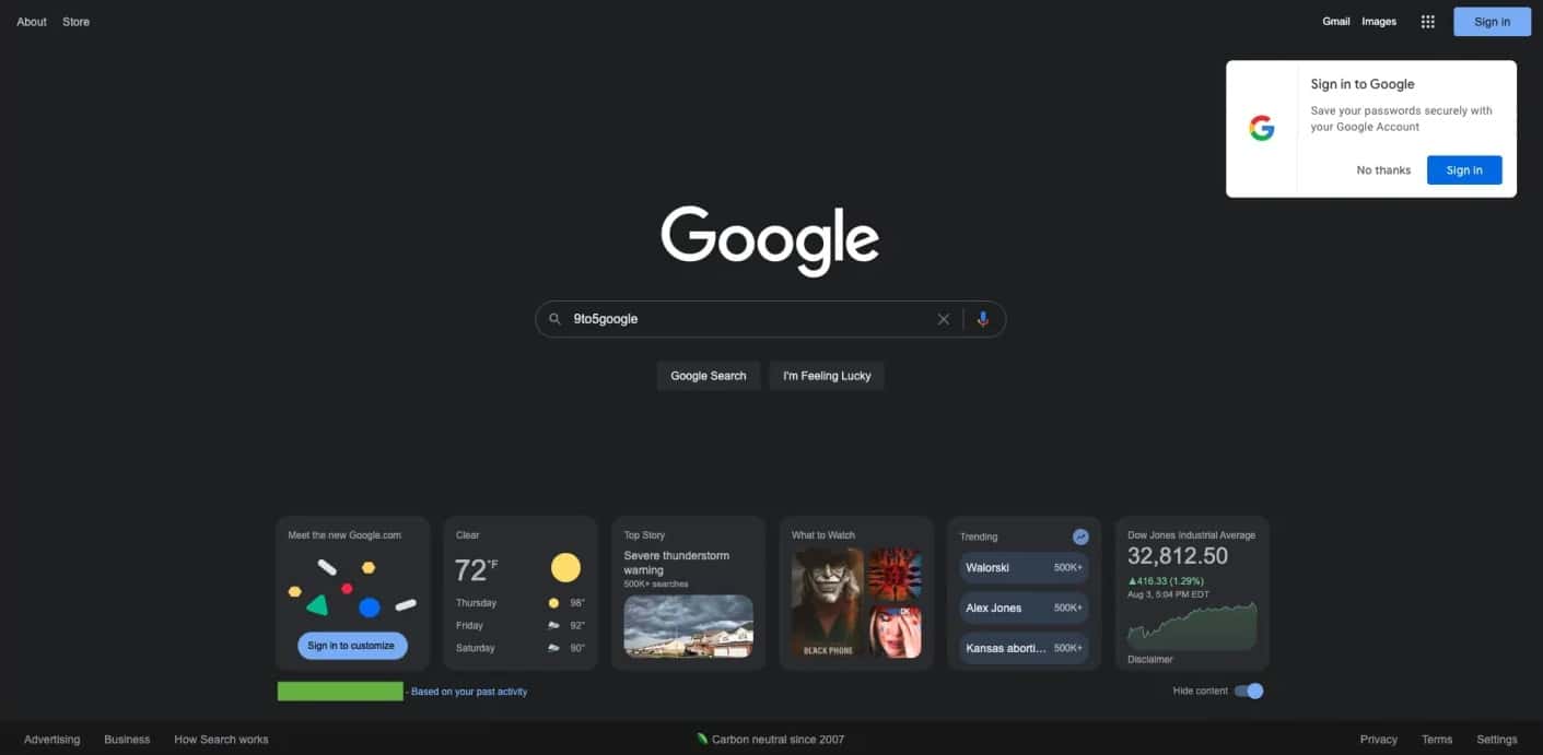
"Meet the new https://t.co/Dw4J4gNDnM"!! I cleared Chrome's browsing history (cache, cookies, everything) and when I logged in back to Google, I got this on its homepage.
I hope that this comes to @googlechrome's NTP.
CC @9to5Google @NexusBen #9to5Google #NewGoogle pic.twitter.com/FPD7J0O7Eh
— Sterling (@GreenShades9) August 1, 2022
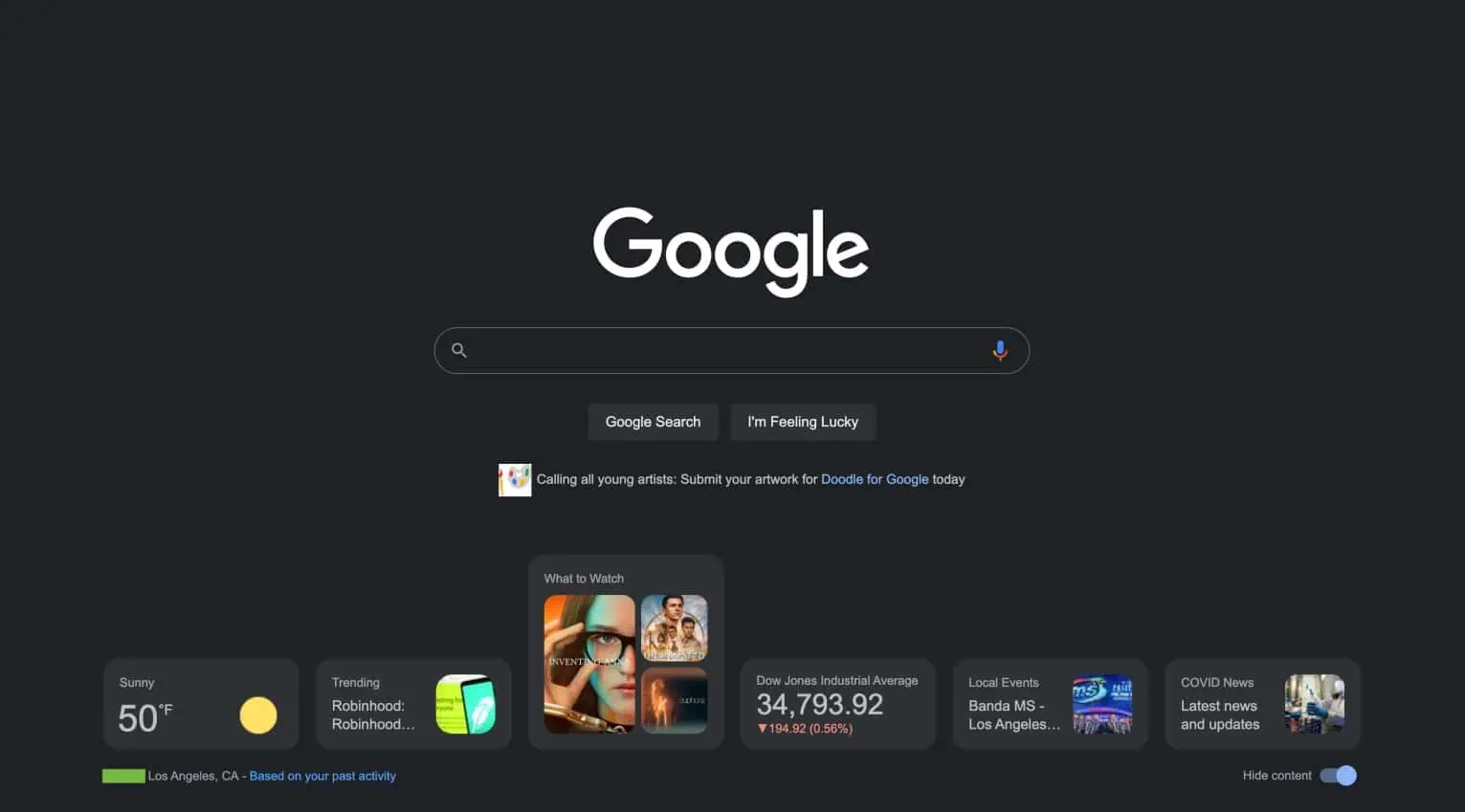
Recent reports show Google is testing a brand-new layout for its home Search page on desktop to a very limited number of users. The “new Google.com” is far from the conventional home page with a clean slate. Apart from the Search bar and the ever-changing doodle Google logo, there will be a set of five new cards containing relevant information for the user.
Upon entering the new page, you will be asked to “Sign in to customize” the page and “Make the space yours.” After that, another question will pop in, saying, “Hi, What are you interested in?” This should let you customize the page according to the widget cards you will choose. Currently, the test offers ten widgets to choose from, but you can only choose five. The choices include Events Nearby, Top Stories, Sports, Air Quality, Cryptocurrency, Stock Market, Your Top Stocks, What to Watch, Weather, and Trending Searches.
Once you have selected, the five cards are supposed to show the latest updates on specific topics of your choice. Some widgets maintain the minimalist theme Google is known for, allowing you to grasp some info with just a glance.
Back in February, Google tested the same feature to select users for a very limited time. However, instead of five square-shaped widget cards, Google previously designed the layout to show six rectangle ones that expand to square (the same appearance of the new cards now) via a hover action.



User forum
0 messages