Google Play gets new Compatibility section and bunch of design changes
4 min. read
Published on
Read our disclosure page to find out how can you help MSPoweruser sustain the editorial team Read more
This is a big week for Google Play after some of the updates it received in its user interface design. Apart from that, the Store is getting a rollout for a new section called “Compatibility for your active devices,” which indicates whether the app is compatible with your device or not.
According to 9To5Google, the new Compatibility section is seen on a few devices, so it is clear that a global rollout is not available at this time. For those who are already experiencing this update, it can be accessed by going to the bottom portion of the “About this app” section of an app listing.
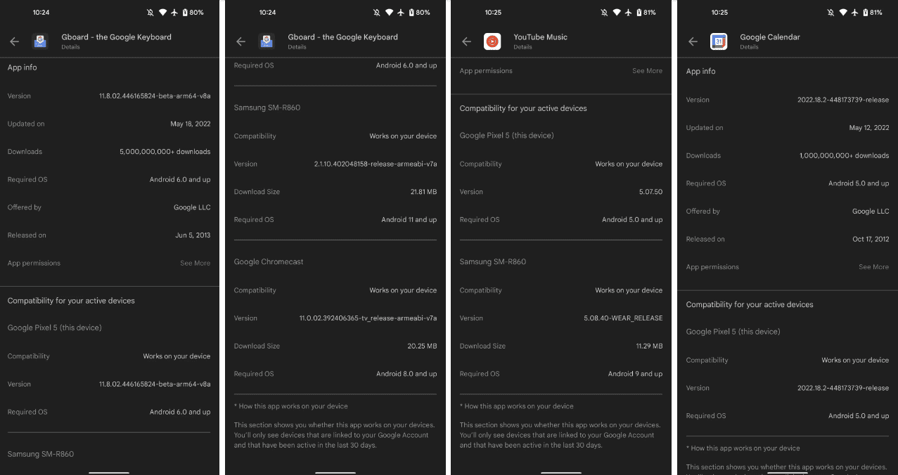
“This section shows you whether this app works on your devices,” the description reads. “You’ll only see devices that are linked to your Google Account and that have been active in the last 30 days.”
It is divided into smaller sections: phone, Wear OS watch, and Android/Google TV. Each sub-section provides information about the said devices, such as the device’s name, compatibility, version, download size, and required OS. With this, the information can be redundant, especially since there’s already the main “App info” section that generalizes the details given in the sub-sections. Nonetheless, viewing these smaller sections will help Play Store users have more relevant info related to a specific device. For instance, if they are concerned about the compatibility of a wearable device, they can simply visit the respective section for it. Unfortunately, these sub-sections don’t have dedicated labels indicating if they are for a phone, a wearable, or an Android/Google TV, though the names of the devices are shown.
Aside from the new Compatibility section, Play Store is being redesigned in big ways. There are lots of changes made. Here are some of the most notable changes we noticed:
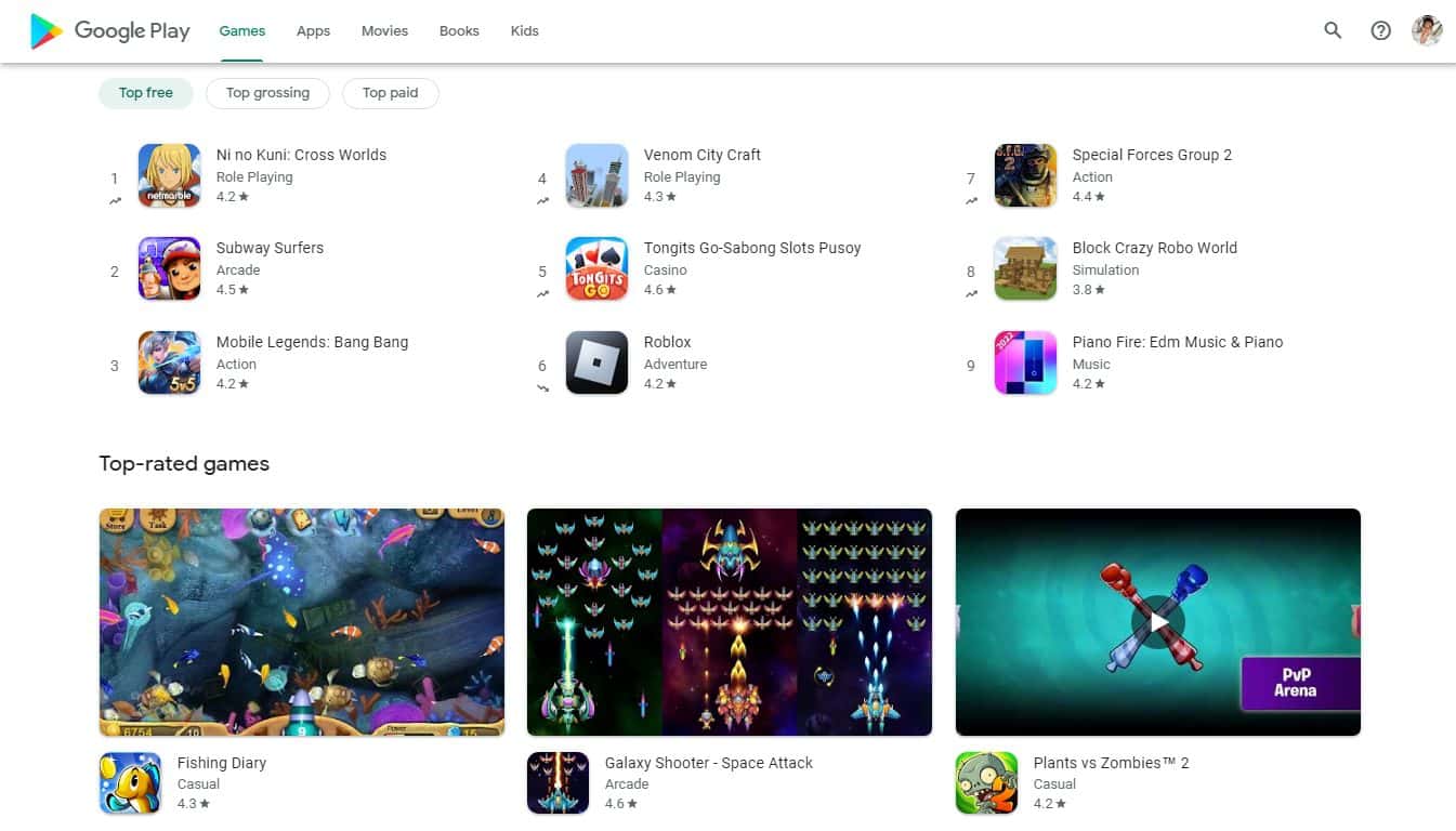
- Search is turned just to a simple little button placed at the upper-right section of the screen before the Help and your account avatar. The top bar is accessible on all pages/tabs.
- The Apps tabs view has filters for Phone, Tablet, TV, Chromebook, Watch, and Car. The Games tab lost the Watch and Car filters.
- The application previews are bigger.
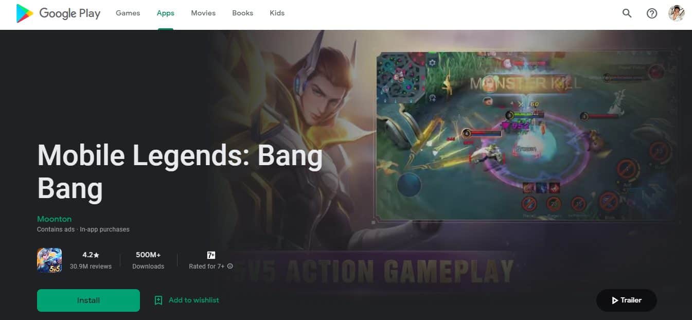
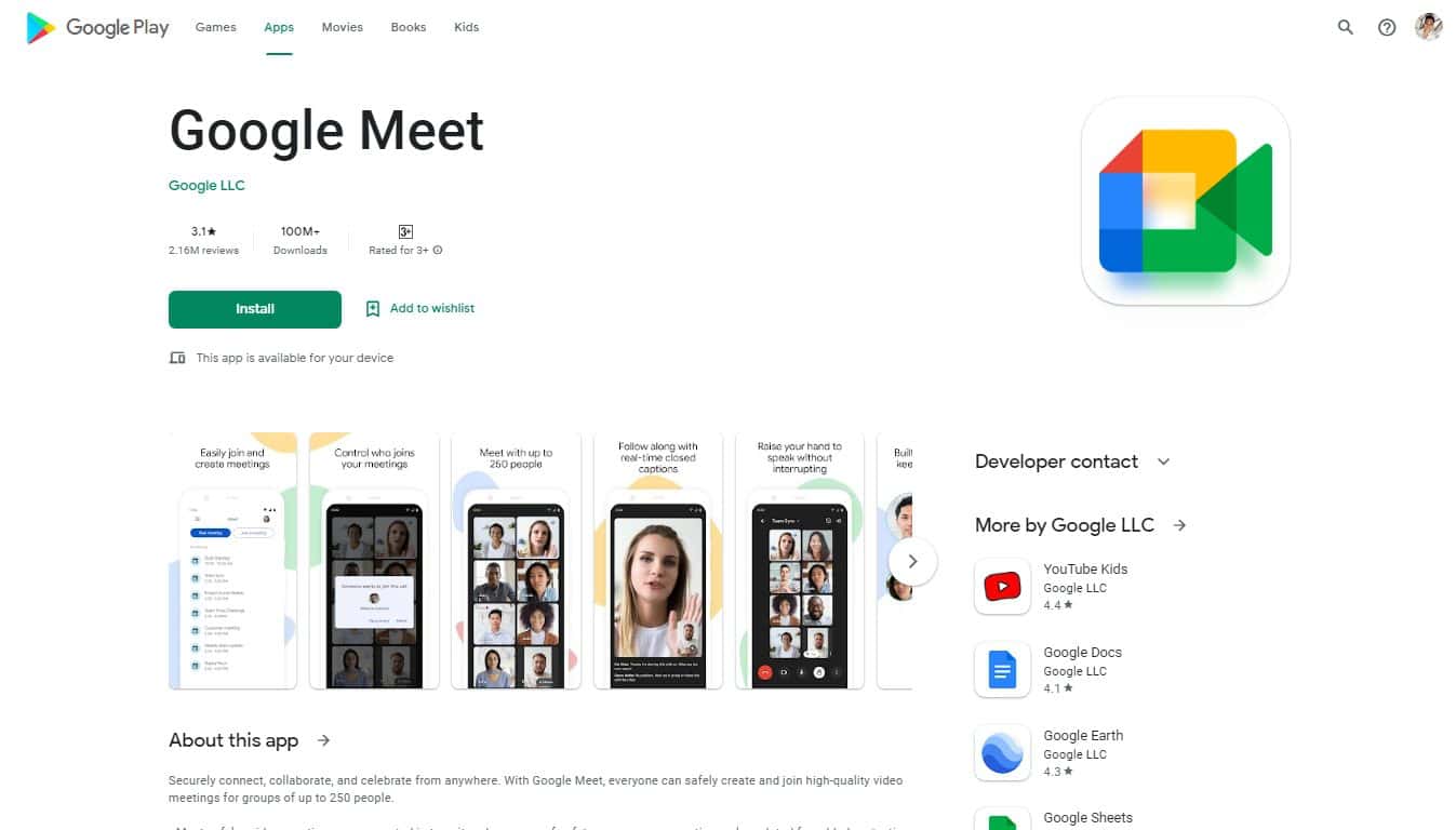
- The game app listing will show you a large section that plays preview videos of the games. It initially occupies almost the entirety of the screen until you scroll down. Included in this preview section is the big title of the game, and placed below are the reviews, downloads, and rating details of the app. At the bottom section of this area, you also get the Install and Add to wishlist buttons and the info if the app is available for your device.
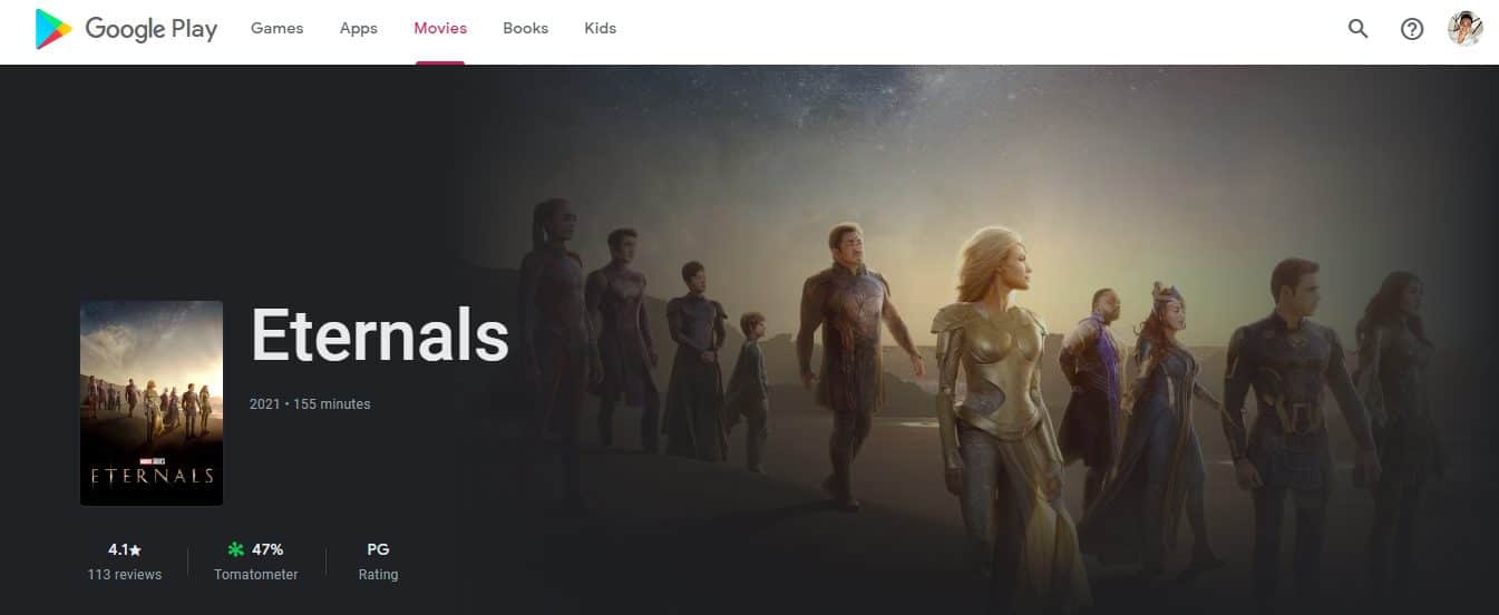
- Clicking movies in the Movies tab will also give you a big section. However, instead of playing a preview video, the big area is occupied by the movie poster (though there is a button for the video preview). Also in this visual section are the title of the movie, the reviews, the Tomatometer, rating, and buttons for buying or renting the movie.
- The listings show big app screenshots, while the side is used for other recommended apps and movies to download.
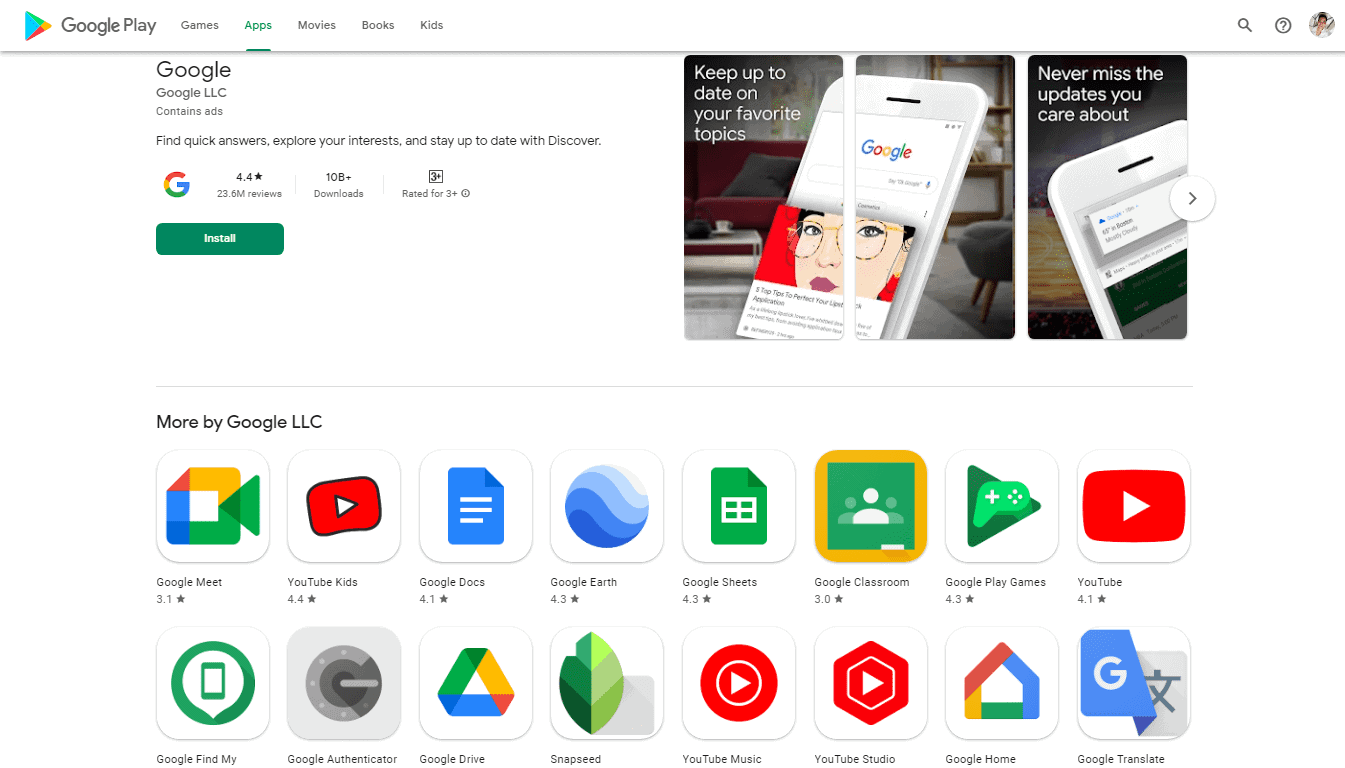
- The listings of social media apps and other types of apps just show icons and screenshots, together with their other details, such as reviews, downloads, and ratings.
- The developer’s page will instantly show you all the apps it is offering.
- The bottom bar on mobile Google Play is improved.
- Moving to a new tab will slide a bar indicator.
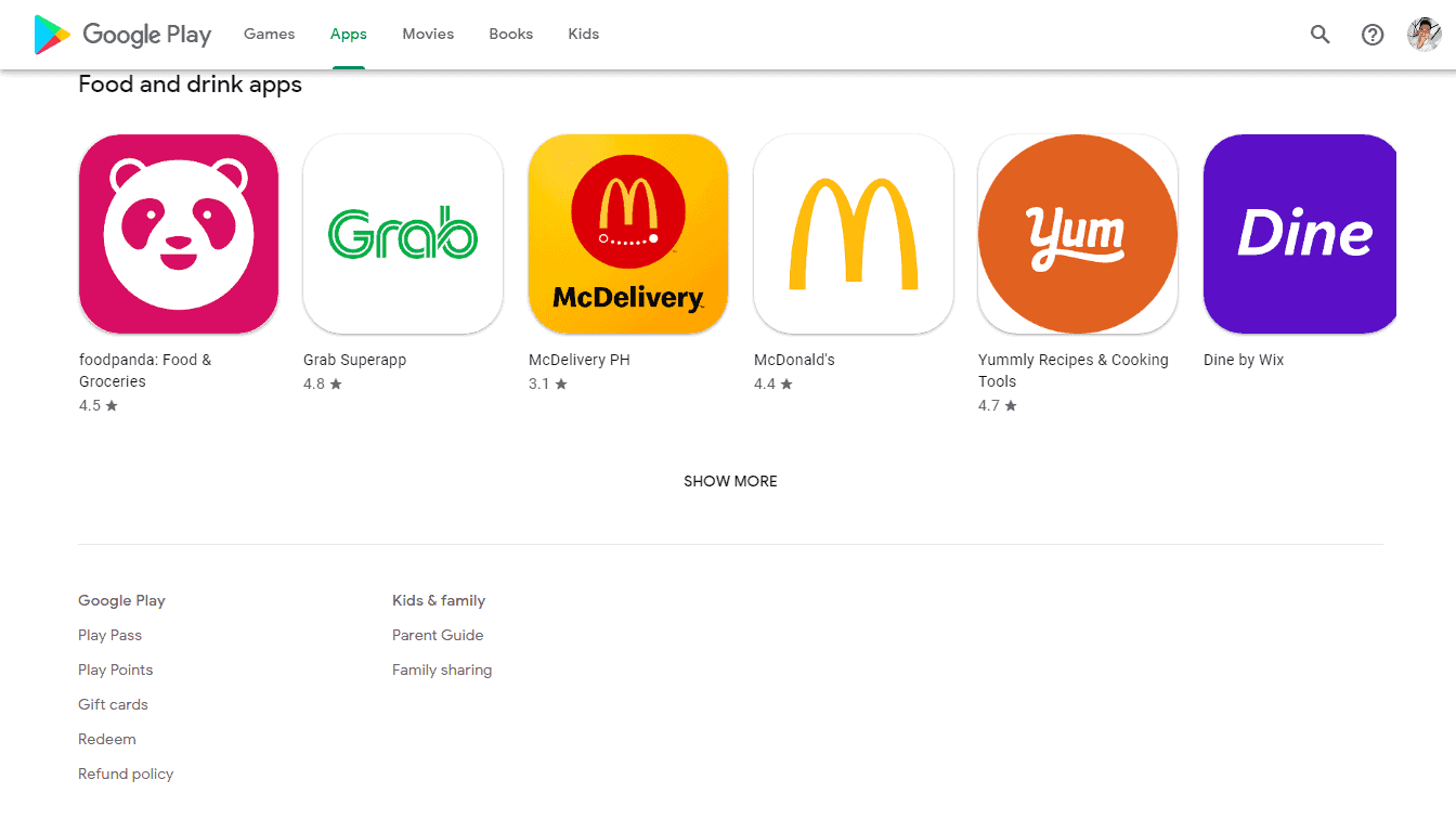
- You can now access the links for Play Pass, Play Points, Gift cards, Redeem, Refund policy, Parent Guide, and Family sharing at the bottom of the page.
- The Books tab that links to Your wishlist and Your library lets you access the old design still available.

User forum
0 messages