Google implements an uglier "Modern" Chrome Global Media Control
1 min. read
Published on
Read our disclosure page to find out how can you help MSPoweruser sustain the editorial team Read more
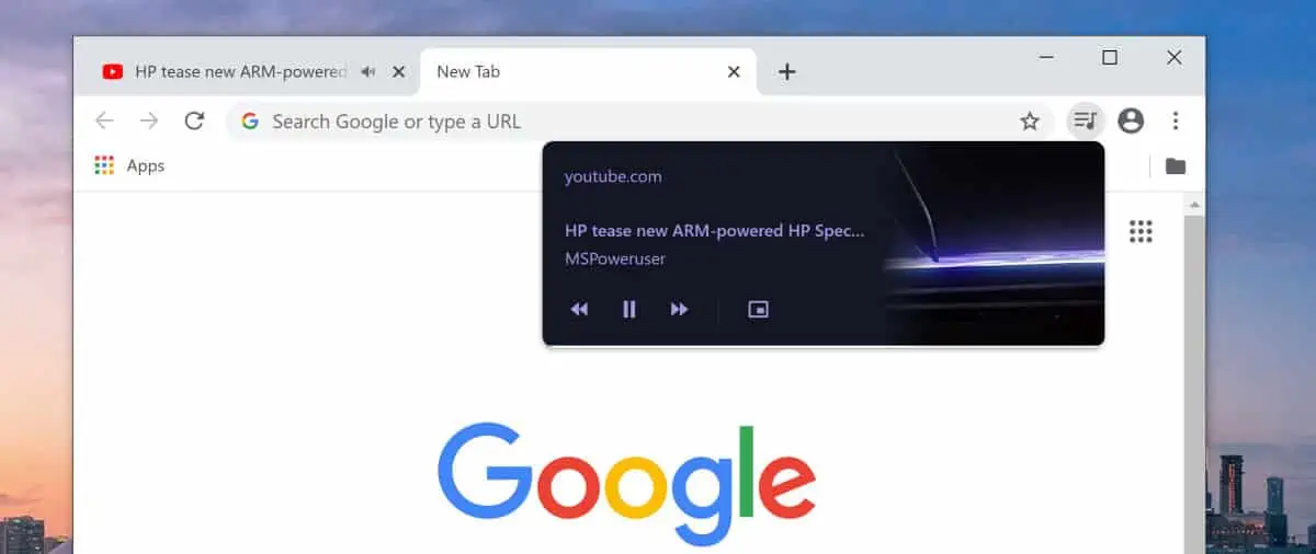
Google is working on a new UI for the Global Media Control in Chrome.
The GMC provides a single location to control the playback of media from any tabs in your browser, allowing you to pause, mute and pop them out in a new window.
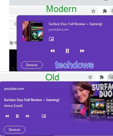
Google is working on a new version which looks a lot less polished than the current design, which Techdows managed to capture below:
The new design features a small, discrete thumbnail versus the attractive bleed version, and the controls are no longer in a single horizontal line, with the PiP button moved above the reverse button. The new design however appears somewhat more compact.
Google says “the change implements a newer version of Global Media Controls UI based on updated UI mocks.”
To activate the new look enable the “Global Media Controls Modern UI” flag in Chrome://flags in the latest canary version of Chrome 87. Note that this did not work for us, suggesting there is a lot more work to do.
Which version of the GMC do our readers like? Let us know below.




User forum
0 messages