Mozilla releases Firefox 89 update which brings a fresh look
2 min. read
Published on
Read our disclosure page to find out how can you help MSPoweruser sustain the editorial team Read more
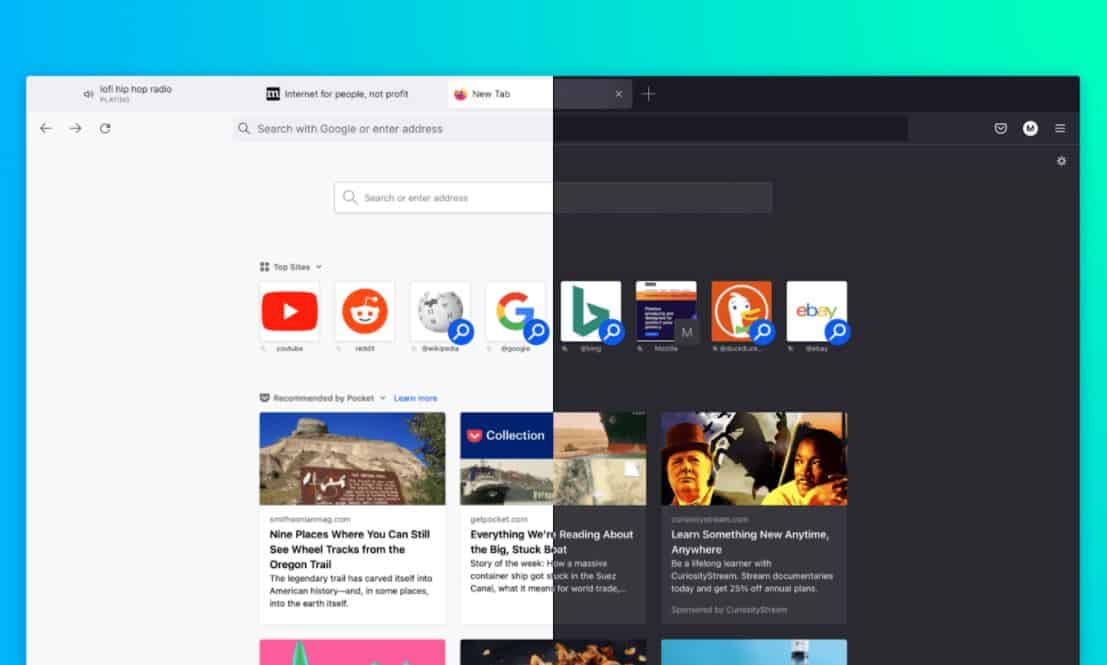
Mozilla today announced the release of Firefox 89 update which brings a fresh new look across platforms. This redesign of the Firefox features simplified toolbar and menus, updated tab design, and more. Find the details below.
- Simplified toolbar: The Firefox toolbar is where you type a URL, so it’s where the action starts. Our new toolbar is simplified so you get to the good stuff effortlessly. We removed visual clutter to focus on the most important navigation items.
- Streamlined menus: We consolidated extra menus to be more direct and intuitive. The streamlined menu puts priority actions quickly at your fingertips. We also reduced visual noise by removing unnecessary iconography and provided clearer labels.
- Inspired tab design: Floating tabs neatly contain information and offer cues only when you need them, like visual indicators for audio controls. The rounded design of the active tab signals the ability to easily grab and move tabs as needed.
- Updated prompts and fewer interruptions: We’ve removed unnecessary alerts and messages. Where we do have messaging, the design and language are clean and clear.
- Cohesive, calmer visuals: Throughout the new Firefox, you’ll quickly notice more consistent styling, lighter iconography, a refined color palette, and a more modern aesthetic for screens of all sizes — computers, phones and tablets.
Source: Firefox


User forum
0 messages