Developers: Please make me a better Windows Phone Podcasting app
3 min. read
Published on
Read our disclosure page to find out how can you help MSPoweruser sustain the editorial team Read more
After purchasing my 3rd podcasting app earlier this week and once again being sorely disappointed by the complete lack of usability of these apps I have decided to appeal directly to the developer community – Developers please build me a good podcasting app!
All three podcasting apps I have purchased so far seems to have been created by people who do not actually listen to podcasts. I am talking about apps like Podcatcher, Podcast Lounge and Podcast Pro!
Too many podcast apps seemed to be designed by people who want to show off how well they can show off “featured podcasts” and album art, when the main purpose of the app is simply to listen to the same list of episodes every week. Bizarrely with many podcasting apps it takes 3 taps to start a podcast playing! With some apps when you leave the app, it takes multiple swipes and taps to get back to the Now Playing screen.
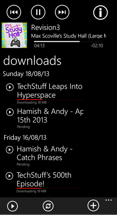
Instead of ranting at these specific developers directly I offer the above design as my idea of the perfect podcast application.The point of my design is to put frequently used functions front and centre, and rarely used functions out of the way.
The details are as follows, from top to bottom:
- A single page design – just because Metro offers panoramas does not mean you have to use it.
- The currently playing podcast at the top of the page, with play controls and a seek bar.
- Have the subtitle scroll constantly sideways so one can see the full title, including episode number, without going to another screen.
- Have an i information icon so, if people really wanted to, they could see the episode description and the other nonsense podcasters tend to add.
- Here’s an important bit – the ability to swipe anywhere on the screen to skip forward 30 seconds, or skip back 15 seconds. With audio ads now so common in podcast, and most podcasts being listened to while driving this feature is essential.
- Next, a list of downloaded podcast episodes, sorted by date of publication.
- One tap play of each episode, and when it finishes go on to the next most recent podcast on the page, not the next episode of the same podcast.
- In the menu bar, one tap play of the most recently downloaded episode if there is nothing currently playing, else resume playing the currently playing episode.
- A one button refresh button that will initiate the refresh of subscriptions and downloading of podcast episodes.
- A + button to add new podcasts by searching directories etc or adding a URL.
- More settings in the menu. In terms of storage management a simple setting that will delete podcasts 2 weeks after downloading.
I hope developers will stop their obsession with style and branding, and for once create a simple usability-focussed application.
Do our readers agree? Let us know below.

