A closer look at the new Windows 10 Start Menu, Start Screen and Taskbar
6 min. read
Updated on
Read our disclosure page to find out how can you help MSPoweruser sustain the editorial team Read more

The Start Menu/Screen and taskbar are the main entry point of a user into any version of Windows. From Windows 10 Mobile, on to Windows 10 Professional, users are encouraged to “start” from the Start menu.
With every iteration of the Windows operating system, Microsoft has made minor tweaks and improvements that change the way we use the Start Menu and taskbar – even if just subtly.
Microsoft’s update to Windows 10 coming in this week does more than add a little spice to the start screen. The firm has revamped the taskbar to add more features which take advantage of the way users use their devices, as well as expanding the feature set available to universal Windows apps. In Windows 10 version 1607, the Start Screen/Menu and taskbar all improved, and we’re taking a look at the improvements here.
Taskbar

To start with, we’re going with the taskbar. if you’re a Windows 10 user on a traditional PC or laptop the taskbar is one of the most important parts of the user interface you’ll ever experience. It houses your apps, your documents, and your entry point Action Centre. From there, you can switch apps, toggle Wi-Fi, off and on, view notifications and more.
Previously in Windows 10, while you could pin apps to the taskbar and receive notifications from those apps, there was no way of viewing app notification counts directly on the pinned apps without opening the Start Menu or Action Center. Now, on the Windows 10 Anniversary Update, apps can display notifications right on the taskbar, alerting you to which apps need your attention at a glance, the usefulness of this is obvious, should you be using the Chrome to use the internet and watch cat videos on YouTube, then when you get an important message on Messenger or via Email or whatever, you’d notice it straight on the taskbar.
While the Action Centre is useful as an aggregation of notifications, just like apps on iOS and Windows phone have app badges for at a glance information, so does the Windows taskbar now. If you’re not into it, you can turn this off in the settings like many things on Windows, so it’s not exactly being forced upon you.
Microsoft’s also changed the notification icon on the taskbar to now indicate which app is offering you a notification as it comes in. For instance, an icon of the email app would temperately flash over the Action Centre icon and display over the icon that normally shows.
What this does is to help you know whether to choose or not to prioritise whether you open the Action Center or not, and that’s pretty much a good thing.
Start Menu
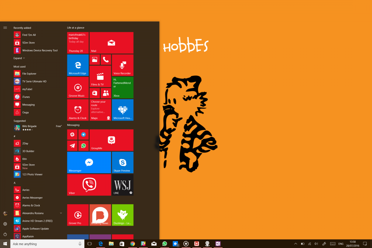
The Start Menu is the is the Windows home page, it’s where apps and services live and it’s the home base of any Windows user’s operations. Microsoft made a drastic change to the Window start menu in Windows 10, prompting an intense backlash against their new user interface from desktop and laptop users. In the Windows 10 Anniversary Update, Microsoft has made some changes to the start menu for desktop users to make it more user-friendly for mice and keyboards. First, the all apps list is now front and centre in the start menu. This mesa that once you open the start menu, you can now start scrolling down towards your apps and files without the need to open another menu. The recently added and most used app screens still remain, as do the suggested app screen, but you’re able to disable this all from settings like most of the things in Windows 10
First of all, the all apps list is now front and centre in the start menu. This mans that once you open the start menu, you can now start scrolling down towards your apps and files without the need to open another menu. The recently added and most used app screens still remain, as do the suggested app screen, but you’re able to disable this all from settings like most of the things in Windows 10
Start Screen

For Windows 10 Tablet users like me, the Start Screen is just as important – perhaps even more so – than the Start menu. In Windows 8, while Microsoft had completely eviscerated the start menu’s usefulness for keyboard and mouse users with a new full-screen Start Screen and app list. For tablet users, the new start screen was a godsend, improving the usability of Windows on tablets and enabling Microsoft’s Surface and similar.
As a Microsoft Surface user, small details like the App List on Windows 8 made the Start Screen on Windows 8 and Windows 8.1 useful to me, especially when considering its neutered nature for keyboard and mouse users. With the new Start Menu for Windows 10, Microsoft improved the usability for Keyboard and Mouse users, arguably still their bread and butter. However, with these improvements came a diminishing for tablet and Surface users, while there was a shiny new Start Screen, the new Start Screen lacked the full-screen app list as well as the multi-select option for tablet users, making it less user-friendly.
Now, the Start Screen has picked up some more usefulness for tablet users. Now there’s full-screen app list for users who prefer the app list functionality from Windows 8 and a hamburger menu for quick switching between the pinned tiles area and the app list.

That’s pretty much all the changes Microsoft’s made to the Start screen, Start Menu and the taskbae in the new update. For desktop users, the taskbar has seen an increase in usability – especially if one uses the pinned apps feature a lot anr rely on app notifications.
For users of tablets, there’s something to be said about the new app list feature compared to the old one – especially if you’re coming from Windows 8 and Windows 8.1
There’s less pressure to pin all apps to the start screen, and it feels like Android and Windows Phone’s full-screen app list/drawer. Now if Microsoft could get around to adding folders in the Start Screen, it may become attractive to more mainstream users.


User forum
16 messages