Chrome for Android Is Testing a Split-Screen Style Settings Page
A new multi-column view keeps the main menu on the left and details on the right, giving Chrome’s settings a cleaner, tablet-like look.
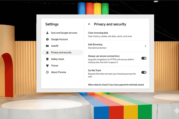
While Google is working on taking new tab page customization in Chrome for Android to another level, it’s also preparing a major redesign of the settings page. Instead of today’s long, single list you scroll through, the new layout introduces a two-column view that feels more like what you’d see on a tablet or desktop.
Multi-Column Settings in Chrome for Android
The change is currently hidden behind a flag in Chrome Canary. In this setup, the main menu stays on the left, while details for each option appear on the right. That makes it much faster to move between different settings without constantly going back and forth.

Google is also testing another under-the-hood update called SingleActivity mode. Currently, each settings page is stacked as a new layer, but with SingleActivity, Chrome reuses the same page and swaps the content inside it. This should make navigation smoother and less clunky.

The experimental flag that reuses the same page instead of stacking new layers when navigating through Chrome’s settings. Image Credit: Venkat |MSPU
While the two-column approach is clearly designed with larger screens in mind, it could also make the settings page feel more organized on regular phones. Together, these changes point to Google’s effort to give Chrome a cleaner, more modern look and make navigating settings easier for everyone.
Apart from this, Google is making Chrome PWAs on Android feel more native with Window Control Overlay support and is also adding a built-in grammar check feature.
Additionally, Chrome will soon support importing data from other mobile browsers and allow bypassing APK download warnings.
Read our disclosure page to find out how can you help MSPoweruser sustain the editorial team Read more


Improve this guide
User forum
0 messages