Bing is testing an improved homepage for its website
2 min. read
Published on
Read our disclosure page to find out how can you help MSPoweruser sustain the editorial team Read more

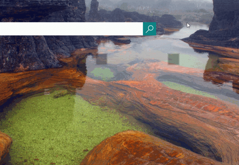
Microsoft’s search engine, Bing, has just begun testing a new homepage design with some users. In previous designs, there was a bar with headlines and things related to your interests on the bottom of the screen. There was a button on the bottom left which toggled if those headlines showed up at all. Now, however, the news and the recent Bing homepage images, which are new to the homepage but can be found elsewhere on Bing, are found by scrolling down.
As mentioned above, the button which used to show the news now simply shows headlines. However, in the case of some of your interests, it simply shows their title.
This design is fairly interesting as it doesn’t feel like a design for Windows 10. The section with recent homepage images looks a lot like the Windows 8 start screen, and that isn’t exactly a bad thing. It’s not the most consistent with Microsoft’s other services, but it still looks nice and feels good to use. Aside from the headline button (which failed to do anything multiple times), it’s all easy to figure out, too.
While we aren’t sure if this is available outside of the United States, it isn’t available completely within it, either. After trying on multiple accounts and browsers, this only appeared while using Firefox on a single account. If all goes well the design will likely be pushed live, although it might be with some changes.
Do you have this new design? Are you outside of the United States, and did you use a browser other than Firefox?




User forum
22 messages