Apple redesigns the Microsoft Windows logo
![]() 1 min. read
1 min. read
![]() Updated on
Updated on
Share this article

Improve this guide
Read our disclosure page to find out how can you help MSPoweruser sustain the editorial team Read more

Steve Jobs famously accused Microsoft of not having any taste, and it must have been annoying to follow Microsoft when the company led the move towards a more flat and stylish UI.
Stretching back to the first Apple GUI, the company always had its roots in skeuomorphic user interfaces, and as can be seen with the layers and transparency effects in iOS 7 and above the company could never really let go of that heritage.
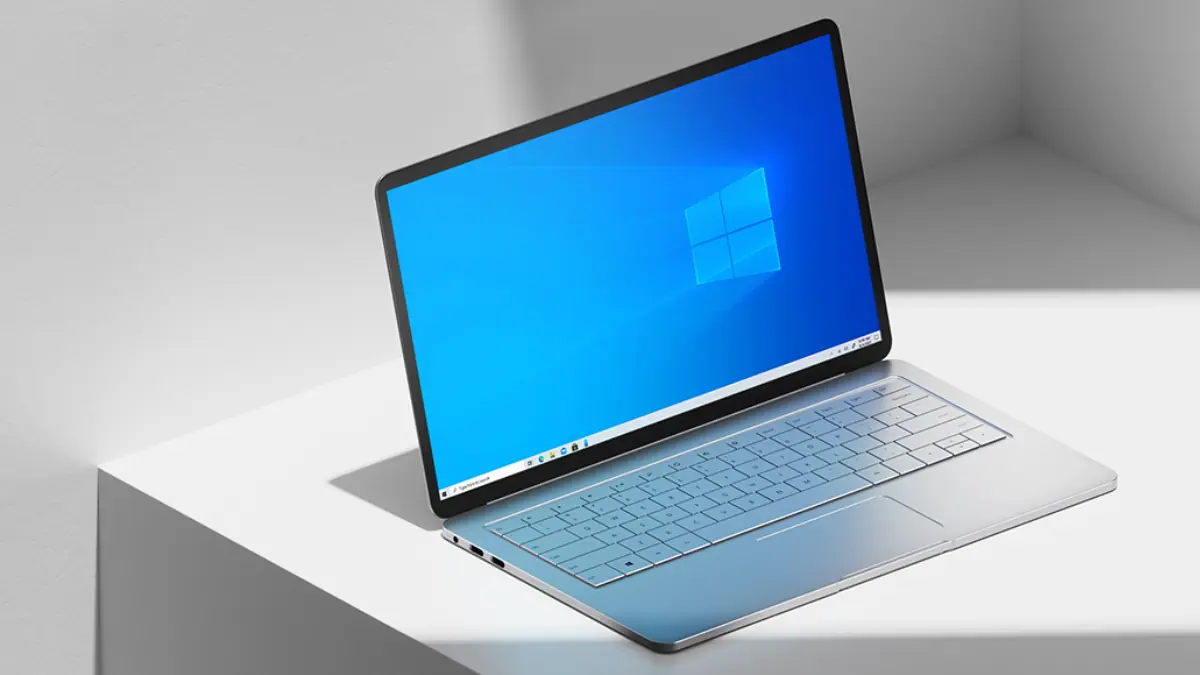
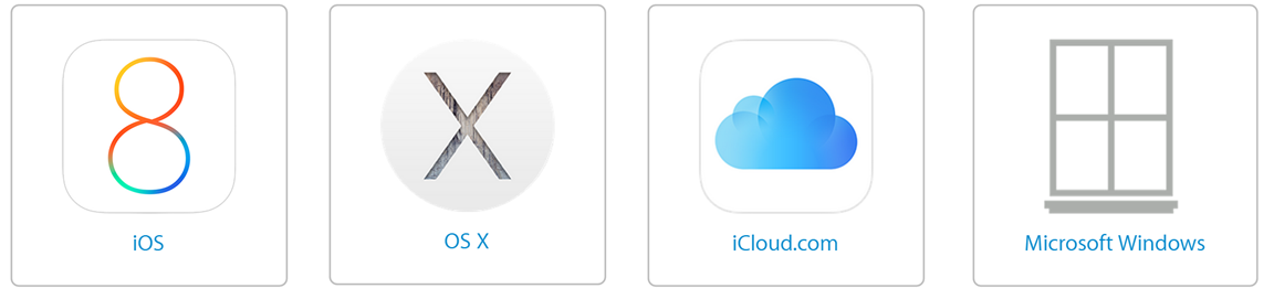
In fact Apple has been so caught up in their own version of flat that it seems the company has decided to do Microsoft a favour by redesigning the Windows logo to make it blindingly obvious we are in fact talking about a Window. I fact I suspect even a blind person would not miss the allusion.

Which version of the logo do our readers prefer? Let us know below.
[via link=”http://tech2.hu/a-microsofton-trollkodik-az-apple-0266231″]Tech2.hu[/via]