Another new Windows Phone Home Screen concept
1 min. read
Published on
Read our disclosure page to find out how can you help MSPoweruser sustain the editorial team Read more
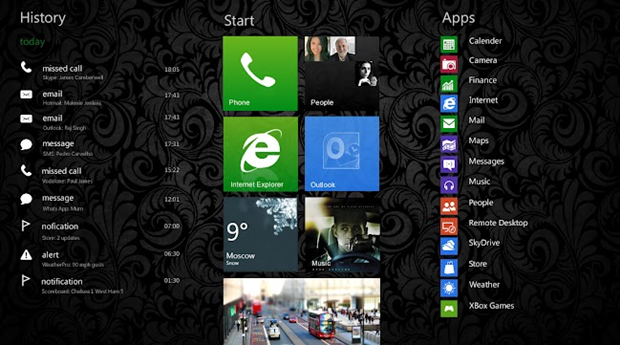
Kasser has sent us this picture of his concept of what a future Windows Phone Home screen would look like, utilizing a swipe to the left to add a notification page, and of course adding background wallpaper.
While his design is certainly very attractive, I think it misses the original idea of Windows Phone – that the tiles would allow more information-rich glance and go-type notifications, and that the OS is meant to be “quietâ€, not bombarding the user with long lists of events.
In that spirit the use of the left side of the Home page is a bit unclear, and one can question if there is even a need to utilize the space for anything at all.
What do our readers think? If that space should be used, what best to fill it with? Let us know below.
Thanks Kasser for the tip.





User forum
0 messages