Android in 3D looks incredibly friendly with the new brand design
2 min. read
Published on
Read our disclosure page to find out how can you help MSPoweruser sustain the editorial team Read more
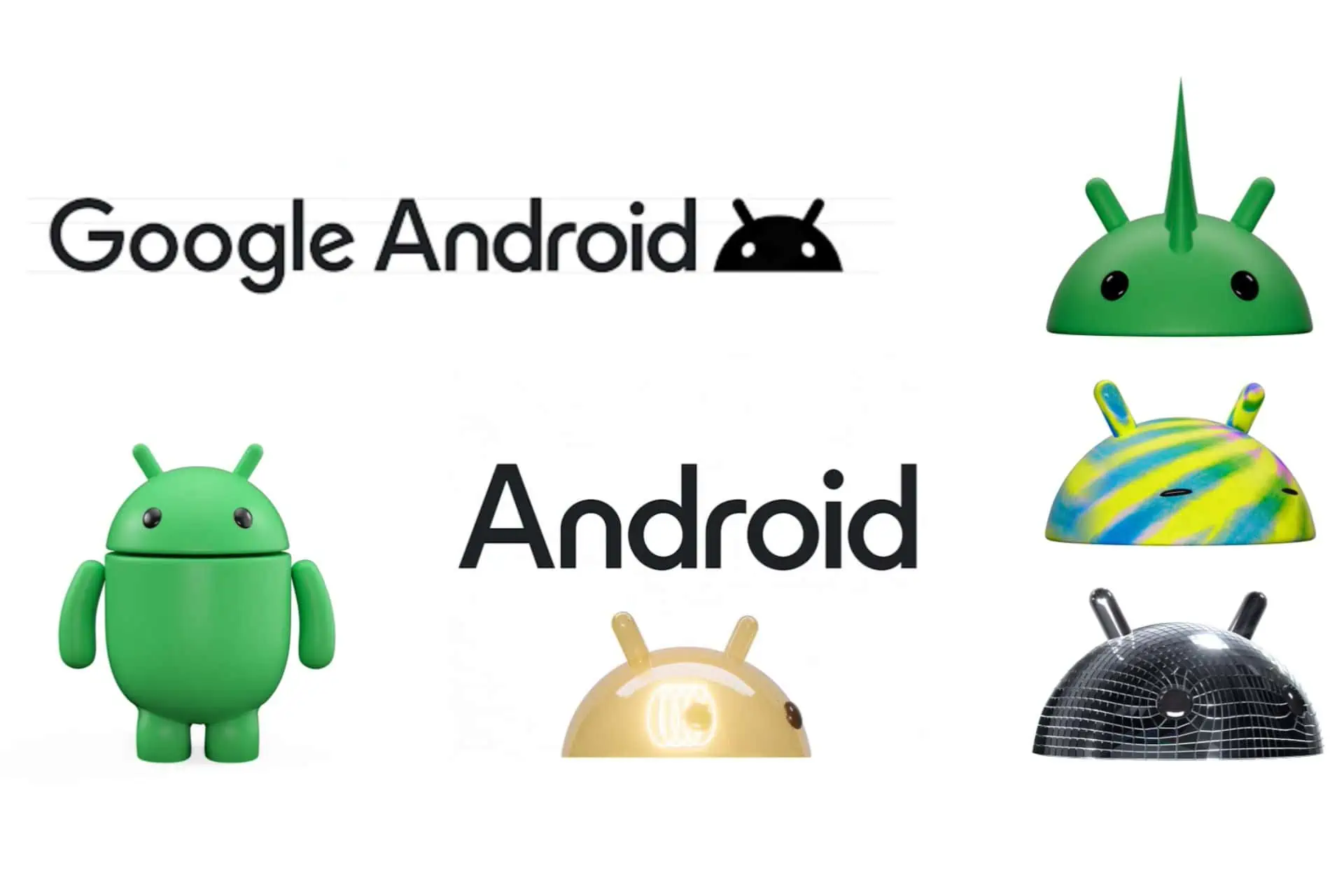
Android in 3D surprises everyone with an incredibly friendly and downright cute 3D version of the popular Android robot. Google decided that it was time for a change, and the tech giant debuted a new brand design for Android, which incorporated 3D shapes, and a lot of colors, to signify diversity and inclusivity. The new 3D robot will also be customized to represent different communities.
Today, we’re giving the most recognizable non-human member of our Android community an entirely new 3D look. The bugdroid — the face and most identifiable element of the Android robot — now appears with more dimension, and a lot more character. As a visual signifier of our brand, we wanted the bugdroid to appear as dynamic as Android itself.
The updated 3D robot is part of Google’s design overhaul, which will start this year, and will probably be implemented everywhere by the start of 2024. The reason behind this overhaul is tied to Google’s mission to bring itself closer to people, and to connect to communities and individuals.
Aside from the 3D robot, which looks absolutely cute, the logo will also suffer some changes. android will become Android everywhere, and the font will be subtly changed to suit the overall theme of the Google brand.
Android is the world’s most used operating system, with over 3 billion people using it daily, on their mobile devices. So this change seems necessary, as Google wants to create a closer connection with the Android community everywhere.
What do you think about it? Do you enjoy Android in 3D?





User forum
0 messages