A Closer Look: The new Settings app in Windows 10 Anniversary Update
3 min. read
Published on
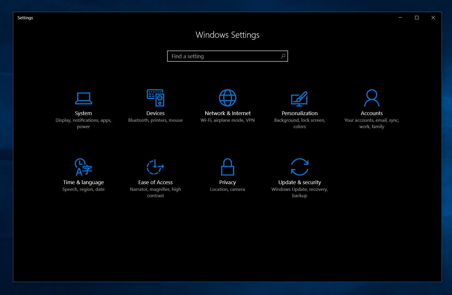

Microsoft is planning to release Windows 10’s biggest update so far, dubbed as the Windows 10 Anniversary Update on August 2. One of the many changes included in this update is the new and improved Settings app. This version of the Settings app has an improved interface, more settings and has taken another step towards completely replacing the Control Panel. So, it is time to take a closer look at the new Settings app in Windows 10 Anniversary Update.
Improved interface
Over the years, the modern Settings app has had a bad track record of poor design choices from the long list of jumbled up settings in Windows Phone 8.1 to Windows 10’s simplistic approach to a modern Settings app, albeit, it introduced the much awaited categorized settings. This will soon change with the Windows 10 Anniversary Update as Microsoft has finally introduced a new design which takes an inspiration from the Control Panel’s productive yet easy to understand layout. Additionally, Microsoft has added new animations to the app and along with numerous bug fixes, the user experience is cohesive and smooth.

In my opinion, Microsoft has done a good job at designing a very productive visual interface, making it looks very mature. Plus the addition of unique icons for each section in a great touch.
New features
Along with the interface improvements, Microsoft has added a bunch of new features to the Settings app. Firstly, the “System” section of the app which now includes a new section – Apps for Websites. This lets one enable (or disable) apps which open websites. Also, under the “Notifications & Actions” section, users can now rearrange the Action Center actions.

The biggest change is under the “Personalization” section as it now enables users to customize the look of Windows 10 by enabling the new Dark Theme. This mode was spotted a while back but has now made its way into the Settings app. Additionally, one can now enable color on title bars. Another really nice addition is the ability to customize the taskbar settings within the new Settings app.

Under the “Update & Security” section, Microsoft has added a separate “Windows Insider Program” section. This provides a better experience than Microsoft’s Windows Insider app for Windows 10 phones as it is integrated into the Settings app. It allows Insiders to select their Insider Ring, or stop them temporarily (or permanently). Additionally, the “Developers” section has got some fun new options for developers to play with. There are a lot of other small additions in the new Settings app — for example, there’s a new toggle which lets Windows automatically change timezone depending on your location.
Conclusion
Microsoft has done a good job at improving the Settings experience on Windows 10 by improving the user interface and adding many new options for users to tweak their Windows 10 experience. The update will be rolling out on August 2nd to Windows 10 PCs, as well as Mobile devices.
What do you think of the improved Settings app on Windows 10 Anniversary Update? Let us know in the comments below.



User forum
33 messages