Windows Store gets a new design on the web
1 min. read
Published on
Read our disclosure page to find out how can you help MSPoweruser sustain the editorial team Read more
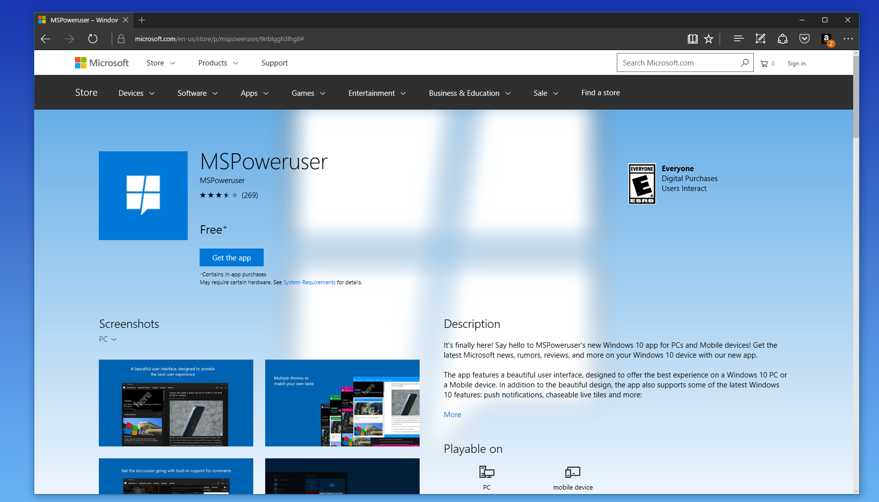
Microsoft has redesigned the Windows Store on the web. The latest update for the Windows Store mainly affects app listings, and the app listings look very similar to how they do on the actual Windows Store. Just like the Windows Store on Windows 10 devices, the web Windows Store’s new design feels pretty rough which isn’t anything surprising to see. However, the new Store does look a lot better than the previous Windows Store — at least on the web. The updated app listings include a better view for reviews, system requirements, feature lists, changelogs, and the other info about an app. Apart from app listings, Microsoft seems to have also updated the Search UI with some minor changes.
Here are some screenshots:
You can checkout the updated app listings UI here — however, the update may not be available for you right now, so just check back later. In the meantime, let us know what you think of the updated Windows Store in the comment section below.



User forum
12 messages