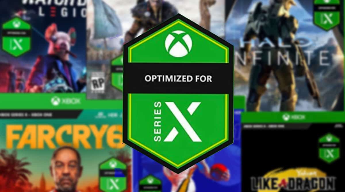
Xbox's Optimised for Series X badge is ruining gorgeous box art
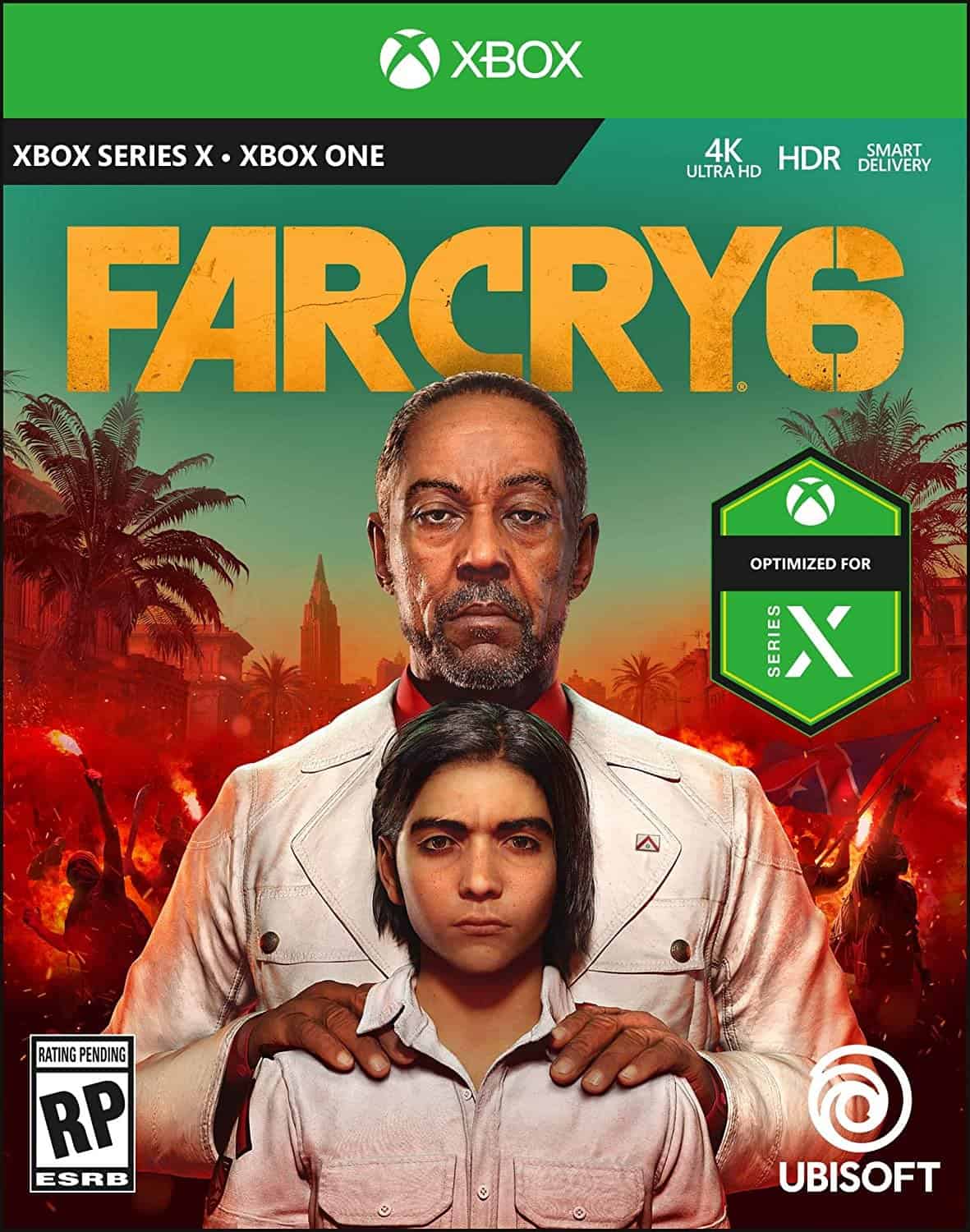
Good box art has often been marred by garish marketing materials and Ubisoft’s just revealed Far Cry 6 Xbox box art is no stranger to tacky marketing tactics thanks to a hideous Optimised For Series X badge.
While the Far Cry 6 Xbox box art may not be as befuddling bad as the infamous Konami’s Best cover for Castlevania Dawn of Sorrow – thank the lord – it’s still ugly as sin.
The standard box art is quite lovely. There’s the bold yellow logo, a gorgeous red Rebellion in the background and then there’s dictator Anton Castillo with his son Diego in the foreground.
Unfortunately, Xbox’s cross-gen approach to video game box art has ruined the tone of Ubisoft’s artistic presentation by slapping a gigantic Optimised for Series X badge right on the front of the box.
It’s minging. Worse than Nintendo’s Download Code Only banners; at least they don’t get in the way of the main piece.
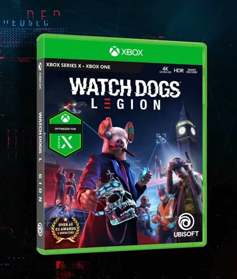
The Far Cry 6 Xbox box art isn’t the only offender. Ubisoft’s Watch Dogs Legion box art, another awesome cover, also features the same massive badge on the front.
Of course, this also means that every game that supports Xbox Series X – Cyberpunk, Assassin’s Creed Valhalla, Halo Infinite, et cetera – are going to feature the same gaudy badge slapped on top of them.
Please Xbox, get that Optimised for Series X badge and make it, like, 50% smaller.
Read our disclosure page to find out how can you help MSPoweruser sustain the editorial team Read more
User forum
0 messages