Xbox encourages users to participate in improving console dashboard homepage

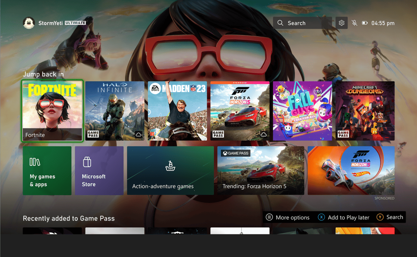
Xbox is getting more dedicated to listening to its gamer community by conducting a “multi-month series of experiments” involving users in redesigning the Xbox dashboard on the Xbox Series X|S and Xbox One consoles. Specifically, a subset of Xbox Insiders in the Alpha Skip-Ahead ring can start scrutinizing the “New Xbox Home Experience” this week.
Ivy Krislov, Xbox Senior Program Manager Lead, underlined the importance of gamers’ involvement in the process.
“We know the Xbox homepage is where our gamers spend the most time, and it’s a space that’s very personal,” said Krislov. “We also know we can always be listening and learning how we can do better here while keeping your experience fast and familiar. With that, we’re kicking off a multi-month series of experiments to learn how to create a more personalized home screen experience and address some of the top trends and fan requests.
As of now, the main changes of the homepage focus on the layout and design, which might and might not include some of the things everyone is expecting. Nonetheless, and thankfully, there’s still a lot of time for the current Xbox Home UI to be improved before it is finalized in 2023. And with Xbox expressing its enthusiasm to entertain suggestions and comments, we (perhaps) can expect a lot from it.
“We want to ensure this experience is the best it can be, and we know getting it right will take some time which is why we will be rolling it out slowly and iterating throughout the process,” Krislov added. “With your input, we’re looking forward to launching this new, better Home experience in 2023.”
As of now, one of the main highlights included in the latest preview updates of the homepage is the new “Jump back in” row at the top of the page, which lists the games and apps you recently played or accessed. Under this row, you’ll spot tiles for the Microsoft Store. And if you scroll down the page, you can get curated content categories based on your past activities and preferences. A search bar and a gear icon for settings are also placed at the top-right part of the layout.
With this minimal number of changes, Xbox still has a lot of things to work on. For instance, there’s still the ad tile that everyone wants to remove, but it is still present in this preview. Customization is also a concern, with many users voicing the need for it instead of Xbox constantly suggesting content based on their own algorithms. Xbox must also consider the need for sufficient Xbox achievement updates and many more. The list is really long, and with users constantly complaining about the Xbox dashboard, we’re sure Xbox will be receiving feedback in numbers more than they are expecting.
Read our disclosure page to find out how can you help MSPoweruser sustain the editorial team Read more
User forum
0 messages