Our Windows Phone 7 Review
9 min. read
Updated on
Read our disclosure page to find out how can you help MSPoweruser sustain the editorial team Read more
I’ve had the pleasure of using a Windows Phone 7 device as my main phone for the past two months. There have been some little annoyances, but as you’ll see, WP7 is a very convincing platform.
Please note, this was on pre-release hardware, and until fairly recently, was pre-release software as well. Things may well have changed since this was written.
Interface
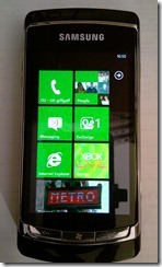
The interface is probably the thing that’s most likely to tempt people to WP7 over other platforms. It’s something completely new, and something “authentically digital†that hasn’t been seen before. The whole concept is based around having clean and clear glanceable information, rather than having yet another “app for thatâ€. The text heavy design language (known internally as Metro) does a lot to aid that cause, and the live tiles which we’ll cover in a bit also give WP7 a leg up on the competition.
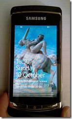
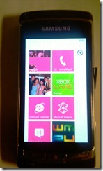
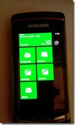
Even on the lock screen, the Metro concepts show through, with large fonts for the things that you’re most likely to check regularly (the time) and information like the next appointment and any missed calls, texts or emails shown on the screen. A simple swipe up brings you to the home screen, with blocks of bright colours on a plain background. This is probably the thing that most divides opinion, there’s not a whole lot of subtlety to be had from bright squares on black, and if you like pretty coloured icons, this definitely isn’t the place to look!
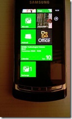
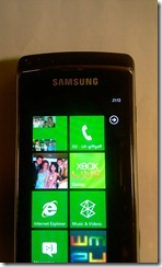
It’s an effect that grows with you over time, though, and the information that can be gleamed from the larger (but fewer) icons does really boost the “glance and go†tag line. For example, you can get the next appointment shown, alongside counters for emails. This feature will get better when the marketplace opens up, as it would be possible to have something like a weather application showing you a weather forecast, or a stocks application showing recent changes.
So great is the obsession with hiding anything not immediately useful that the title bar actively hides all information but the time. A press on the top few pixels of the screen does bring it back though.
Sometimes, the interface can be a little dull, and perhaps not as flashy as things like the iPhone, or Android, but it puts information, rather than shininess first, and at that, it’s pretty much unparalleled.
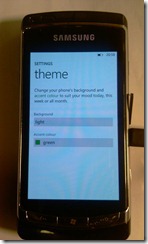
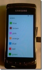
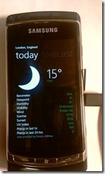
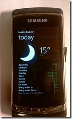
Theming wise, there are two options, “Background†and “Accent colourâ€. The background colour is the overall feel of the OS, dark, or light. By default, it’s dark, and this is because it’s designed with AMOLED screens, and black has significantly lower power usage on AMOLED screens than white does. The accent colour is used to highlight information, and is used to great effect in a demo weather application. There are a variety of colour options available, though some should definitely be avoided (magenta on a light background is a rather painful experience). OEMs are allowed to add one accent colour to the mix, but that’s the limit of OEM theming. There’s no way to change icons or anything like that, so WP7 is quite limited in that respect.
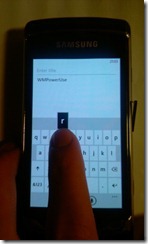
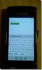
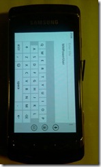
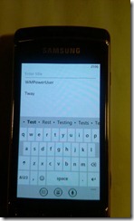
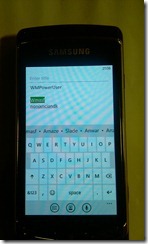
The keyboard is for all intents and purposes excellent. It’s a standard QWERTY layout, and works in both portrait and landscape. It also changes colour with the theme of the application/device. It’s black text on a white background in “light†themes, and the opposite in “dark†themes. The auto correction is very good, with the ability to correct virtually everything I’ve typed – it’s even good enough to be able to text without looking, and that’s an achievement for a SIP. If you do mistype a word (even if you’ve skipped over it and moved on the the next sentence, a tap on that word brings up a sliding panel of all the possible words you might have typed, and a simple tap on one changes it. This is reminiscent of the way the Windows Mobile (without the third party keyboards) handled spell checking, and it’s one of the few things that’s been carried over. The typing experience will vary with different hardware/devices, but on the devices I’ve tried, it’s been very very good.
The Metro design language has a few things that should be consistent between apps. The “Application Bar†replaces the text based softkeys of WM6.5 with small graphics similar to WM2003, and an expandable bar that can house less commonly used functions. Context menus also exist, and can be brought up with a tap and hold on any object that supports them.
The other big design idea with Metro is the concept of the Panorama or Pivot. There have been countless demos of these, so it’s not worth going too much in to detail on them, but the basic idea is a small window on a much larger space. This fits with the swiping gestures that are used so often in WP7, and the typography helps to hint that a swipe to the left or right will lead you to things.
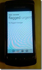
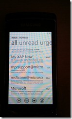
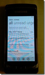
Pivots differ from Panoramas in that they’re a list of lists, rather than a single page that you look at a part of. This works well for things like the mailboxes, where you can swipe between certain areas (flagged, urgent, unread etc).
The implementations for both these ideas are very slick, and with the latest tool release, developers have been able to build their own applications using them.
Built in software
The Email client is pretty much spot on. It supports IMAP, POP, Hotmail/Live and Exchange ActiveSync push email, as well as full HTML support, and the interface is brilliant to boot. One of the key styles of the Metro design language is used in the mail program, the Pivot. It lets you quickly switch between things like urgent, unread, and flagged (if supported) with a simple swipe left or right.
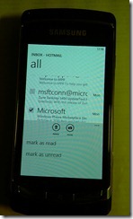
Selecting multiple emails is very quick, you just tap at the left side of an email, and a checkbox pops up, at which point it’s possible to mark as read or unread, move, delete, or flag (if your mail service lets you, which Hotmail doesn’t, but EAS does).
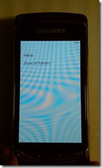
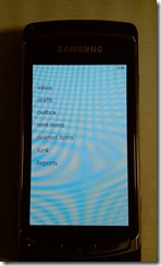
Access to folders other than the inbox is equally simple, a tap on the picture of a folder lets you pick from commonly used folders, or all folders.
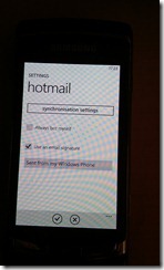
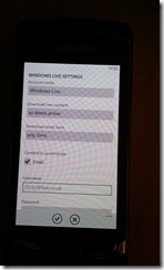
For anyone use to Windows Mobile, the settings for messaging are remarkably easy to use, instead of a massive number of pages filled with very little information, there are now two. One that lets you change quick settings like automatically BCC’ing yourself (a feature I’ve not noticed on any other smartphone I’ve used), and one for setting up synchronisation settings such as how frequently to sync, and what server address to use.
By default, emails are shown without downloading any images (this is done for privacy reasons apparently), and there’s no way to change that to automatically download. Once you’ve viewed an email with images that need to be downloaded, it does at least cache them and save having to force it to download again. WP7 supports full HTML emails, and does a great job displaying emails even if very image heavy. Pinch to zoom is supported, though text doesn’t reflow, which can be a little annoying at times.
My biggest annoyance with the email client is a lack of a single messaging program. I don’t want a unified inbox, if I did, I wouldn’t use 5 different email accounts, I’d use one, but what I do want is something like Windows Mobile, where a swipe left or right takes you in to a different mailbox. As it is, you need an icon for each mailbox, and that clutters things up. I’m sure many people would like a unified inbox as well though.
SMS is a great experience as well, though the first possible annoyance becomes obvious very quickly. There’s no way to have non-threaded SMS. For many, this won’t be an issue, but I can see it getting annoying to some (including me). On the bright side, conversations are handled very well, and even in threads of over a thousand texts, there’s no noticeable slow down, and no “tap here to see older messagesâ€. I haven’t had the phone long enough to try longer streams of texts, but I’m fairly sure WP7 will cope.
Phone calls will be dependent on the phone and network you’re on as well as the signal you have, but the dialler is something none of those will change. Unfortunately, it’s lacking massively in both features and design. The first thing that hits you is a list of recent calls (both outward, and inward) with missed calls highlighted. This in itself isn’t a huge issue, but with the lack of hardware call buttons, there’s no quick way to get to the dial pad, and that’s annoying. When you do finally get to the dial pad (it’s the middle button in the app bar by the way), it’s lacking a lot as well. There’s no smart dialling. At all. You either have to know the number, or call someone from the contacts list, and that kind of makes the phone app a bit pointless. Why go via the phone app, when the people hub does a better job of letting you call people?
Final thoughts
Up until the RTM, there was no way to delete just one text of a conversation. You used to have to delete the entire conversation, or just live with whatever was shown. From the fact that things like that have changed in the past few weeks, it’s clear that Microsoft listen to what people want, and will add things, or adjust software to make the OS work as people want it.
From features like the selection of a folder to view, it’s clear that a lot of work has been done on the details, and that microsoft really are commited to perfecting the OS with a few key features, instead of just putting more and more in to it in ways that make it harder to use.
![IMAG0776[4] IMAG0776[4]](http://mspoweruser.com/wp-content/uploads/2010/10/IMAG07764_thumb.jpg)

![IMAG0765[4] IMAG0765[4]](http://mspoweruser.com/wp-content/uploads/2010/10/IMAG07654_thumb.jpg)
![IMAG0779[4] IMAG0779[4]](http://mspoweruser.com/wp-content/uploads/2010/10/IMAG07794_thumb.jpg)




User forum
0 messages