Review: Windows 10 Mobile Anniversary Update — Needed improvements
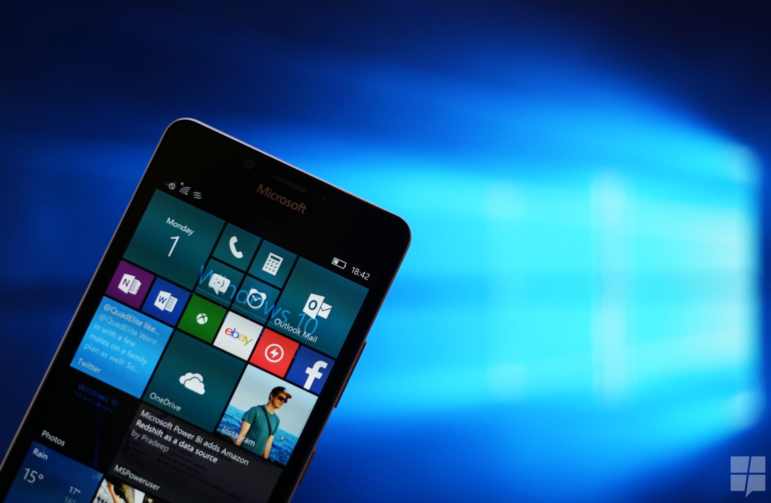
Table of contents
Microsoft’s Windows 10 Mobile, once had a bright future. A bright, colorful, polycarbonate future which was fun for the consumer, but over time, that future, much like the phones they shipped with, has turned gray, black and business like. Consumers had rejected them, apps makers had snubbed the growing OS and the tech media’s cheers quickly turned into jeers. Even with all that withstanding, Microsoft continue to plug at Windows 10 Mobile, trying to tune it into something, though I’m not enitrely sure what. When looking at all the Windows 10 Mobile phones that have been launched, you get the feeling that Microsoft is now aiming for business users – with a side of fans. Other questions may arise from skeptics such as: Does Microsoft still intend to create a viable mobile ecosystem as some say? Or is Windows 10 Mobile simply an existence that is less easily killed than continued? After all, with Microsoft’s unified development, it is much easier for the firm to plug away at making new OS versions of both desktop and mobile with less than maximal effort, so they continue to do so, creating new build after new build. Whatever the reason, Microsoft’s Windows 10 Anniversary Update has a mobile counterpart, and it’s much better than the one that Microsoft shipped with the Lumia 950 and 950 XL in November.
What’s new? The thing is, there’s almost nothing new in this update, what is here is refinements to core features that have existed in the OS since the original build of Windows 10. As you’ll see in this review, many of the changes make the OS better to use, but not necessarily “better” for any particular user – and that’s not a bad thing. Instead of an OS that tilts too much in the focus for one user at the detriment of the other, we get a jack of all trades who’s brushing up on his skills. If you are looking for the review of the Anniversary Update on the desktop, head over to this link.
Video Hands-on
Interface
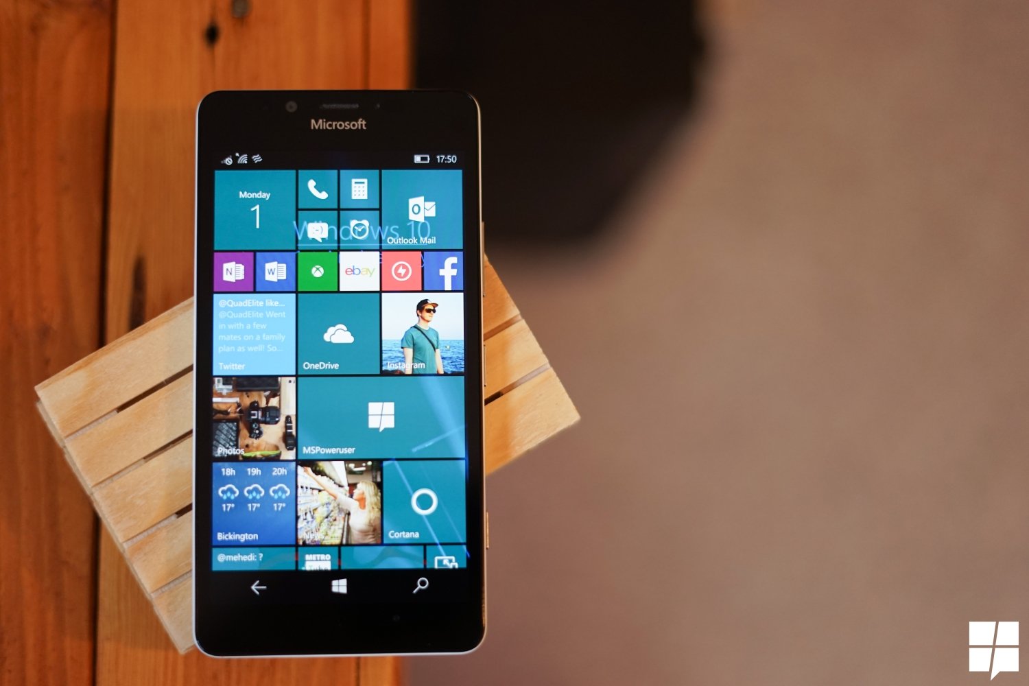
Windows 10 Mobile still retains a very distinctive user interface, with a home screen populated by live tiles, and an app list a swipe to the right, as it has been since 2010. It’s very intuitive, it’s customizable – more than IOS and less than Android. In other words, Windows 10 Mobile can be very pretty or very ugly out of the box depending on how well it is configured. Oddly enough, I haven’t noted any OEM- Microsoft included taking advantage of this out of the box. The UI of Windows Mobile OOB is always very spartan and (dare I say) bland, with minor additions based on either carrier mandated apps or Microsoft’s own apps.
In Windows 10 1607, the start screen got a few minor tweaks with Microsoft refreshing the way apps refresh their tiles. Making it more efficient on the battery life and aesthetically pleasing.
Microsoft also introduced what It calls chaseable live tiles in this update, now while I say “introduced” I mean Microsoft’s talked about it at build at told us how it should work, we have no idea how It works in practice just yet. None of Microsoft’s apps support, it and third party apps don’t make use of it yet. While we’re on the topic of live tiles, Microsoft’s making it faster to get to your app content via tiles if you tap on the app tile as it’s refreshing, this is apparently easier on the battery life and devices on the Windows 10 Anniversary Update should see improvements in that arena.
Microsoft’s also made some addition to the lockscreen as well, now when users are on the lockscreen, they can quickly launch the cameras by tapping the camera icon which replaces the vestigial back button. This is a feature found on both the iPhone and Android devices, however, while one may be inclined to question Microsoft on the lack of this and other lockscreen enhancements present in the new OS, it would be wise to note that the firm already had their own implementations of various lockscreen configurations. You didn’t need lockscreen notifications to scroll down and clutter your lockscreen if the Action Center remained a swipe away, and the quick at a glance notification panel at the bottom gives you some information already.
Apple and Google’s methods may be the most popular, but Microsoft’s still telling us their way works too.
Action Center and Cortana
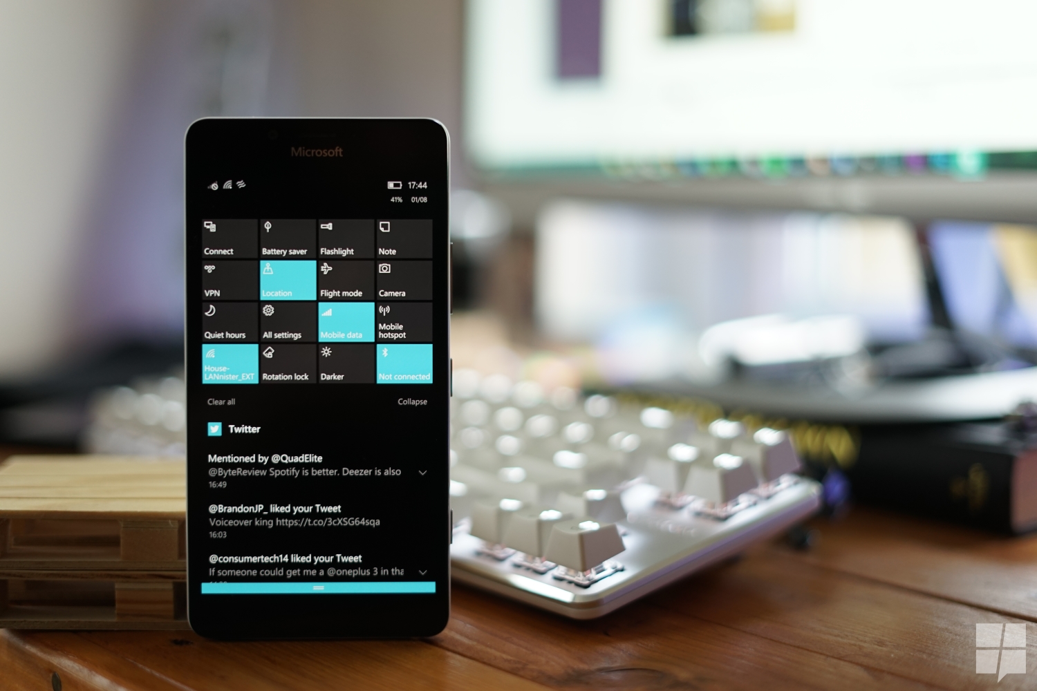
Microsoft’s also made some improvements to the Action Center, not too many, just enough to make it more useful than it was before. Now you can rearrange actions in the action center just by moving them manually in the settings app. There’s also been a slight redesign to notifications on the action center, with a focus on the “people” who trigger notifications from apps like WhatsApp and Line, rather than on the app itself. In addition to that, the firm also limits notifications by default to the first 20 notifications triggered by an app, you can customize this, but I believe the default setting gives just enough information without letting the user get swamped by notifications.
You can also customize which apps show up first in your action center, clearly, I’m biased towards communication apps like Outlook, Slack, and Messenger, so I always have them on top. Any other apps can pile up their notifications at the bottom, and you are free to attend to them at your leisure.
In addition to the above, Microsoft’s also added Hero Images on notifications, where apps can display a hero image in their notification to make it stand out. In my experience, this feature seems poorly implemented. If one were to swipe away the hero image of an app, all notifications from that app are summarily dismissed – whether you were done with them or not. That is poor design and something that Microsoft should consider rectifying.
By far though, the most exiting feature of the new Action Center isn’t its sorting features, it is its integration with the Action Center of Windows 10 for PCs. When configured correctly, Cortana synchronizes the action Center of your Windows phone with that of your PC, so you see all texts and emails received on your phone – on your PC. This feature is incredibly useful for replying to the SMS, but – if you buy into universal Windows apps – not much else. The premise behind using universal Windows apps on PCs and Mobile is pretty sound, you use an app on both platforms in a way that’s suited to the form factor of the platform where it is in use.
However, this leads to triplication of notifications, once on your phone, once on your PC, then again on your PC, since the phone beams it there as well. It’s also strange that despite a universal app sending a notification from your phone, you cannot open the app that notified you directly from the notification even if you have it installed. Microsoft will instead open the store for you, causing a brief moment of irritation as you now wait for the Store to either load or just close it instantly.
That aside, the notification sync is pretty neat, and if you’re able to configure it so it pretty much works exactly as you’d like then there’s no clear downside.
Aside from enabling notification sync, Cortana also shares pictures, directions and alerts you of low battery life between devices. Now that, I have no problems with.
Wallet 2.0
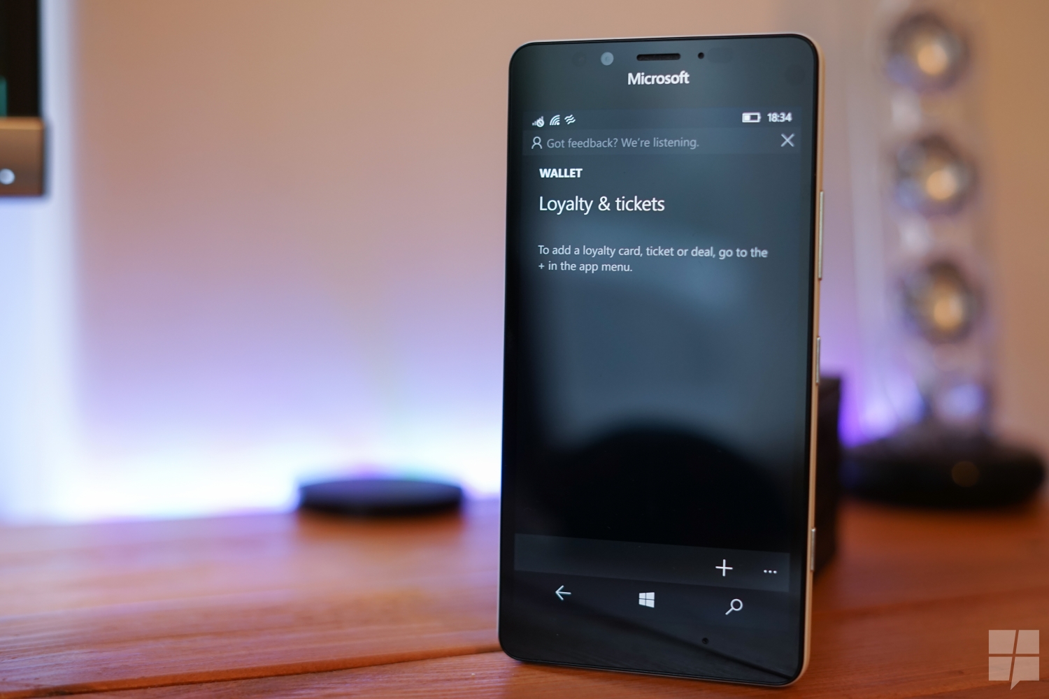
Microsoft’s added a new wallet app to the OS – one which supports tap to pay via NFC and more. Or course, being in the UK I can’t access all of its features, I’ve used some of its functionality and its presented a very meh impression to me.
For one, I’d say that the lack of NFC Functionality in the UK is not the wisest decision. While the USA Is a large market, NFC and other advanced card functionalities aren’t as prevalent as it is in the UK. Here in the UK, I use NFC to tap and pay for travel, outings, and other financial transactions via my bank card. If the Microsoft Wallet app offered it, then that’d be a good product which I could actively use. As it stands now, the Microsoft Wallet app doesn’t present the full gamut of its features in a market which can take advantage of it, and that’s just baffling.
On the other hand, you can scan loyalty cards and vouchers into the new app using its built-in QR scanner and that’s about it. There’s no back up of cards to OneDrive, no automatic recognition of loyalty cards. It’s just a little less useless than it was before its big “2.0” update, and that too – is baffling.
Apps
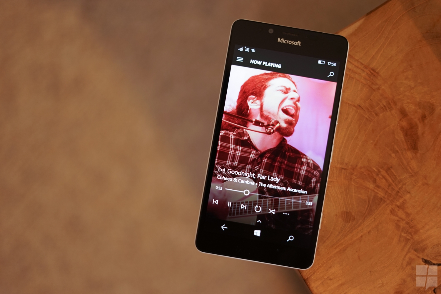
Even though Microsoft’s apps for Windows 10 Mobile get updates uncoordinated with OS updates, most of the largest improvements arrived for Insiders on the Anniversary Update first, and deserve a slight mention here. Groove Music and Maps got huge updates prior to the Windows 10 Anniversary Update, with Groove adding Your Groove and Maps taking on a more streamline design and developing a better interface for navigation. Groove Music is one of my favourite Microsoft consumer apps, I’m not sure the firm is giving it the attention it deserves just quite yet, but I’m still enjoying it on Windows, iPhone, and Android, so that counts for something. Your Groove, one of the features that makes me happy, generates a list of auto-playlists from your library via an algorithm. While it is like Spotify and Google Play Music’s curated playlists feature’s there’s something that set it apart for me personally. Your Groove pulls from my Music library, it is inherently personal and not something that an algorithm’s pulling from what it’ll think I like.
Sure if I want to branch out, I’ll use the radio feature or go to Spotify’s Discover weekly (which I wish Groove would copy). For my day to day music needs, however, Your Groove feels like something tailored to me and I can’t help but feel nice about it. Microsoft’s maps are also one of my favorite consumer apps, sure it isn’t available outside of PCs and mobile devices, but it’s a good app for navigation. While the version that shipped with Windows 10 Mobile last November was adequate, Maps V5 has improved and iterated upon the features that make maps app good.
There’s now tabs for tabbed navigation, so you can start a search for a location, then search for another one without using your place. It’s a neat feature, and I wish other apps like Word and OneNote would let you quickly make use of tabs for maximum productivity, but that’s not possible yet.
The navigation features themselves are adequate, though sometimes I encountered some oddities such as maps asking me to wait at a bus stop for the next bus when I had already boarded the bus – effectively rendering it useless. Offline maps are still a big feature of Windows, so if you’re strapped for data or visiting a foreign country or both, Microsoft Maps is a handy tool that is nearly as good as Google Maps (unless its Japan).
Finally, Microsoft also added the much anticipated Skype app for Windows 10 Mobile. If you’re a Windows phone user, this is important. Microsoft’s Skype app for Windows Phone hasn’t received any substantial updates since 2014 (aside from Mojis earlier this year) so the firm’s new Skype app means you can now use a modern Skype client on your Windows phone.
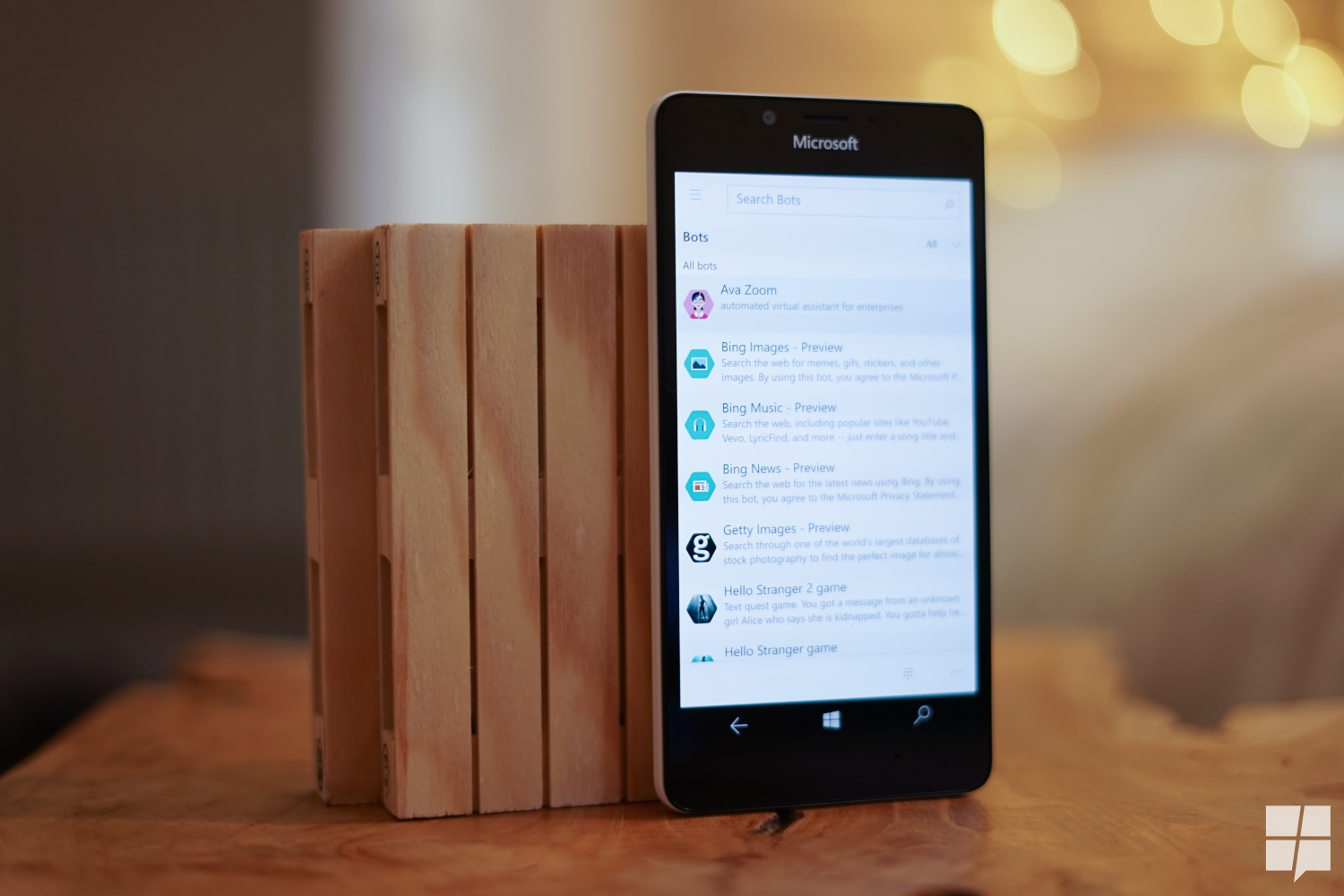
The app itself is a universal Windows app, so it’s nice to look at, and scales across phones. It has actionable notifications and support for Microsoft’s new bot ecosystem.
It’s a good Skype app, nut just like Google hangouts on Android, I suppose it may not be much of a draw for everyone. Facebook Messenger and WhatsApp are now the de facto standards for messaging worldwide, and thus few people use Skype for day to day chat anymore. Microsoft plans to add SMS integration to Skype soon, and that should bring it closer to the iMessage clone US users seem to want.
Microsoft’s other apps like Office and MSN apps also pick up mall changes, with MSN News gaining a true dark theme (great for the majority of Windows 10 Phones) and the Office Mobile apps now being capable of inking on mobile devices.
Missing in Action
Microsoft’s Windows phone updates aren’t complete without the removal of a few features, and Microsoft has some new missing features for this update as well. If you relied on SMS and Skype integration in Windows 10 version 1511, you’ll have to get used to using separate apps again. Microsoft is separating them for now planning to remerge them later in the year as stated above. Perhaps they feel the Skype app is a better all round messaging app than the SMS app or more likely they just want to push Skype. I don’t think people use Skype enough to be bothered by this, but consider that a heads up.
Microsoft is also removing part of WiFi sense, a feature which allowed users to share their WiFi with any of their contact groups. The feature had been present in Windows Phone 8.1, and was improved upon in Windows 10, but due to a privacy backlash, was removed from both the mobile and PC apps. Again, as Microsoft have demonstrated, this isn’t a thing that real people care about or actively engage with (except to shut if off in fits of paranoia), but just kee[ that in mind if you’re one of the few who do use it.
Final thoughts
Windows 10 Mobile’s Anniversary Update is a good update to the beleaguered mobile operating system. But it just doesn’t feel quite right. As I alluded to in the title, Windows 10 Mobile has moved from a path where it was focused on mobile devices for consumers, to an ecosystem where it is focused on mobile devices for the enterprise. Nothing demonstrates this better than the lack of a launch device for Windows 10 Mobile 1607. While other Windows Phone updates – even those for the General Distribution Updates had devices which launched alongside them (Lumia 920, 925, 1520, 930, 830, HTC One, Lumia 640 ), Windows 10 Mobile 1607 is launching within any consumer facing flagship device that shows off all its promise – not even a midranger. The best you can point to is the HP Elite X3, and while that is a fabulous device based on specs alone, it’s out of reach for most consumers due to the way it is sold -including Windows fans of whom 950’s and 950 XL’s make up solely half of it.
It’s quite saddening now where Windows Phone begins to reach what one would consider its endgame, that it begins to die. At this point, it’s clear that when Microsoft rebranded Windows Phone as Windows Mobile, they did more than rebrand – they took the platform back to where Windows Mobile was in terms of priority, market share and general interest.
A mobile OS is like a browser, it exists to do one thing, run apps – either on the web or natively. Every new feature that is added, every speed improvement, it’s all done for that purpose. A mobile OS that cannot run many apps is as good as a browser that cannot run many web sites. Unless Microsoft can completely redefine the usage of mobile devices or close the app gap decisively, Windows 10 Mobile will remain irrelevant for consumers. As a Windows Phone fan, it hurts, and I don’t think Microsoft can get out of this consumer rut anytime soon .
For business users, the story is more appealing, there’s a HP Elite X3, a Vaio Phone Biz and an Acer Jade Primo among other devices. We’ve talked about how Microosft is making continuum far wasier to use here , and its clear that these firms – and Microsoft – think that business is the way to go for “success”.
There is one more bright spot, though. If you’ve been paying attention, you would note that the Windows 10 Mobile Anniversary Update was more about patching up the OS than adding new things, Microsoft is rumored to be focusing on Windows 10 Mobile and the rumored Surface Phone with the next two Windows 10 updates. If true, perhaps Windows 10 Mobile will finally offer enough to catapult it over other mobile oses for both businesses, consumers and fans. Hopefully, that day will come soon.
Read our disclosure page to find out how can you help MSPoweruser sustain the editorial team Read more

User forum
145 messages