This 'new' macOS feature was introduced in Windows 15 years ago
Key notes
- Apple announced window tiling for macOS Sequoia, similar to what Windows has had for 15 years.
- This isn’t the first time Apple has adopted features from Windows, like widgets and a universal clipboard.
- While macOS Sequoia offers improvements, the delay raises questions about Apple’s innovation compared to Windows.
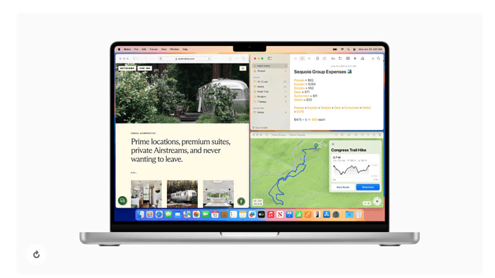
Apple’s WWDC 2024 keynote came with a slew of announcements, but one feature in particular caught the eye of long-time Windows users: window tiling.
macOS Sequoia will finally allow users to easily arrange windows side-by-side or in corners by dragging them to the edge of the screen. This functionality, however, has been a staple of Windows for nearly 15 years, first appearing in Windows 7 back in 2009.
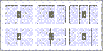
There are two ways to use your keyboard to Snap in Windows 11:
Use your keyboard to open the Snap layout box
- Press the Windows Logo Key + Z to display the layout box.
- Enter the number of the layout you want to use, then enter the number where you want your window positioned in that layout.
You can also use your mouse to select the preferred layout.- Use Snap Assist to fill the layout with other windows or apps you’d like to Snap together on the same screen.
Use your keyboard arrows to open the Snap layout
- Press and hold the Windows Logo Key + Arrow to Snap the app you are on. You can keep changing positions of the snap using your keyboard arrows.
- Use the Left Arrow to position the app on the left side of your screen
- Use the Right Arrow to position the app on the right side of your screen
- Use the Up Arrow to position the app on the upper side of your screen.
- When you’ve found the Snap location you want, release the Windows Logo Key to position the Snap.
- Use Snap Assist to fill the layout with other windows or apps you’d like to Snap together on the same screen.
While Apple’s implementation offers a sleek and intuitive approach with automatic tile suggestions and keyboard shortcuts, the question remains: Is it better late than never or a missed opportunity for earlier innovation?
While Apple often polishes its features to a high sheen, there is definitely a delay. Maybe it’s Apple’s way of doing things, but keeping users waiting for so long for a basic yet important feature doesn’t seem fair for users.
Not just these, several ‘new’ features on iOS have been there for a decade on Androids. iPhone users can now finally arrange app icons wherever they want on the newly unveiled iOS 18, which will work for iPhone XS and newer models. Android users have enjoyed this level of customization for over a decade. More such ‘new’ features are here.
However, WWDC 24 wasn’t all about catching up. Apple also unveiled “Apple Intelligence,” a personal AI assistant designed to work across Macs, iPhones, and iPads. This project integrates AI with user workflows, giving features like context-aware suggestions and proactive actions. And how can we forget that the calculator is finally here on iPads.
Overall, macOS Sequoia presents a mixed bag. While features like window tiling offer a welcome improvement for Mac users, the delay compared to Windows raises questions about Apple’s approach to user experience.
Read our disclosure page to find out how can you help MSPoweruser sustain the editorial team Read more
User forum
0 messages