Rounded corners comes to Firefox with their Proton redesign
1 min. read
Updated on
Read our disclosure page to find out how can you help MSPoweruser sustain the editorial team Read more
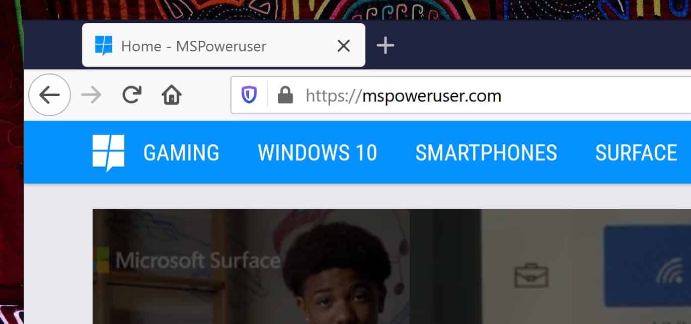
While the 2010s were dominated by sharp concerns and a flat user interface, the 3rd decade of the 21st century is going back to a softer, more dimensional look, which for Windows means rounded corners, layers, gradients, opacity and colours.
Those new design ideas have now percolated to 3rd party browser Firefox, as part of its Proton redesign. In the latest Nightlies you can now see the first implementation of the softer look, which can be seen below:
Old vs New
Currently, the Proton redesign means rounded corners for the active tabs, which is also now more prominent, with the tabs having increased height for easier use on a touch screen.
Mozilla also plans to make changes to the address bar, main menu, info bars, context menu and other elements of the browser, with the final result expected to roll out in Firefox 89.
How to activate
Currently, to see the changes, you need to download Firefox Nightly (here) and enable the “browser.proton.tabs.enabled” flag under about:config.
via Winfuture


User forum
0 messages