OneNote's new design gets refined in new update
2 min. read
Published on
Read our disclosure page to find out how can you help MSPoweruser sustain the editorial team Read more
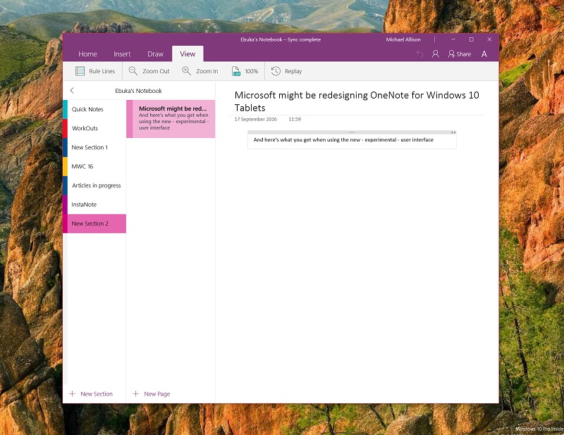

Microsoft earlier this month gave OneNote a facelift for Windows Insiders on the fast ring. Now the facelift is optional for now, as it is classed as an “experimental feature” but that hasn’t stopped Microsoft from improving and iterating on it.
In an earlier update this week Microsoft improved the controls for tablet users, moving the +New Page and Add New Section buttons to the bottom of the screen for easier reach when mobile. In today’s update, the firm now makes it easier to clean up your display for more focused work with a new “font” button now appearing to the right of the share buttons.
When the button is clicked or tapped, users now get the option to enter full screen drawing mode or hide the section list for immersive note-taking with a keyboard and mouse/touchpad.
To engage the new user interface for OneNote, you’ll have to go to options and toggle enable experimental features. A restart of the app should trigger the user interface change. While the new interface looks well done and slick, it still has some quirks around navigation due to the removal of the hamburger menu. This isn’t because of any good quality the hamburger menu possesses, just due to the fact that the OneNote team has yet to finalised the design at this time – just keep that in mind when using the app.
You can download the update from the store link below:
[appbox windowsstore 9wzdncrfhvjl]





User forum
0 messages