Microsoft Whiteboard for Teams gets Fluent Design update
1 min. read
Updated on
Read our disclosure page to find out how can you help MSPoweruser sustain the editorial team Read more
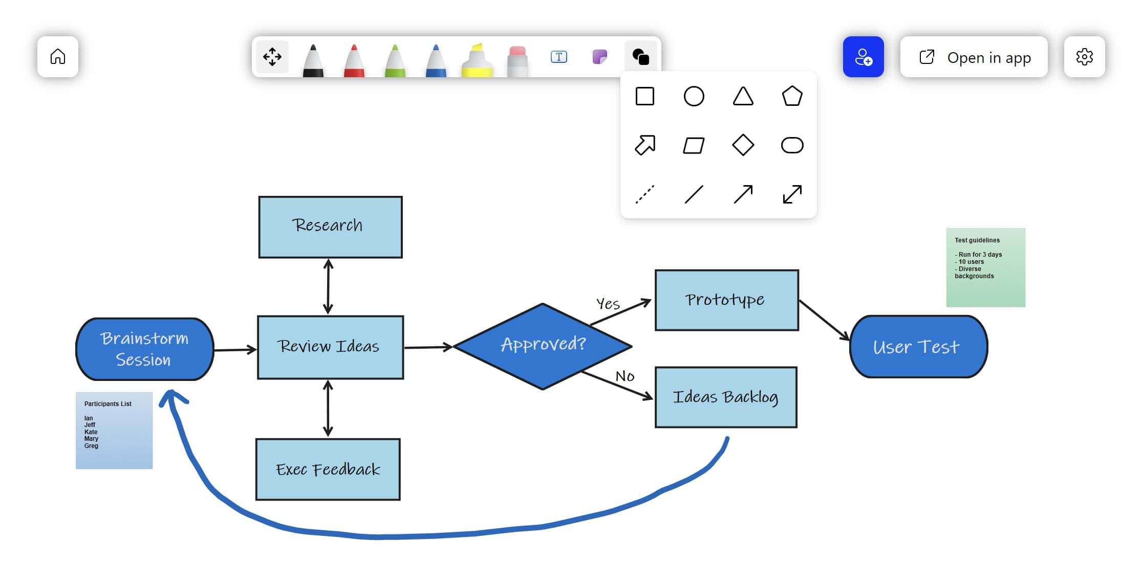
Microsoft Whiteboard for Microsoft Teams has received a Fluent design update, bringing a smoother look with attractive gradients to the app.
The improvement is most visible in the toolbar.
Above is the old toolbar, which is of course pretty flat.
Below is the new toolbar, which brings rounded corners and gradients to the UI element.
The upgrade has also brought new arrows and shapes to the app.
This should make collaborative brainstorming sessions a bit easier.
The update should be rolling out to users now.
via Ian Mikutel



User forum
0 messages