Microsoft redesigns Edge PWA app menu

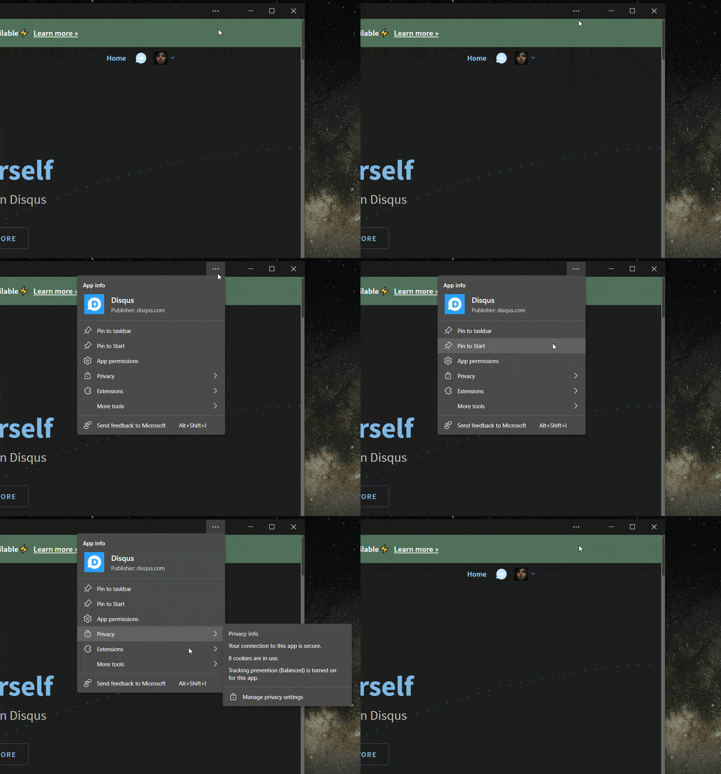
In the latest Edge Canary build, Microsoft has given the ellipses menu for PWAs a new look, differentiating the menu from the usual ellipses menu on a normal website on Edge.
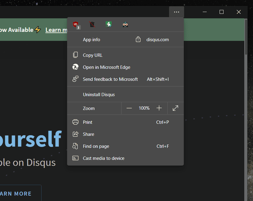
The old menu looks very similar to the regular Edge menu.
The new menu has fewer items as its root level and features a large app icon.
It’s notable that Microsoft chose to move items such as Open to Edge to the More tools sub-menu, as Microsoft continues to work towards making PWAs appear the same as regular apps.
Source: Leo Varela
Read our disclosure page to find out how can you help MSPoweruser sustain the editorial team Read more
User forum
0 messages