Microsoft introduces a new look for OneNote in new insider update
Note taking is becoming an important part of computing, both mobile and traditional. As a result of the digitisation of text, users are now more inclined to take their notes on PCs and Tablets rather that traditional notebooks. As a result of this demand, tech companies have risen up to develop proper note taking solutions for users of their products. Apple has Notes.App, Google has Google Keep and Microsoft has its flagship note taking app – OneNote.
Earlier this week, Microsoft announced its Office Insider changes for September 2016. Tucked in among the changes to the other note taking apps, was an overlooked “experimental” design change to Microsoft’a OneNote note-taking app.
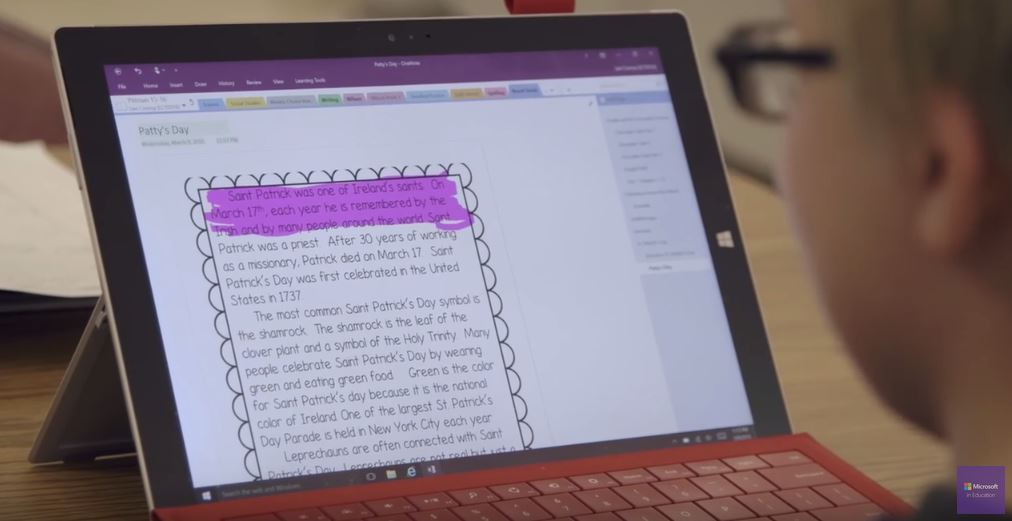
Once the new experimental design is triggered in the settings, the UI and UX of the app undergo a slight overhaul. The hamburger menu in the app is gone, along with the tabbed “section”[thnk separators in a physical notebook] list at the top of the screen.
Instead, Microsoft has moved the “sections” list to a new collapsible sidebar, and added a new back button to the app for switching between Notebooks.
As a frequent OneNote user on the Surface, this change makes it easier to switch between sections in a Notebook for more organised note taking. For instance, while you;d have to reach all the way to the top for the screen for most navigation, Microsoft moving the navigation actions to the side of the screen makes the app more tablet focused and adhere to Microsoft’s own design guidelines better.
Clearly, the design is still quite unpolished as it is currently “experimental”, so there’s a chance that Microsoft may well drop it f they don’t feel it meets their standards.
Earlier this month, Microsoft hinted at a new OneNote user interface for users on all plaftorms in an attempt to unify the design language, and this may be the very first step.
We’re working on a ton of great features, including a brand-new UI which is more accessible and consistent across platforms. We think you’ll really like it, and you’ll be able to try it for yourself very soon
What do you think of OneNote’s new design? Let us know in the comments below.
Read our disclosure page to find out how can you help MSPoweruser sustain the editorial team Read more


Improve this guide


User forum
0 messages